Neutral Sans Workhorse

Army Force + Corven
Lets Army Force own the focal silhouette while handling secondary copy, sizing and subheads cleanly.
Inspect Corven specimenDisclosure: MakerFileHub may earn a commission from qualifying purchases via paid links on this page. How our links work.
Star-inlaid heavy military stencil with thick squared stems
Army Force is a heavy stencil alphabet in which the stems are thick and squared, the counters cut straight through and a star replaces the counter of the A, so a word reads as equipment marking.
Paid link
Get this fontProject & layout blueprintsAt-a-glance maker compatibility
Open counter bridges hold interior islands intact on laser-cut wood, acrylic, and mylar stencils.
Visual anatomy & craft review
The A holds a five-pointed star in place of its counter, the R keeps a squared bowl and a straight leg, the M splays from a narrow vertex and the Y forks with flat cuts, all at a heavy even weight with bridges that keep the letters from closing. That construction is what makes the face practical: the bridges let the letters be cut as a mask as well as printed solid. Because the shapes are simple and the weight is uniform, a word stacks into two lines at 50 pt and reads from a distance on a case or a wall. The counters are wide enough to survive a spray. The brushed dark ground, the bone ink, the thin rules, the stars and the two caption lines are presentation; the typeface is the word.
Military · Stencil · Heavy
Two-font hierarchy recipes
Tested contrast partners — pairing Army Force with grounded secondary typography.
Army Force + Corven
Lets Army Force own the focal silhouette while handling secondary copy, sizing and subheads cleanly.
Inspect Corven specimen
Army Force + Aureline
Grounds bold display lettering with classic typographic authority on posters, badges and apparel.
Inspect Aureline specimenPractical applications
Concrete hierarchy, scale and production guidance tailored to Army Force’s stroke geometry.
The bridges are drawn for a mask, and the heavy squared stems read through a sprayed marking at 40 mm on a case that will be handled hard.
Hierarchy & layout recipe
Spray a 60 mm marking: cut a mylar stencil with the name at 60 mm, keep every bridge at 5 mm, and leave 10 mm of mask around each letter so the overspray does not creep under the edge.
Pre-production check
A bridge under 4 mm tears when the mask is lifted; check the cut file at full size and widen the bridge rather than the stem.
The stencil weight gives a feature title the look of equipment marking, which suits a story about gear or travel at 60 pt.
Hierarchy & layout recipe
Print an A4 cover: set the title at 60 pt across a solid panel, set the standfirst in a 11 pt sans beneath, and keep 18 mm of margin so the stencil gaps are visible against the panel edge.
Pre-production check
Stencil gaps over a photograph read as damage; check the cover and place the lettering on a plain panel rather than on the image.
The heavy letters read on a small tag at 12 pt and survive a laminated print, which is what a kit label needs in a wet season.
Hierarchy & layout recipe
Print a 60 by 30 mm laminated tag: set the name at 12 pt, set the number in a 6 pt caps sans beneath, and keep 8 mm clear at one end so the cable tie does not cross a bridge.
Pre-production check
A cable tie pulled tight creases the laminate; check a tied sample and keep 6 mm of card between the hole and the nearest letter.
Technical & licence verification
Confirm included OTF/TTF/WOFF formats, full glyph tables and licence coverage on the live store page before batch production.
Closest visual alternatives
Matched across letterform anatomy, stroke behaviour and craft applications.
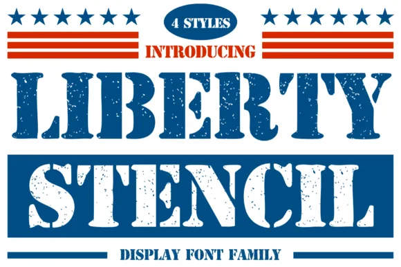
4-style heritage Americana stencil
Liberty Stencil offers a four-style Americana slab-stencil family drawn from 1776 heritage crates, Independence Day banners and rugged apparel, where bracketed slab serifs meet crisp centre bridges instead of the flat shoulders of a modern military stencil.
Ideas for this font
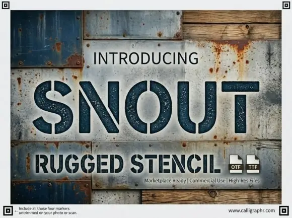
Wide rugged stencil capitals with narrow vertical gaps and speckled fill
Snout is a wide industrial stencil in which heavy capitals are interrupted by narrow vertical gaps, the S and O stay round against straight-sided N, U and T shapes and a speckled fill roughens the surface, so a word reads as a sprayed crate marking.
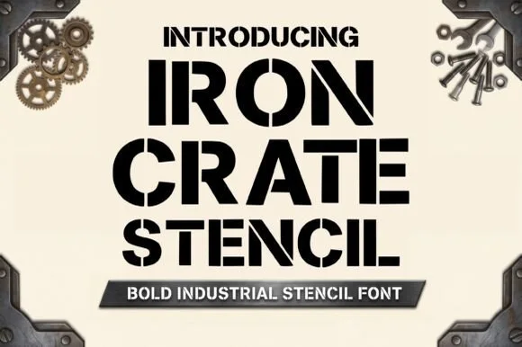
Heavy industrial crate stencil
Iron Crate Stencil builds ultra-bold industrial shipping-crate capitals, where thick vertical bars and generous bridges keep every letter and numeral centre open instead of dropping out as an island.
Ideas for this font
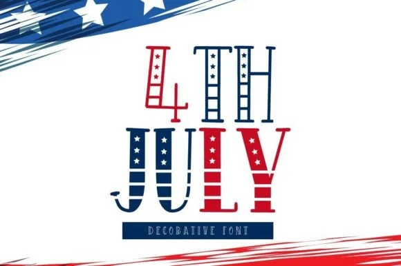
Tall hand-drawn Americana stars-and-stripes display
4th July is a tall, whimsical folk-art patriotic display font pairing star-filled vertical stems with striped crossbar ribs.
Ideas for this font
Same independent foundry
Allow optional Google Analytics to measure visits and catalogue actions. Your search words and notes are not included. Privacy & storage