Modern Grotesque Body

Stencil Army + Mango Dream
Creates crisp high-hierarchy contrast beneath Stencil Army headlines across menus, websites and labels.
Inspect Mango Dream specimenDisclosure: MakerFileHub may earn a commission from qualifying purchases via paid links on this page. How our links work.
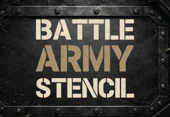
Heavy footed stencil capitals with broad breaks and scattered worn marks
Stencil Army shows white uppercase words on an olive camouflage field, where heavy stems and broad curved slab feet are interrupted by stencil breaks, and the C and S curves split vertically while E arms separate from parts of the main stem.
Paid link
Get this fontProject & layout blueprintsAt-a-glance maker compatibility
Open counter bridges hold interior islands intact on laser-cut wood, acrylic, and mylar stencils.
Visual anatomy & craft review
The weight stays heavy, the feet curve wide, the breaks cut through the middle of the letters and small worn marks roughen the rest. That broad foot is the character: the word reads as sprayed through a cut mask rather than printed from a plate, which is why the sample leans on a camouflage ground. The treatment is visible distress rather than proof of military use or a cut-ready stencil, so inspect the outlines before any mask and keep 40 pt so the breaks survive.
Stencil · Broad feet · Worn
Two-font hierarchy recipes
Tested contrast partners — pairing Stencil Army with grounded secondary typography.
Stencil Army + Mango Dream
Creates crisp high-hierarchy contrast beneath Stencil Army headlines across menus, websites and labels.
Inspect Mango Dream specimen
Stencil Army + Hailey
Adds a warm human signature touch for 1-to-3-word callouts without competing against structured serif capitals.
Inspect Hailey specimenPractical applications
Concrete hierarchy, scale and production guidance tailored to Stencil Army’s stroke geometry.
The footed stencil suits a crate mark, and the heavy stems stay solid at 40 mm on a branded panel, where the breaks keep their width.
Hierarchy & layout recipe
Print a 250 mm crate panel: set the word at 40 mm on one row, keep every break at 5 mm minimum, and keep 12 mm of clear ground around the outermost foot.
Pre-production check
A break printed under 2 mm closes with ink; check the plate proof and hold the word at 36 mm or above.
The stencil capitals read along a corridor, and the broad feet hold a bay name at 56 pt on a printed sheet, where the splits stay clear at distance.
Hierarchy & layout recipe
Print an A4 sign: set the bay name at 56 pt on one row, keep 20 mm of clear ground beneath before the number at 14 pt, and keep 18 mm of margin all round.
Pre-production check
Worn marks at 24 pt read as print faults; check the mounted sheet and keep the sign at 46 pt or above.
The distressed stencil sets a seasonal poster, and the heavy forms hold a short title at 54 pt on an A3 sheet, where the camouflage mood carries.
Hierarchy & layout recipe
Print an A3 poster: set the title at 54 pt on one row, keep 22 mm beneath before the times at 14 pt, and keep a plain field behind the letters so the breaks read.
Pre-production check
A camouflage ground behind the type hides the breaks; check the sheet and keep the letters on flat colour.
Technical & licence verification
Confirm included OTF/TTF/WOFF formats, full glyph tables and licence coverage on the live store page before batch production.
Closest visual alternatives
Matched across letterform anatomy, stroke behaviour and craft applications.
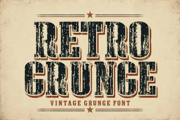
Tall worn slabs with vertical scrape texture
Retro Grunge shows tall closely spaced slab capitals with rounded bowls and deep vertical scratches, where the E and R keep heavy stems even as the surface breaks and a red-brown offset edge sits behind the black letters on aged paper.
Ideas for this font
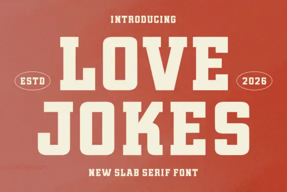
College slab display
Love Jokes is a college slab in cream on a rust-red ground: heavy caps with wide block serifs, a low waist and closed counters, set on two lines between two oval badges that read ESTD and 2026, with a tracked line beneath.
Ideas for this font
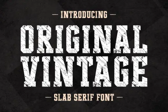
Tall angular slabs covered by diagonal scratches
Original Vintage uses tall white slab capitals with clipped corners and dense diagonal cuts. The scratch direction crosses both rows with a consistent angle, producing a striated surface rather than scattered chip damage, while the black charcoal background stays separate from the letter texture.
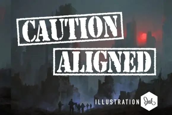
Distressed stencil capitals enclosed in rough rectangular rules
Caution Aligned shows white heavy capitals in two separately framed rows, where narrow gaps interrupt several bowls and stems and ragged edges with coarse rectangular outlines create a stamped-looking silhouette.
Same independent foundry
Allow optional Google Analytics to measure visits and catalogue actions. Your search words and notes are not included. Privacy & storage