Editorial Serif Anchor

Christmas + Medvilea Editorial
Anchors Christmas's fluid strokes with crisp Roman proportions on wedding suites, headers and packaging.
Inspect Medvilea Editorial specimenDisclosure: MakerFileHub may earn a commission from qualifying purchases via paid links on this page. How our links work.
Thick seasonal script with star accents
Christmas shows broad connected downstrokes with tall looped C and h shapes, an outlined star replacing the visible i dot and three more stars sitting near the final s.
Paid link
Get this fontProject & layout blueprintsAt-a-glance maker compatibility
Weld or Unite overlapping script joins into one continuous vector path before sending to the blade.
Visual anatomy & craft review
The downstrokes stay thick, the loops rise high on the capitals, the connectors run short and the star marks sit where a dot or terminal would fall. The thick seasonal script is the character: the line reads as a warm written greeting, which is why the sample sets one word with star accents. Because the loops are tall and the strokes thick, keep 28 pt as the floor and cut from 1.1 inches of x-height so the joins weld cleanly on vinyl; the stars are decorative glyphs, not a separate icon set.
Seasonal · Thick script · Star accents
Two-font hierarchy recipes
Tested contrast partners — pairing Christmas with grounded secondary typography.
Christmas + Medvilea Editorial
Anchors Christmas's fluid strokes with crisp Roman proportions on wedding suites, headers and packaging.
Inspect Medvilea Editorial specimen
Christmas + Clyne Sans
Keeps small-scale dates, URLs, nutrition facts and care instructions crisp and legible below script titles.
Inspect Clyne Sans specimenPractical applications
Concrete hierarchy, scale and production guidance tailored to Christmas’s stroke geometry.
The thick script suits a holiday card, and the tall loops keep a short greeting readable at 26 pt on an A6 sheet. The thick strokes also keep a holiday greeting warm at card size.
Hierarchy & layout recipe
Print an A6 card: set the greeting at 26 pt, keep 16 mm of clear ground beneath the loops, and set the family name at 12 pt in a serif beneath with 10 mm of clear space. Keep the card flat under the greeting.
Pre-production check
Star accents printed at 14 pt fill into dots; check the proof and keep the greeting at 24 pt or above. Keep the accents at full size only.
The warm script suits a small tag, and the even weight stays clear at 20 pt on a 45 mm kraft card. The tall loops also give a small tag its lift without needing a second colour on the kraft.
Hierarchy & layout recipe
Print a 45 by 80 mm tag: set the word at 20 pt, punch a 4 mm hole 10 mm from the top edge, and keep 6 mm between that hole and the tallest loop, and set the tag string through the hole after printing.
Pre-production check
A thick loop printed under a hole leaves a thin bridge; check the die and shift the hole 4 mm lower. Use a 350 gsm tag for the punch.
The thick script reads across a stall, and the rounded strokes hold a two-word sign at 44 pt on a printed board. The rounded script also reads from a market path.
Hierarchy & layout recipe
Print a 500 by 250 mm board: set the sign at 44 pt, keep 18 mm of margin so no loop runs off the edge, and set the prices in a 14 pt sans on a separate band. Keep the sign on one line.
Pre-production check
A seasonal script printed at 30 pt seen from outdoors loses its connectors; check the board and keep the sign at 40 pt or above.
Technical & licence verification
Confirm included OTF/TTF/WOFF formats, full glyph tables and licence coverage on the live store page before batch production.
Closest visual alternatives
Matched across letterform anatomy, stroke behaviour and craft applications.
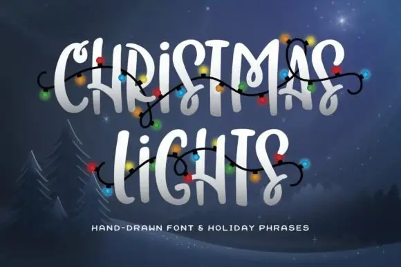
Hand-drawn caps with curly hooks and connecting swashes
Christmas Lights is a hand-drawn capital alphabet in which the strokes end in curls, some letters carry connecting hooks and the fit stays loose, so a two-word greeting reads as lettering drawn with a brush pen and decorated with a string of bulbs.
Ideas for this font
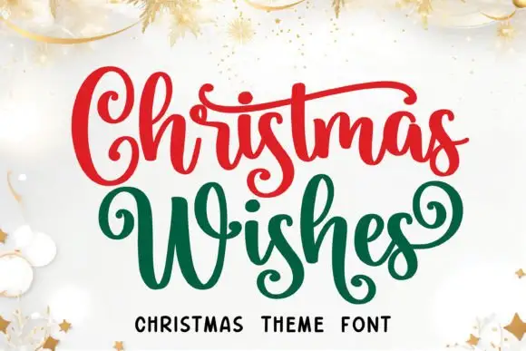
Christmas script with curled capitals, long cross strokes and low looping s forms
Christmas Wishes is a festive script in which the capital curls forward, the W spreads wide, the cross strokes run long and the s forms loop low, so a two-word greeting reads as ribbon lettering on a card.
Ideas for this font

Flourished Christmas script with large open capitals and returning lower swashes
Christmas Wish is a festive script in which the capitals open wide, the lower swashes return under the word and the ascenders stay tall, so a two-word greeting reads as an engraved seasonal plate.
Ideas for this font
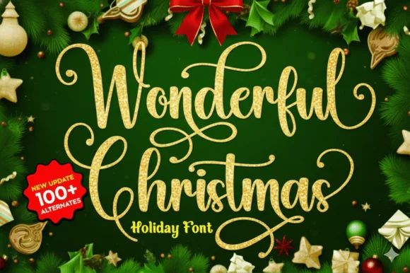
Ornate gold holiday calligraphy
Wonderful Christmas builds tall looping calligraphy flourishes with spiral loops that crown the capitals and descenders across a two-line specimen, pairing fine hairlines with medium calligraphic downstrokes.
Ideas for this font
Same independent foundry
Allow optional Google Analytics to measure visits and catalogue actions. Your search words and notes are not included. Privacy & storage