Editorial Serif Anchor

Bubble Font + Cronelo
Anchors Bubble Font's fluid strokes with crisp Roman proportions on wedding suites, headers and packaging.
Inspect Cronelo specimenDisclosure: MakerFileHub may earn a commission from qualifying purchases via paid links on this page. How our links work.
Thick rounded monoline script with ballooned curves
Bubble is a thick rounded monoline script whose curves swell wider than the stems, so the word reads as a chain of balloons rather than as a written line.
Paid link
Get this fontProject & layout blueprintsAt-a-glance maker compatibility
Weld or Unite overlapping script joins into one continuous vector path before sending to the blade.
Visual anatomy & craft review
The capital B doubles its bowl into two overlapping balloons, and every letter after it keeps the same generous radius: the u is a cup, the b and l rise into tall rounded stems, and the e closes into a circle with a small bar. Weight is heavy and unvarying, the terminals are round rather than blunt, and the joins sit low so the letters overlap slightly instead of linking. The counters stay open and almost circular, which is what keeps the shape legible when it is set large. The pale rainbow arc behind the word is a gradient on the card, and the two tracked caption lines beneath belong to a plain cap face, not to the script.
Bold · Round · Bouncy
Two-font hierarchy recipes
Tested contrast partners — pairing Bubble Font with grounded secondary typography.
Bubble Font + Cronelo
Anchors Bubble Font's fluid strokes with crisp Roman proportions on wedding suites, headers and packaging.
Inspect Cronelo specimen
Bubble Font + Helina
Keeps small-scale dates, URLs, nutrition facts and care instructions crisp and legible below script titles.
Inspect Helina specimenPractical applications
Concrete hierarchy, scale and production guidance tailored to Bubble Font’s stroke geometry.
Round bold script matches the shape of the balloons it will stand beside, and the heavy monoline reads across a party room where a delicate script would vanish into the background chatter.
Hierarchy & layout recipe
Set the name at 90 mm wide on an A3 card, keep the age in the same face at 130 mm, and hold 60 mm of margin at the foot so the sign clears the cake stand it sits behind.
Pre-production check
Bold rounded lettering and a printed board both look flat; add a one-tone shadow or a coloured ground if the sign has to read from the far side of a hall.
A rounded bold script reads at a distance and its even weight survives the laminated, glossy finish that classroom boards usually get, where thin strokes glare out of view.
Hierarchy & layout recipe
Print the welcome word at 160 mm wide on an A1 board, keep the class name in a plain sans at 40 mm beneath, and leave the lower third for the day's timetable in straight lines.
Pre-production check
Gloss lamination wipes out detail under ceiling lights; check the board on the wall at the angle children will see it from, not flat on a table.
The script's round shapes echo the product itself, and the heavy weight holds up on a small sticker where a thin script would read as a smudge at arm's length.
Hierarchy & layout recipe
Keep the mark at 45 mm diameter on a die-cut sticker, set the flavour name in a plain sans at 7 pt curved along the lower edge, and hold 5 mm between the last letter and the cut line.
Pre-production check
Die-cut edges and round letterforms compete; keep a flat area on the sticker for the peel tab so the design is not split when it comes off the backing.
Technical & licence verification
Confirm included OTF/TTF/WOFF formats, full glyph tables and licence coverage on the live store page before batch production.
Closest visual alternatives
Matched across letterform anatomy, stroke behaviour and craft applications.
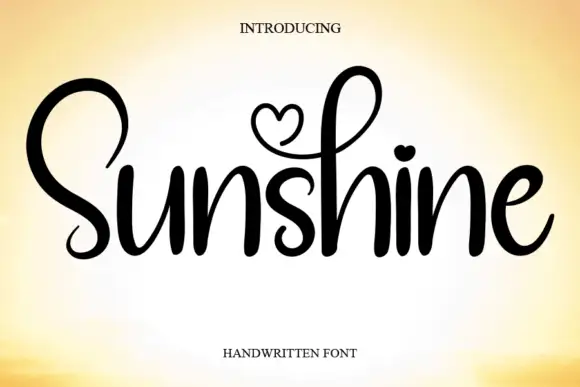
Rounded script with heart details
Sunshine is a rounded script with heart-shaped details in black on a warm gradient: fat soft strokes, a tall capital S, a heart drawn inside the loop of the h and a heart instead of the dot on the i.
Ideas for this font
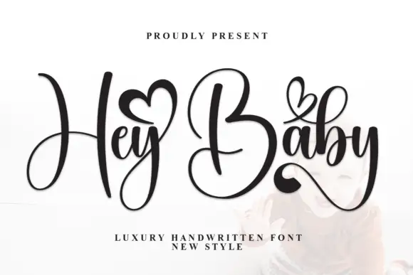
Narrow lowercase joins with towering capitals and heart accents
Hey Baby pairs narrow lowercase joins with a towering H and B, sets small hearts above the words and finishes the y with a sweeping tail, so a short phrase reads as a written line lifted by two tall capitals.
Ideas for this font
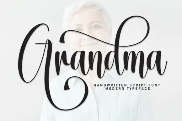
Broad looping capital with a very high ascender
Grandma combines a broad looping capital G that returns below the word with a very high d ascender, while the fine joins carry the rest of the line across a portrait.
Ideas for this font
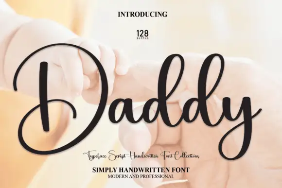
Handwritten script with an oversized circular capital and paired tall ascender loops
Daddy is a gentle handwritten script in which one oversized circular capital leads the word, two matching ascender loops rise beside it and a low y turns back beneath the baseline, so a short name reads as a soft signature.
Ideas for this font
Same independent foundry
Allow optional Google Analytics to measure visits and catalogue actions. Your search words and notes are not included. Privacy & storage