Editorial Serif Anchor

Spooky + Vanielst Elegant Serif Display Stylistic
Anchors Spooky's fluid strokes with crisp Roman proportions on wedding suites, headers and packaging.
Inspect Vanielst Elegant Serif Display Stylistic specimenDisclosure: MakerFileHub may earn a commission from qualifying purchases via paid links on this page. How our links work.
Modern rounded display
Spooky is a modern rounded display in black over a soft photograph: wide rounded capitals and a lowercase with open bowls, even strokes, soft terminals and a tall ascender on the k, so the word reads as a contemporary signage face rather than a seasonal horror lettering.
Paid link
Get this fontProject & layout blueprintsAt-a-glance maker compatibility
Weld or Unite overlapping script joins into one continuous vector path before sending to the blade.
Visual anatomy & craft review
The word is set once across the frame, and the drawing is a rounded geometric sans: the o and the p are near circles, the s closes cleanly, and the k carries a straight leg with a soft junction, which keeps the face readable at almost any size. The stroke is even and moderately heavy, so the letters hold on a busy ground without an outline, and the spacing is loose enough that each letter reads separately. The specimen places the word over a pale photograph of hanging fabric with paper bats, which is a seasonal setting for a face that is not itself seasonal, and the two tracked captions above and below are set in a light roman so the display stays uncontested. The result is a page that sells versatility rather than a single occasion.
Modern, rounded, soft, neutral
Two-font hierarchy recipes
Tested contrast partners — pairing Spooky with grounded secondary typography.
Spooky + Vanielst Elegant Serif Display Stylistic
Anchors Spooky's fluid strokes with crisp Roman proportions on wedding suites, headers and packaging.
Inspect Vanielst Elegant Serif Display Stylistic specimen
Spooky + Saltriver Grotesk
Keeps small-scale dates, URLs, nutrition facts and care instructions crisp and legible below script titles.
Inspect Saltriver Grotesk specimenPractical applications
Concrete hierarchy, scale and production guidance tailored to Spooky’s stroke geometry.
A rounded geometric face reads as contemporary and friendly, and the even stroke survives being cut in vinyl or printed on a glass door where a thin display would fade.
Hierarchy & layout recipe
Set the mark at 40 mm on a window, 20 pt on a card and 11 pt on a label. Keep one colour, build a slightly tighter version for the small sizes, and reserve clear space equal to half the cap height.
Pre-production check
Check the 11 pt label, where the rounded bowls can fill on a laser printer; keep the size above 9 pt. Confirm the window mark reads from across a street and that the k's junction stays open at 40 mm.
A rounded face keeps a seasonal event light rather than frightening, and the even stroke reads at a distance where a textured or drippy face would turn into a smear.
Hierarchy & layout recipe
A2 board: the event name at 100 mm cap height, the times in a 22 mm sans, and a 6 mm rule. Keep 30 mm margins and print white on a dark board so the soft curves read against the photograph behind.
Pre-production check
Check the board at four metres, where thin joins can break after a season outdoors; thicken the stroke for the panel. Confirm the 22 mm times read at two metres and that the rule clears the frame.
A rounded display reads clearly for young children and looks modern on a card where a novelty seasonal face would look cheap when printed at home.
Hierarchy & layout recipe
A6 card: the name at 26 pt, the details in a 9 pt rounded sans, and a 3 mm border. Keep 10 mm margins and print one colour on a pale card so the soft counters stay open at small size.
Pre-production check
Check the 26 pt name on a home printer, where an even stroke can look weak; keep the ink dark. Confirm the 9 pt details keep a 4.5:1 contrast and that the name still reads at half size on a phone screen.
Technical & licence verification
Confirm included OTF/TTF/WOFF formats, full glyph tables and licence coverage on the live store page before batch production.
Closest visual alternatives
Matched across letterform anatomy, stroke behaviour and craft applications.
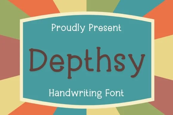
Neat rounded monoline classroom & journal print sans (NOT a serif!)
Depthsy is actually a clean, friendly monoline handwritten print sans (zero typewriter serifs despite seller copy!) built for everyday legibility.
Ideas for this font
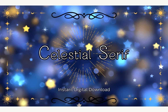
Clean rounded monoline print sans (ZERO serifs despite 'Serif' in the title!)
Heads-up: despite its title, Celestial Serif has ZERO serifs—it is actually a neat, rounded monoline print sans!
Ideas for this font
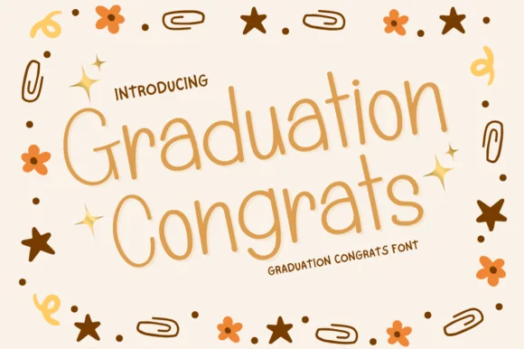
Warm rounded-bowl classroom & card monoline print sans
Graduation Congrats is a friendly, wide-bowled monoline print sans (NOT a slab serif!) crafted for congratulatory cards, banners, and Cricut Pens!
Ideas for this font
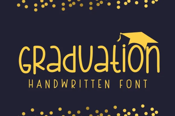
Geometric circular-bowl monoline classroom print sans
Graduation (by Sirinart) is a clean geometric monoline handwritten sans mixing circular lowercase 'a/d/o' bowls into sleek celebratory titles!
Ideas for this font
Same independent foundry
Allow optional Google Analytics to measure visits and catalogue actions. Your search words and notes are not included. Privacy & storage