High-Contrast Display Serif

Baseball Grunge + Wolles Elegant Modern Serif
Pairs sculptural editorial warmth with Baseball Grunge's clean modern geometry.
Inspect Wolles Elegant Modern Serif specimenDisclosure: MakerFileHub may earn a commission from qualifying purchases via paid links on this page. How our links work.
Slanted heavy distressed athletic & racing sans
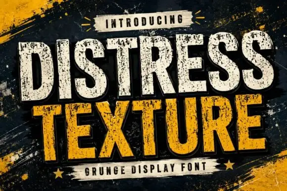
Baseball Grunge (by Dreamspace.studio) is a forward-slanted, heavy athletic sans scarred with gritty chalk-and-asphalt distress streaks.
Paid link
Get this fontProject & layout blueprintsAt-a-glance maker compatibility
Fine grain and micro-texture excel in 300 DPI print, sublimation, and screen print rather than small vinyl weeding.
Visual anatomy & craft review
A slanted heavy athletic sans shown in crimson and white across dark stadium plating: thick oblique capitals lean forward with rough horizontal scuff marks, so the word reads as racing or travel-ball lettering rather than as a clean italic block. The lean and the weight are the character, and the scuffs are cut into the strokes rather than applied as a texture, which keeps them repeatable across a set. Because the cores are solid, the face holds at banner distance. The metal plating behind is staging. Uses are tournament banners, gym signage, team kit and sports-channel graphics where forward motion is the message.
Aggressive-sport · Slanted-grunge · Heavy
Two-font hierarchy recipes
Tested contrast partners — pairing Baseball Grunge with grounded secondary typography.
Baseball Grunge + Wolles Elegant Modern Serif
Pairs sculptural editorial warmth with Baseball Grunge's clean modern geometry.
Inspect Wolles Elegant Modern Serif specimen
Baseball Grunge + Simple Alphabet
Introduces organic movement on pull-quotes, signatures and gift tags.
Inspect Simple Alphabet specimenPractical applications
Concrete hierarchy, scale and production guidance tailored to Baseball Grunge’s stroke geometry.
The forward lean and the scuffed weight read as competition rather than as a school poster, so a tournament banner carries motion at the distance a field sign is actually read, and the solid cores survive a cheap one-colour print.
Hierarchy & layout recipe
A2 banner: the tournament at 100 mm cap height on two lines, the dates in a 22 mm sans, and the venue at 11 mm. Keep 28 mm margins, print one colour on a dark stock, and keep the scuffs above 3 mm.
Pre-production check
Check the banner at five metres, where a scuff can vanish into the ground; keep it above 3 mm. Confirm the 11 mm venue reads at two metres and that the lean does not push the last letter past the margin.
A slanted athletic face gives a batting cage or a gym the authority of a facility sign, and the heavy oblique holds on a fascia read from a car park where a light italic would look like a placeholder.
Hierarchy & layout recipe
Cut a 1200 by 300 mm fascia: the facility at 110 mm cap height, the hours in a 24 mm sans, and two colours on a dark panel. Keep 26 mm margins, keep the strokes above 9 mm and keep a 4 mm contour on the letters.
Pre-production check
Check the cut at 110 mm, where a scuff can tear on weeding; keep it above 9 mm. Confirm the 24 mm hours read at twelve metres and that the letters clear the mounting rails.
A lean forward sans prints as league kit, and the distressed weight gives a new shirt the look of a season already played, which is what a summer league wants for its end-of-season run.
Hierarchy & layout recipe
Print a 250 mm chest graphic: the league at 55 mm cap height, the year at 24 mm, and two inks on a light shirt. Keep the smallest scuff at 4 mm and place the graphic 80 mm below the collar.
Pre-production check
Check the screen at actual mesh, where a 4 mm scuff can fill; enlarge it. Wash-test one shirt and confirm the lean stays even after five cycles and that the two inks do not misregister.
Technical & licence verification
Confirm included OTF/TTF/WOFF formats, full glyph tables and licence coverage on the live store page before batch production.
Closest visual alternatives
Matched across letterform anatomy, stroke behaviour and craft applications.
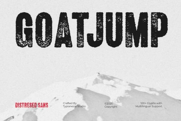
Tall condensed dry-roller & woodblock distressed sans (100+ glyphs, Multilingual)
Goatjump is a commanding, tall condensed distressed sans (100+ glyphs, Multilingual) stamped with vertical woodgrain & dry-roller grit!
Ideas for this font
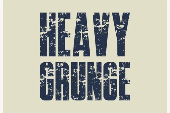
Tall condensed asphalt-scuffed grunge grotesk
Heavy Grunge is a tall, condensed distressed sans-serif font stamped with authentic scratched-asphalt and worn-paint texture.
Ideas for this font
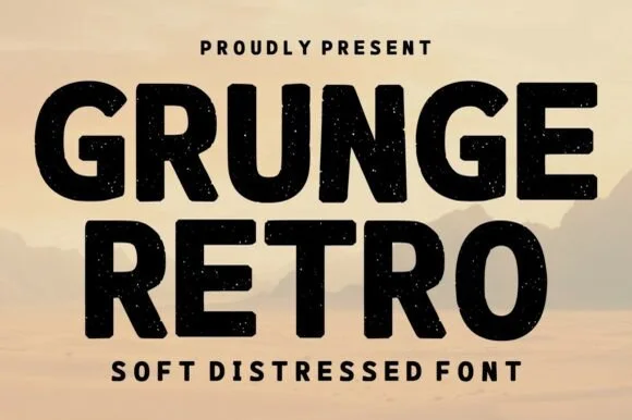
Bold soft-distressed vintage geometric sans display
Grunge Retro is a wide, bold geometric sans display font carrying rounded corners and light, tasteful vintage speckle wear.
Ideas for this font
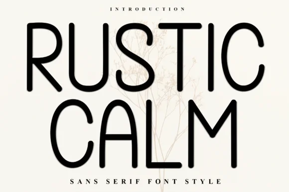
Clean tall rounded monoline geometric sans serif
Rustic Calm is a serene, 100% smooth tall monoline sans serif (zero rustic distressing!) with rounded terminals and wide open bowls.
Ideas for this font
Same independent foundry
Allow optional Google Analytics to measure visits and catalogue actions. Your search words and notes are not included. Privacy & storage