Modern Grotesque Body

Eldercroft + Helina
Creates crisp high-hierarchy contrast beneath Eldercroft headlines across menus, websites and labels.
Inspect Helina specimenDisclosure: MakerFileHub may earn a commission from qualifying purchases via paid links on this page. How our links work.
Clean 1970s open-road flared editorial & craft-beer serif
Eldercroft is a crisp modern-retro flared serif with subtle wedge terminals built for craft-beer cans, outdoor heritage brands, and editorial headers.
Paid link
Get this fontProject & layout blueprintsAt-a-glance maker compatibility
Crisp hairline serifs shine on stationery, foil stamping, and packaging; add slight offset for small decals.
Visual anatomy & craft review
Eldercroft is a modern-retro flared serif with subtle wedge terminals, tall clean capitals and open counters, built for craft-beer cans and editorial headers, so a word reads as a seventies open-road brand rather than a period pastiche. The flare is restrained, which keeps the face legible at 12 pt on a can edge, and the wedge terminals hold in a one-colour print. It needs roughly 24 mm on signage for the flare to read, and it is best in one dark ink on cream or a warm metallic on a deep ground.
Desert-highway · Flared-wedge-serif · Craft-beer
Two-font hierarchy recipes
Tested contrast partners — pairing Eldercroft with grounded secondary typography.
Eldercroft + Helina
Creates crisp high-hierarchy contrast beneath Eldercroft headlines across menus, websites and labels.
Inspect Helina specimen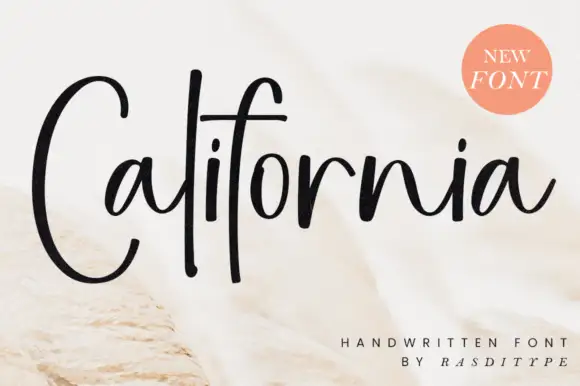
Eldercroft + California
Adds a warm human signature touch for 1-to-3-word callouts without competing against structured serif capitals.
Inspect California specimenPractical applications
Concrete hierarchy, scale and production guidance tailored to Eldercroft’s stroke geometry.
A flared retro serif is the letterform a small brewery puts on a can rather than a modern sans, and it holds a long beer name on a 60 mm can band. The wedge terminals survive a shrink sleeve and a one-colour print, and the flare gives the can a heritage look.
Hierarchy & layout recipe
Can label 60 x 120 mm, name 16 mm, style line 5 pt, 4 mm die margin and 8 mm from the seam. Carton 200 x 150 x 80 mm, word 44 mm on the lid, 25 mm margins. Header 1200 x 300 mm, word 160 mm, 50 mm margins.
Pre-production check
A shrink sleeve wraps the whole can and a word set flat bulges at the shoulder, so the last letter stretches. Map the artwork to the can's own template, and check one sleeved can on the line before the run.
A flared serif with wedge terminals reads as an outdoor heritage title, which is what a travel or craft supplement wants. The tall clean caps hold a long place name at 60 pt, and the restrained flare keeps the page from looking nostalgic.
Hierarchy & layout recipe
Cover 210 x 280 mm, title 60 pt, subtitle 12/16 pt, 20 mm margins and 10 mm trim. Opener 420 x 297 mm, headline 100 mm, body 9.5/14 pt. Section header 210 x 60 mm, word 28 pt, 12 mm margins.
Pre-production check
A 60 pt flare on uncoated stock spreads into the wedge terminals and the title looks bolder than intended. Print on coated stock or reduce to 54 pt, and check one printed page before the run.
Flared retro serif reads as a rural fair bill, which is what an autumn event posts on a lane. The tall caps hold at 260 mm in one ink, and the flare gives the poster a hand-painted sign feel without a distressed texture.
Hierarchy & layout recipe
Poster A2, word 260 mm, dates 22/28 pt, 30 mm margins and 20 mm trim. Sign 900 x 600 mm, word 170 mm, 60 mm margins and 25 mm frame clearance. Label 70 x 95 mm, word 16 mm, 5 mm top arc.
Pre-production check
A lane sign is read against the light and a single dark word on a pale panel glares at midday. Add a tinted ground behind the word, and check one mounted sign at the gate before the fair.
Technical & licence verification
Confirm included OTF/TTF/WOFF formats, full glyph tables and licence coverage on the live store page before batch production.
Closest visual alternatives
Matched across letterform anatomy, stroke behaviour and craft applications.
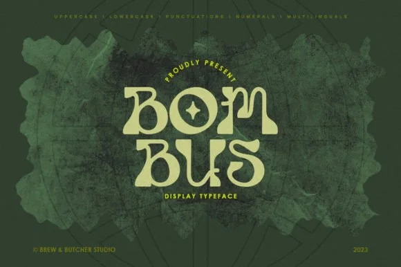
1960s psychedelic Art-Nouveau bell-bottom display serif
Bombus is an organic 1960s psychedelic display serif featuring sinuous Art-Nouveau stems, flared bell-bottom feet, and curled teardrop terminals.
Ideas for this font
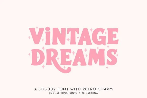
Chubby 1970s Cooper-inspired groovy swash serif
Vintage Dreams is a lovable, chubby 1970s display serif combining soft Cooper-Black curves, sparkle-star 'i' dots, and a swooping 'R' tail!
Ideas for this font
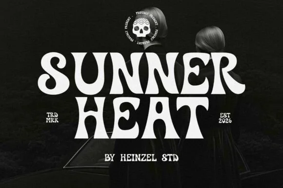
Psychedelic curl display
Sunner Heat is a psychedelic display in cream on a dark photograph: heavy letters whose stems curve into long hooks and loops, a waving baseline and exaggerated swashes on several letters, with a round skull badge above and small tracked notes at the sides, so the plate reads as a seventies rock poster.
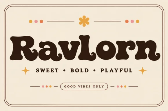
Fat retro serif with psychedelic curls
Ravlorn is a fat retro serif in brown on cream: heavy rounded strokes, ball terminals that curl into the counters, a swash tail on the final n, and an even weight that reads as a 1970s soft serif rather than a sharp display.
Ideas for this font
Same independent foundry
Allow optional Google Analytics to measure visits and catalogue actions. Your search words and notes are not included. Privacy & storage