Modern Grotesque Body

Bombus + Lemon Milk Pro FTR
Creates crisp high-hierarchy contrast beneath Bombus headlines across menus, websites and labels.
Inspect Lemon Milk Pro FTR specimenDisclosure: MakerFileHub may earn a commission from qualifying purchases via paid links on this page. How our links work.
1960s psychedelic Art-Nouveau bell-bottom display serif
Bombus is an organic 1960s psychedelic display serif featuring sinuous Art-Nouveau stems, flared bell-bottom feet, and curled teardrop terminals.
Paid link
Get this fontProject & layout blueprintsAt-a-glance maker compatibility
Sturdy stroke walls and open counters weed cleanly on adhesive vinyl, HTV apparel film, and cut cardstock.
Visual anatomy & craft review
Bombus is a nineteen-sixties psychedelic serif that borrows Art-Nouveau bell-bottom forms: rounded bulbous stems that flare into wide feet, a wavy baseline, small teardrop terminals and a texture that reads as a screen-printed concert poster. The flares widen a word considerably and the teardrops are the finest element. It needs roughly 32 mm for the teardrop and the flare to read, and it is best in two warm inks on cream, or one ink plus paper where the flares read as knockouts on a tinted ground.
Psychedelic · Curvaceous · Vintage-poster
Two-font hierarchy recipes
Tested contrast partners — pairing Bombus with grounded secondary typography.
Bombus + Lemon Milk Pro FTR
Creates crisp high-hierarchy contrast beneath Bombus headlines across menus, websites and labels.
Inspect Lemon Milk Pro FTR specimen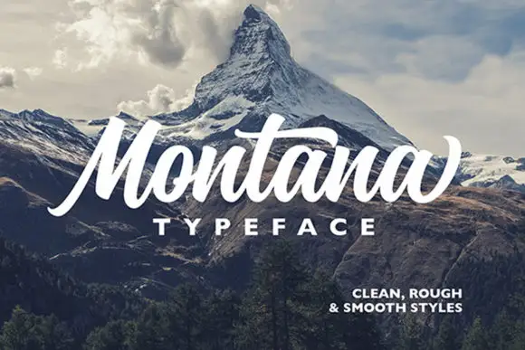
Bombus + Montana
Adds a warm human signature touch for 1-to-3-word callouts without competing against structured serif capitals.
Inspect Montana specimenPractical applications
Concrete hierarchy, scale and production guidance tailored to Bombus’s stroke geometry.
A psychedelic bell-bottom serif reads as a printed sleeve rather than a modern logo. The flares hold at 60 mm on a sleeve, and two warm inks print the sleeve and the cards in one order.
Hierarchy & layout recipe
Sleeve print 300 x 300 mm, word 70 mm with 12 mm flare clearance, 20 mm margins. Card 85 x 55 mm, word 14 mm, 5 mm margins. Bag print 200 x 250 mm, word 50 mm, 15 mm margins.
Pre-production check
On an 85 x 55 mm card the flare touches the next letter and the name reads as one ribbon. Keep the card word at 24 mm, and check one card before the run.
A sixties poster serif turns a music feature into its own concert bill. The teardrops hold at 72 pt on a coated cover, and two warm inks keep the flares from merging against a tinted band.
Hierarchy & layout recipe
Cover 210 x 297 mm, title 72 pt with 12 mm flare clearance, cover lines 10/14 pt over two columns of 82 mm, 18 mm margins and a 12 mm head. Opener 56 pt. Pull quote 40 pt.
Pre-production check
At 40 pt on the pull quote the teardrops fill and the quote reads as a warm block. Keep the face at 52 pt and above, and proof one spread at 1:1.
A screen-printed poster serif reads as a hand-pulled autumn bill rather than a modern flyer. The flares hold at 100 mm on a poster, and two warm inks print the poster and the prize labels in one pass.
Hierarchy & layout recipe
Poster A2, word 100 mm with 12 mm flare clearance, details 34 mm, 20 mm margins. Tent sign 600 x 400 mm, word 90 mm, 25 mm margins. Prize label 90 x 60 mm, word 16 mm, 5 mm margins.
Pre-production check
A 90 x 60 mm prize label at 16 mm fills the teardrop and the word reads as a stain. Raise the label word to 22 mm, and print one label before the batch.
Technical & licence verification
Confirm included OTF/TTF/WOFF formats, full glyph tables and licence coverage on the live store page before batch production.
Closest visual alternatives
Matched across letterform anatomy, stroke behaviour and craft applications.
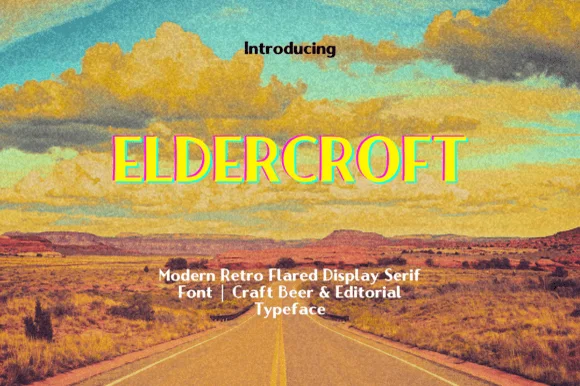
Clean 1970s open-road flared editorial & craft-beer serif
Eldercroft is a crisp modern-retro flared serif with subtle wedge terminals built for craft-beer cans, outdoor heritage brands, and editorial headers.
Ideas for this font
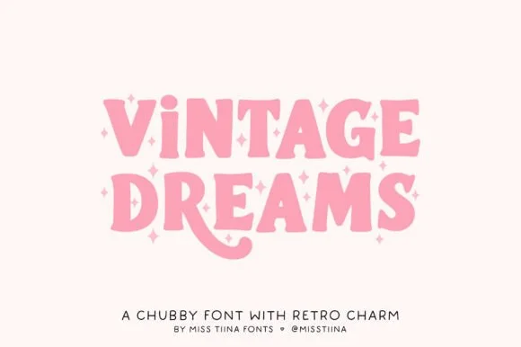
Chubby 1970s Cooper-inspired groovy swash serif
Vintage Dreams is a lovable, chubby 1970s display serif combining soft Cooper-Black curves, sparkle-star 'i' dots, and a swooping 'R' tail!
Ideas for this font
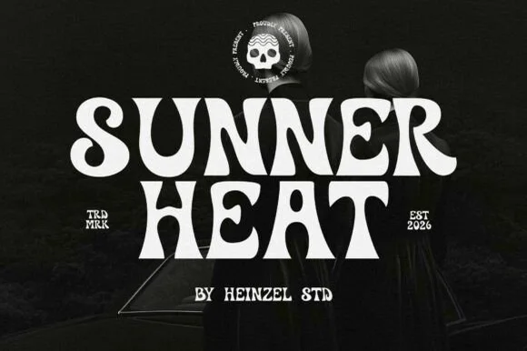
Psychedelic curl display
Sunner Heat is a psychedelic display in cream on a dark photograph: heavy letters whose stems curve into long hooks and loops, a waving baseline and exaggerated swashes on several letters, with a round skull badge above and small tracked notes at the sides, so the plate reads as a seventies rock poster.
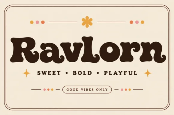
Fat retro serif with psychedelic curls
Ravlorn is a fat retro serif in brown on cream: heavy rounded strokes, ball terminals that curl into the counters, a swash tail on the final n, and an even weight that reads as a 1970s soft serif rather than a sharp display.
Ideas for this font
Allow optional Google Analytics to measure visits and catalogue actions. Your search words and notes are not included. Privacy & storage