Neutral Sans Workhorse

Sloppy Notes + Furion
Lets Sloppy Notes own the focal silhouette while handling secondary copy, sizing and subheads cleanly.
Inspect Furion specimenDisclosure: MakerFileHub may earn a commission from qualifying purchases via paid links on this page. How our links work.
Melty chunky display with fused lowercase
Sloppy Notes is a melty chunky display in cream on red: fat rounded lowercase letters that fuse where they meet, a heavy dark outline and a drooping baseline, with a small line beneath and circled emoticons across the top.
Paid link
Get this fontProject & layout blueprintsAt-a-glance maker compatibility
Sturdy stroke walls and open counters weed cleanly on adhesive vinyl, HTV apparel film, and cut cardstock.
Visual anatomy & craft review
The word is set as one large lowercase block and the face is a chunky display with a melty quality: the strokes are very thick, the letters sag and swell, the counters close into small holes, and the letters fuse where they touch, so the word reads as a single soft mass rather than a row of shapes. That fusion is what gives the face its sloppy, melted look, and it only works at a large size where the joins can be seen. A heavy dark outline holds the block together and separates it from the red ground, and the baseline sags in the middle. Above the block a row of circled doodle faces is drawn in the same dark ink, and two small lines beneath name the face and describe it. The palette is cream, red and a dark brown. Sloppy Notes is a display face for posters, packaging, apparel and social graphics, and it needs a short word at a large size and a plain ground.
Melty, chunky, modern
Two-font hierarchy recipes
Tested contrast partners — pairing Sloppy Notes with grounded secondary typography.
Sloppy Notes + Furion
Lets Sloppy Notes own the focal silhouette while handling secondary copy, sizing and subheads cleanly.
Inspect Furion specimen
Sloppy Notes + Majestic Letters
Grounds bold display lettering with classic typographic authority on posters, badges and apparel.
Inspect Majestic Letters specimenPractical applications
Concrete hierarchy, scale and production guidance tailored to Sloppy Notes’s stroke geometry.
A melty block reads as a poster rather than a page, and the single word at full width makes a cover without an illustration.
Hierarchy & layout recipe
Print a 210 by 297 mm cover: set the title at 120 pt on one line, keep 26 mm of clear ground beneath before the coverlines at 10 pt, and hold 14 mm of margin on all four sides.
Pre-production check
A fused block can lose its letterforms at small sizes; keep the title large and proof one cover.
A heavy melty face reads across a room and looks right in a photograph, and the dark outline survives a busy background.
Hierarchy & layout recipe
Print a 900 by 400 mm banner: set the greeting at 150 pt over one line, keep 32 mm of clear ground beneath before the date at 30 pt, and hold 24 mm of border on all four sides.
Pre-production check
A very heavy face on fabric can bleed the outline; print one section at final size and check the edges.
A loose melty face attracts students to a club about making things, and the heavy shapes are visible on a crowded noticeboard.
Hierarchy & layout recipe
Print an A3 poster at 297 by 420 mm: set the title at 130 pt on one line, keep 30 mm of clear ground beneath before the meeting time at 20 pt, and hold 22 mm of margin on all four sides.
Pre-production check
On a busy board a soft block can disappear; proof one sheet against the board it will hang on.
Technical & licence verification
Confirm included OTF/TTF/WOFF formats, full glyph tables and licence coverage on the live store page before batch production.
Closest visual alternatives
Matched across letterform anatomy, stroke behaviour and craft applications.
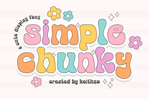
Chunky multicolour sticker display
Simple Chunky is a chunky rounded display in pastel multicolour with a white contour and a soft offset shadow: fat lowercase letters, a bouncing baseline, daisy and sparkle ornaments, and a curved note in a light script at the left, so the plate reads as a sticker sheet.
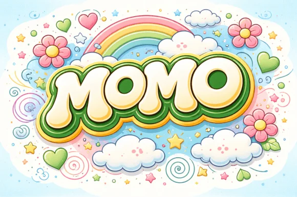
Groovy 60s/70s rainbow-flower-power plump bubble font
Momo is a plush, groovy retro bubble display font built for multi-ringed 1970s rainbow outlines, daisy illustrations, and puff-print apparel.
Ideas for this font
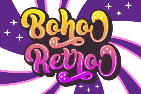
Swirled 1970s psychedelic bubble script-display
Boho Retro is a plump, heavy-looped 1970s groovy display script with curled swash caps and pillowy connected lowercase bowls.
Ideas for this font
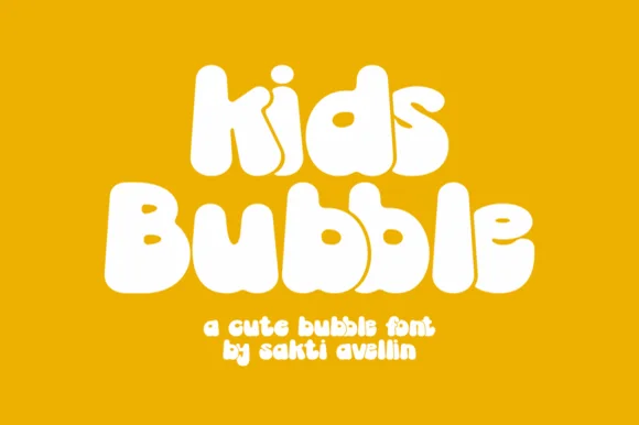
Groovy 70s marshmallow lowercase & mixed-case bubble font
Kids Bubble is a buoyant, ultra-heavy mixed-case bubble font packing 1970s marshmallow warmth into chubby lowercase letters.
Ideas for this font
Same independent foundry
Allow optional Google Analytics to measure visits and catalogue actions. Your search words and notes are not included. Privacy & storage