Editorial Serif Anchor

California + Rosemode
Anchors California's fluid strokes with crisp Roman proportions on wedding suites, headers and packaging.
Inspect Rosemode specimenDisclosure: MakerFileHub may earn a commission from qualifying purchases via paid links on this page. How our links work.
Tall narrow handwriting with an oversized capital C and open joins
California is a tall narrow handwritten face in which the capital C runs twice the height of the small letters, the joins stay open and the strokes lean forward, so a word reads as a place name written in one sweep.
Paid link
Get this fontProject & layout blueprintsAt-a-glance maker compatibility
Weld or Unite overlapping script joins into one continuous vector path before sending to the blade.
Visual anatomy & craft review
The C opens as a huge crescent that starts below the baseline and closes near the cap height, and everything after it stays narrow: the a closes a small bowl, the l rises into a plain stem, the f crosses with a fine bar and the r keeps a short arm. That scale difference is the character — the face is built to set place names and single words rather than sentences, because the capital dominates every line it starts. Weight is an even medium with a slight swell at the turns, and the joins stay open so the letters remain distinct at 30 pt. The folds of fabric behind, the black ink, the coral badge and the two tracked caption lines are presentation; the script is the word.
Oversized · Narrow · Open
Two-font hierarchy recipes
Tested contrast partners — pairing California with grounded secondary typography.
California + Rosemode
Anchors California's fluid strokes with crisp Roman proportions on wedding suites, headers and packaging.
Inspect Rosemode specimen
California + Saltriver Grotesk
Keeps small-scale dates, URLs, nutrition facts and care instructions crisp and legible below script titles.
Inspect Saltriver Grotesk specimenPractical applications
Concrete hierarchy, scale and production guidance tailored to California’s stroke geometry.
The oversized capital gives a place name a poster voice, and the narrow small letters let a long name hold one line at 70 pt.
Hierarchy & layout recipe
Print an A2 poster: set the place name at 70 pt across the middle, set the dates in a 16 pt caps sans beneath, and keep 25 mm of margin so the tall capital stays clear of the trim on the left.
Pre-production check
An oversized capital on a narrow sheet can crowd the margin; check the poster at final size and set the name on two lines rather than condensing.
The single-sweep lettering reads on a bag label at 14 pt, and the leaning joins give an outdoor brand a hand-drawn mark without a script that clots.
Hierarchy & layout recipe
Print a 60 by 80 mm bag label: set the brand at 14 pt, set the origin in a 5 pt caps sans beneath, and keep 6 mm of margin so the tall capital is not cut where the label wraps the bag's fold.
Pre-production check
A label folded on a bag creases the first letter; check the wrap position against the artwork and move the type block off the fold.
The open joins read at 10 cm from a gate, and the oversized capital gives a small rental sign a confident mark seen from the road.
Hierarchy & layout recipe
Print a 500 by 300 mm board: set the house name at 10 cm, set the access details in a 3.5 cm sans below, and leave 7 cm of border so the capital and its entrance stroke stay on the panel.
Pre-production check
Salt air fades painted lettering fast; check the board after a season and keep the strokes wide enough to repaint cleanly.
Technical & licence verification
Confirm included OTF/TTF/WOFF formats, full glyph tables and licence coverage on the live store page before batch production.
Closest visual alternatives
Matched across letterform anatomy, stroke behaviour and craft applications.

Bold slanted script with a curled capital and heavy connected stems
Esmeralda is a bold slanted script in which the capital curls back over itself and the body runs in connected heavy stems with a steady forward lean.
Ideas for this font
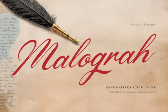
Fine italic script with a broad capital
Malograh is a fine italic script in red on aged paper: a broad capital M with a long entry swash, a light slanted body, and a final h whose exit stroke lifts above the line and curls back.
Ideas for this font
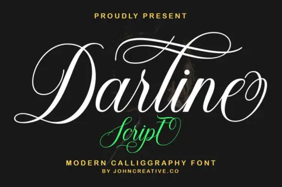
Fine ornate calligraphy with oversized upper loops and heavy shaded stems
Darline Script is fine ornate calligraphy in which every capital opens with an oversized upper loop and the word finishes with a mirrored flourish, drawn with strong contrast between shaded stems and hairline joins.
Ideas for this font

Ornate flourished calligraphy with oversized loops
Handmade Calligraphy is an ornate script whose flourishes leave the letters entirely, curling above and below the line so the two words read as a drawn flourish with letters inside it.
Ideas for this font
Same independent foundry
Allow optional Google Analytics to measure visits and catalogue actions. Your search words and notes are not included. Privacy & storage