Modern Grotesque Body

Marlowe + Hermano
Creates crisp high-hierarchy contrast beneath Marlowe headlines across menus, websites and labels.
Inspect Hermano specimenDisclosure: MakerFileHub may earn a commission from qualifying purchases via paid links on this page. How our links work.
Light irregular small caps serif
Marlowe is a light serif in white on near-black: small capitals with fine even strokes, curved terminals and slightly irregular heights, with an oversized initial M and a lowercase e at the end, and a tracked line beneath naming the style.
Paid link
Get this fontProject & layout blueprintsAt-a-glance maker compatibility
Sturdy stroke walls and open counters weed cleanly on adhesive vinyl, HTV apparel film, and cut cardstock.
Visual anatomy & craft review
The word is set in small capitals with an initial capital and a lowercase e, which is a deliberate mix and the right way to show a face sold as a mono-style serif: the reader can see that the lowercase and the capitals are related but distinct. The drawing is light and slightly irregular, with curved terminals and uneven heights, so the word reads as hand-set rather than as a machine font, and the plate sets it large enough that the irregularities are visible. The near-black ground makes the white read as type on a dark page, which suits the quiet character of the face. The tracked line beneath is set in a plain sans and names the product, and there is nothing else on the sheet, which keeps the letterforms the subject.
Serif, light, irregular, quiet
Two-font hierarchy recipes
Tested contrast partners — pairing Marlowe with grounded secondary typography.
Marlowe + Hermano
Creates crisp high-hierarchy contrast beneath Marlowe headlines across menus, websites and labels.
Inspect Hermano specimen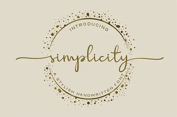
Marlowe + Simplicity
Adds a warm human signature touch for 1-to-3-word callouts without competing against structured serif capitals.
Inspect Simplicity specimenPractical applications
Concrete hierarchy, scale and production guidance tailored to Marlowe’s stroke geometry.
A light irregular serif suits short lines, and the uneven heights keep a poem from looking mechanically set on the page.
Hierarchy & layout recipe
B-format interior: the poems at 11 pt with 17 pt leading, the titles at 18 pt small caps, and 44 characters per line. Print one ink on a cream stock with 20 mm margins.
Pre-production check
Check a full page at 11 pt, where a light serif can look thin; keep the leading at 17 pt. Confirm the titles stay distinct from the text and that the running head reads at 7.5 pt.
A quiet serif reads as a printed edition, and the small caps suit an imprint line on a sticker where a bold face would shout.
Hierarchy & layout recipe
Print a 60 by 40 mm label: the title at 10 pt small caps, the author at 8 pt, and the price at 6 pt. Keep 3 mm inside the die and print one ink on a textured stock.
Pre-production check
Check the 10 pt title on a textured label, where a light serif can break; keep the size at 10 pt or above. Confirm the 6 pt price reads at arm's length and that the label peels cleanly.
A light serif gives a small wedding a quiet invitation, and the small caps keep a long list of details orderly without ornament.
Hierarchy & layout recipe
A5 invitation: the names at 22 pt, the request in a 10 pt serif, and the date at 9 pt small caps. Keep 22 mm margins and letterpress one ink on a heavy cream card.
Pre-production check
Check the 22 pt names in letterpress, where a light stroke can sink; proof the plate first. Confirm the 10 pt request reads at arm's length and that the small caps stay even.
Technical & licence verification
Confirm included OTF/TTF/WOFF formats, full glyph tables and licence coverage on the live store page before batch production.
Closest visual alternatives
Matched across letterform anatomy, stroke behaviour and craft applications.

High-contrast italic editorial serif
The Simple Editorial is a high-contrast italic serif in near-black on white: very fine hairlines, sharp serifs, a strong forward slant and a tall waist, shown in a full specimen with weight and width labels in a small caps grid around the display line.
Ideas for this font
Hand-drawn thin serif caps
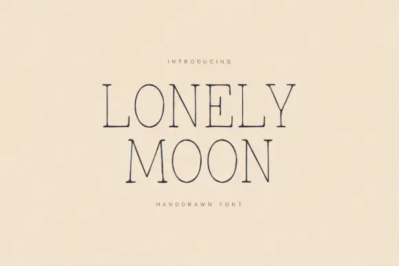
Lonely Moon is a hand-drawn thin serif in navy on cream: tall caps with hairline serifs and slightly wavering stems, wide spacing, a high waist and open counters, set in two lines with a tracked caption beneath in the same thin weight.
Ideas for this font
Fine condensed mixed case with long straight ascenders
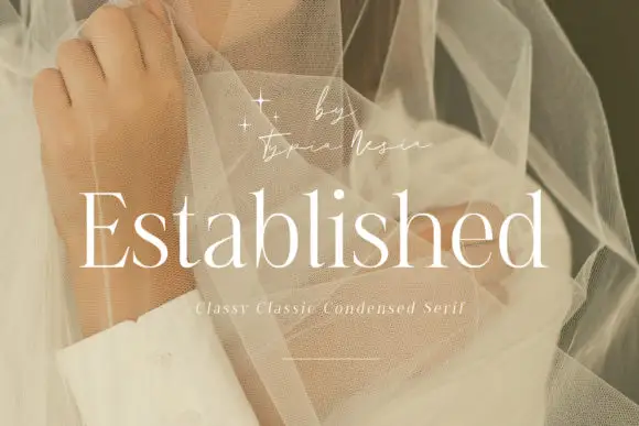
Established shows light white serif letters with narrow rounded bowls and tall upright stems, where the thin horizontal strokes and small serifs keep a long word visually delicate, and the title overlays a pale portrait behind translucent fabric with a small script credit above.
Ideas for this font

Large contrasting mixed case with a very tall capital and a wide open e
Evoire is a high-contrast editorial serif in which one capital rises far above the lowercase, the bowls stay broad and round, the i dot is a large circle and the final e opens wide to the right, so a name reads as a fashion masthead.
Ideas for this font
Same independent foundry
Allow optional Google Analytics to measure visits and catalogue actions. Your search words and notes are not included. Privacy & storage