Editorial Serif Anchor

Cinco De Mayo + Majestic Letters
Anchors Cinco De Mayo's fluid strokes with crisp Roman proportions on wedding suites, headers and packaging.
Inspect Majestic Letters specimenDisclosure: MakerFileHub may earn a commission from qualifying purchases via paid links on this page. How our links work.
Slender airy rounded fine-pen print
Cinco De Mayo (by Juggabee) is a slender, airy rounded monoline handwritten print font suited to everyday greeting cards, notes, and planners.
Paid link
Get this fontProject & layout blueprintsAt-a-glance maker compatibility
Weld or Unite overlapping script joins into one continuous vector path before sending to the blade.
Visual anatomy & craft review
Cinco De Mayo is a slender rounded fine-pen print in which each letter is drawn as a light monoline with soft bullet terminals, wide round bowls and a generous x-height, with no connection between letters. The fine pen keeps it airy at display sizes and honest at small ones, and the rounded terminals are what stop it reading as a typewriter. It needs roughly 22 mm for the pen weight and the terminal to read, and it is best in one bright ink on white, or a single deep colour on cream where the fine line stays clean.
Light · Casual · Planner-neat
Two-font hierarchy recipes
Tested contrast partners — pairing Cinco De Mayo with grounded secondary typography.
Cinco De Mayo + Majestic Letters
Anchors Cinco De Mayo's fluid strokes with crisp Roman proportions on wedding suites, headers and packaging.
Inspect Majestic Letters specimen
Cinco De Mayo + One More
Keeps small-scale dates, URLs, nutrition facts and care instructions crisp and legible below script titles.
Inspect One More specimenPractical applications
Concrete hierarchy, scale and production guidance tailored to Cinco De Mayo’s stroke geometry.
A light rounded print reads as hand-lettered bunting rather than a licensed fiesta graphic, which is what a family birthday wants. The bullet terminals give the wording its handmade edge at 34 mm, and one bright ink prints the invite, the banner and the topper on white stock in a single order.
Hierarchy & layout recipe
Invite A6, word 34 mm with 8 mm terminal clearance, details 8/11 pt, 12 mm margins. Banner flag 200 x 250 mm, word 80 mm, 20 mm margins. Topper 120 x 100 mm, word 38 mm with a 6 mm stick slot and 12 mm clear.
Pre-production check
A 120 mm topper cut from a 0.5 mm monoline leaves a hairline bridge that snaps when the stick goes in. Cut the topper with a 2 mm outline offset or print it on 3 mm board, and test one before the set.
A fine-pen print gives a classroom display a hand-written look that a teacher can match with her own lettering. The light monoline holds at 14 mm on a name card, and one ink prints the display header and the whole class set of cards in a single pass.
Hierarchy & layout recipe
Display 1200 x 400 mm, header 140 mm with 12 mm terminal clearance, 20 mm margins. Name card 105 x 75 mm, name 14 mm, 5 mm margins. Worksheet header 60 mm, word 20 mm, 15 mm margins.
Pre-production check
At 14 mm on a name card the monoline lands near 0.15 mm and a school copier drops segments of the stroke. Print name cards at 18 mm or nudge the weight, and photocopy one sheet at 80 percent before the set.
A light rounded print suits a spring fair because the fine pen reads as chalk on a card rather than signage. The generous bowls hold the fair name at 90 mm on a poster, and one ink prints the poster, the stall cards and the jam labels on the same cream stock.
Hierarchy & layout recipe
Poster A3, word 90 mm with 10 mm terminal clearance, details 28 mm, 18 mm margins. Stall card 105 x 75 mm, word 20 mm, 5 mm margins. Jar label 70 x 45 mm, word 12 mm, 4 mm die margin.
Pre-production check
On a 70 x 45 mm jam label at 12 mm the bullet terminal merges into the bowl and the word reads as a dotted line. Raise the label word to 16 mm, and check one labelled jar in the fridge before the batch.
Technical & licence verification
Confirm included OTF/TTF/WOFF formats, full glyph tables and licence coverage on the live store page before batch production.
Closest visual alternatives
Matched across letterform anatomy, stroke behaviour and craft applications.
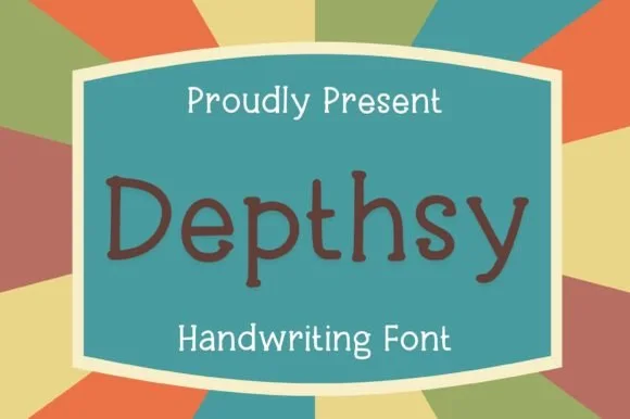
Neat rounded monoline classroom & journal print sans (NOT a serif!)
Depthsy is actually a clean, friendly monoline handwritten print sans (zero typewriter serifs despite seller copy!) built for everyday legibility.
Ideas for this font
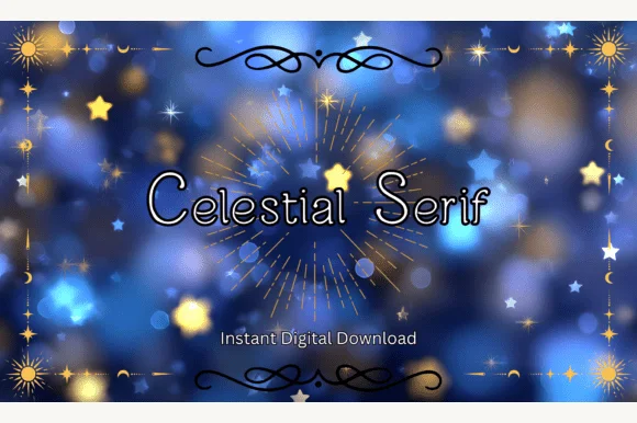
Clean rounded monoline print sans (ZERO serifs despite 'Serif' in the title!)
Heads-up: despite its title, Celestial Serif has ZERO serifs—it is actually a neat, rounded monoline print sans!
Ideas for this font
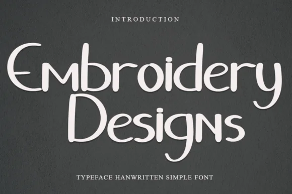
Quirky mixed-case handwritten print with curled descenders
Embroidery Designs is a neat, whimsical handwritten print font pairing clean disconnected bowls with playful curled 'y', 'g', and 's' hooks.
Ideas for this font
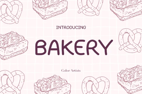
Clean wide-stance casual felt-pen uppercase sans
Bakery (by MyFontsShop) is a clean, wide-stance hand-printed sans serif (disconnected, NOT a cursive script!) with open counters and calm clarity.
Ideas for this font
Allow optional Google Analytics to measure visits and catalogue actions. Your search words and notes are not included. Privacy & storage