Neutral Sans Workhorse

Mexican Moon + Miniplate
Lets Mexican Moon own the focal silhouette while handling secondary copy, sizing and subheads cleanly.
Inspect Miniplate specimenDisclosure: MakerFileHub may earn a commission from qualifying purchases via paid links on this page. How our links work.
Heavy mixed case carrying fine dots, parallel curves and small geometric flower marks
Mexican Moon shows multicoloured lettering inside a busy illustrated border, where narrow pale patterns follow the broad strokes, dots and chains sit inside the M, small star-like flowers appear in the e and parallel curves travel along the counters.
Paid link
Get this fontProject & layout blueprintsAt-a-glance maker compatibility
Sturdy stroke walls and open counters weed cleanly on adhesive vinyl, HTV apparel film, and cut cardstock.
Visual anatomy & craft review
The bodies stay heavy, each letter carries its own pattern, the marks follow the stroke direction and the colour changes from letter to letter. That internal patterning is the character: the word arrives decorated without a separate illustration, which is why the sample sets one title inside a border of cacti and birds. The cultural label is a source identity rather than evidence of authenticity, so confirm which patterns are glyphs, source any surrounding art yourself and keep 40 pt before the fine marks close.
Heavy mixed case carrying fine dots, parallel curves and small geometric flower marks
Two-font hierarchy recipes
Tested contrast partners — pairing Mexican Moon with grounded secondary typography.
Mexican Moon + Miniplate
Lets Mexican Moon own the focal silhouette while handling secondary copy, sizing and subheads cleanly.
Inspect Miniplate specimen
Mexican Moon + Marquis - Elegant Modern Serif
Grounds bold display lettering with classic typographic authority on posters, badges and apparel.
Inspect Marquis - Elegant Modern Serif specimenPractical applications
Concrete hierarchy, scale and production guidance tailored to Mexican Moon’s stroke geometry.
The patterned capitals set a festive banner, and the heavy bodies read at 54 pt across an A3 sheet, where the dots and flowers survive the print size.
Hierarchy & layout recipe
Print an A3 banner: set the title at 54 pt on one row, keep 24 mm of clear ground beneath before the details at 14 pt, and keep 22 mm of margin so the painted border stays outside the type.
Pre-production check
Fine dots printed under 3 mm read as noise; check the proof at final size and hold the title at 46 pt or above.
The multicoloured letters give a fiesta poster energy, and the patterned fills hold a short word at 60 pt on an A2 sheet, where each colour keeps its own motif.
Hierarchy & layout recipe
Print an A2 poster: set the title at 60 pt on one row, keep 28 mm of clear ground beneath before the date at 16 pt, and keep 26 mm of margin so the surrounding illustration does not crowd the letters.
Pre-production check
Five colours on one row need a proof; check the poster and reduce to three inks if the motifs vibrate.
The decorated caps suit a school culture day, and the heavy silhouettes hold a short sign at 46 pt on a printed board, where the patterns read as craft rather than texture.
Hierarchy & layout recipe
Print a 500 by 250 mm board: set the sign at 46 pt on one row, keep 22 mm of clear ground beneath before the times at 14 pt, and keep 22 mm of border all round.
Pre-production check
Patterns painted at 26 mm lose their shape; check the mounted board and keep the sign at 42 pt or above.
Technical & licence verification
Confirm included OTF/TTF/WOFF formats, full glyph tables and licence coverage on the live store page before batch production.
Closest visual alternatives
Matched across letterform anatomy, stroke behaviour and craft applications.
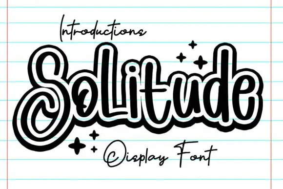
Outlined looping display script
Solitude shows connected upright script forms traced by a thick dark outer contour with a second pale inline inside it, where the S curls into a large lower loop, the tall l and d rise over a compact rounded body and four spark marks sit at the right.
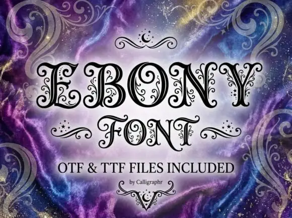
Contrast capitals with curled terminals, fine interior tendrils and small star-like marks
Ebony is an ornate Victorian display face in which every stroke carries a spiral, a dot or a small curl, so a word looks engraved and then hand-decorated on top.
Ideas for this font
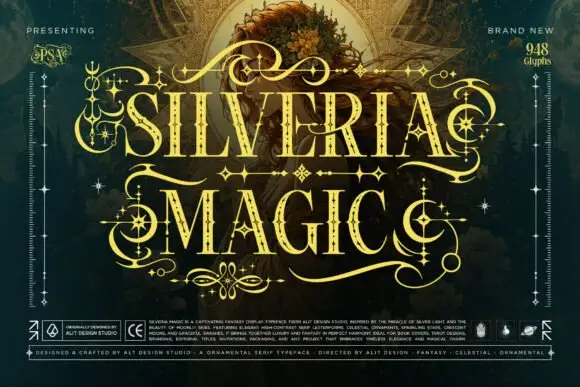
Ornate high-contrast capitals with celestial embellishments
Silveria Magic shows narrow serif capitals in pale gold with fine internal details and sharp contrasting strokes, where long sweeping extensions, crescent curls and star-shaped ornaments frame two rows over a detailed teal fantasy scene and a corner note advertises a glyph count.
Ideas for this font
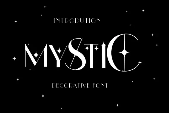
Star-crossed contrast display
Mystic is a high contrast display in white on black: wide capitals crossed by thin extensions that run past the strokes, with four-point stars placed inside and around the letters, set as one word with a small tracked line above and a plain line beneath.
Same independent foundry
Allow optional Google Analytics to measure visits and catalogue actions. Your search words and notes are not included. Privacy & storage