Neutral Sans Workhorse

Noctis + Borsen
Lets Noctis own the focal silhouette while handling secondary copy, sizing and subheads cleanly.
Inspect Borsen specimenDisclosure: MakerFileHub may earn a commission from qualifying purchases via paid links on this page. How our links work.
Intricate Mesoamerican & Aztec calendar stone-carved font (OTF & TTF)
Noctis carves monumental capitals out of intricate Mesoamerican sun-stone discs, feathered-serpent frets, and totem reliefs (OTF & TTF)!
Paid link
Get this fontProject & layout blueprintsAt-a-glance maker compatibility
Sturdy stroke walls and open counters weed cleanly on adhesive vinyl, HTV apparel film, and cut cardstock.
Visual anatomy & craft review
Noctis is a Mesoamerican-inspired stone-carved display: blocky stepped letters with glyph-like bars and dots in the counters, sharp incised cuts along the stems and a heavy even weight that reads as carved relief. The glyph detail is the design and closes first at small sizes, and the stepped silhouette makes a word wide. It needs roughly 34 mm for the incised cut and the glyph to read, and it is best in one dense ink on stone-toned stock, or a single terracotta on cream where the carving prints as a shadow.
Aztec-sun-stone · Totem-engraved · Mesoamerican-art
Two-font hierarchy recipes
Tested contrast partners — pairing Noctis with grounded secondary typography.
Noctis + Borsen
Lets Noctis own the focal silhouette while handling secondary copy, sizing and subheads cleanly.
Inspect Borsen specimen
Noctis + Bulgary
Grounds bold display lettering with classic typographic authority on posters, badges and apparel.
Inspect Bulgary specimenPractical applications
Concrete hierarchy, scale and production guidance tailored to Noctis’s stroke geometry.
A stone-carved display reads as a carved stele rather than a modern headline, which is what a history feature wants at the top. The incised cuts hold at 64 pt on an uncoated page, and the glyph counters supply texture without illustration.
Hierarchy & layout recipe
Opener 210 x 297 mm, title 64 pt with 10 mm cut clearance, standfirst 11/15 pt, body 9/13 pt, 18 mm margins. Pull quote 40 pt. Section rule 180 mm wide.
Pre-production check
At 40 pt on the pull quote the glyph counters fill and the quote reads as a solid block. Keep the face at 52 pt and above, and proof one spread at 1:1.
A carved display gives a cacao brand the look of a stone relief rather than a modern label, which is what a small chocolate maker wants in season. The stepped letters hold at 30 mm on a box, and one terracotta ink prints the box and the label in one order.
Hierarchy & layout recipe
Box print 200 x 200 mm, word 50 mm with 10 mm cut clearance, 20 mm margins. Bottle label 90 x 70 mm, word 20 mm, 5 mm margins. Card 85 x 55 mm, word 14 mm, 5 mm margins.
Pre-production check
A 90 x 70 mm bottle label at 20 mm merges the glyph counters into one block and the name reads as a slab. Raise the label word to 28 mm, and check one label on the bottle.
A carved display suits a summer festival with a heritage theme because the stepped letters read as carved stone at distance. The blocks hold at 140 mm on a poster, and one ink prints the poster and the tote from the same separation.
Hierarchy & layout recipe
Poster A2, word 140 mm with 15 mm cut clearance, details 40 mm, 20 mm margins. Stage banner 3000 x 800 mm, word 260 mm, 60 mm safe edge. Tote print 300 x 300 mm, word 70 mm, 25 mm margins.
Pre-production check
Screen printed on a tote at 70 mm the incised cuts bridge and the glyphs fill into a solid block after a wash. Use the plain cut on fabric, and wash one sample before the order.
Technical & licence verification
Confirm included OTF/TTF/WOFF formats, full glyph tables and licence coverage on the live store page before batch production.
Closest visual alternatives
Matched across letterform anatomy, stroke behaviour and craft applications.
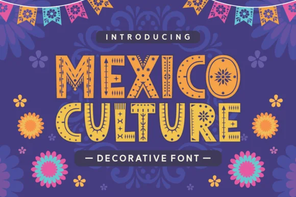
Ornamented cantina display
Mexico Culture is an ornamented display in yellow and orange on purple: bold caps with hand-drawn patterns cut inside each stroke, sun and flower motifs in the bowls, dot and dash ornaments around the letters, with paper bunting above and layered flowers below.
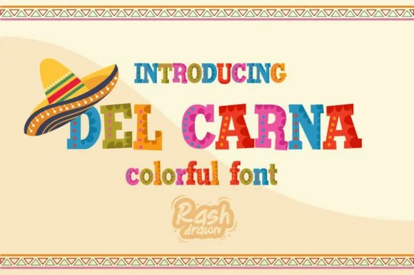
Multi-color textured fiesta & folk-carnival serif display
Del Carna is a festive multi-color fiesta display font combining bouncy flared serif capitals with painted folk-stripe textures.
Ideas for this font
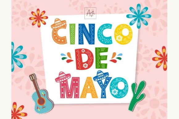
Folk-floral & Otomi-patterned Cinco de Mayo color font
Cinco De Mayo (by Art cafe) is a full-color folk-art display font filling bold block capitals with painted Mexican flowers, sombreros, and stripes.
Ideas for this font
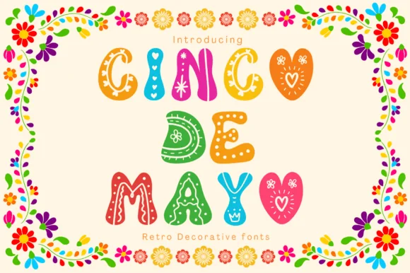
Scallop-and-heart folk-doodle color fiesta bubble font
Cinco De Mayo (by Pui Art) is a sweet, scalloped folk-bubble color font decorated inside each colorful chubby letter with hearts, dots, and zigzags.
Ideas for this font
Same independent foundry
Allow optional Google Analytics to measure visits and catalogue actions. Your search words and notes are not included. Privacy & storage