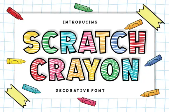
Neutral Sans Workhorse

Mexican Vibes + Modern Limited
Lets Mexican Vibes own the focal silhouette while handling secondary copy, sizing and subheads cleanly.
Inspect Modern Limited specimenDisclosure: MakerFileHub may earn a commission from qualifying purchases via paid links on this page. How our links work.
Broad block capitals filled with thin geometric tracks, diamonds and floral marks
Mexican Vibes fills wide block capitals with pale folk patterns, so MEXICAN and VIBES read as two rows of woven textile rather than as lettering painted with a brush.
Paid link
Get this fontProject & layout blueprintsAt-a-glance maker compatibility
Sturdy stroke walls and open counters weed cleanly on adhesive vinyl, HTV apparel film, and cut cardstock.
Visual anatomy & craft review
Each letter is a broad slab with a hairline inner outline, and inside that outline sits a different motif: zigzag tracks, stepped diamonds, rows of dots, small birds, crosses and flower heads picked out in cream against teal, green, orange, pink and red. The two rows alternate colours letter by letter, so the word becomes a stripe of the same textile repeated. Around the type, a border of sombreros, maracas, a guitar, chillies, crowned hearts and a cactus carries the folk style without touching the letterforms. The pattern is fine, so the capitals need size to keep the motifs from merging into a blur.
Broad block capitals filled with thin geometric tracks, diamonds and floral marks
Two-font hierarchy recipes
Tested contrast partners — pairing Mexican Vibes with grounded secondary typography.
Mexican Vibes + Modern Limited
Lets Mexican Vibes own the focal silhouette while handling secondary copy, sizing and subheads cleanly.
Inspect Modern Limited specimen
Mexican Vibes + Wolles Elegant Modern Serif
Grounds bold display lettering with classic typographic authority on posters, badges and apparel.
Inspect Wolles Elegant Modern Serif specimenPractical applications
Concrete hierarchy, scale and production guidance tailored to Mexican Vibes’s stroke geometry.
The patterned blocks give a food night a hand-printed poster look, and two short rows carry the whole message at wall distance.
Hierarchy & layout recipe
Print an A2 poster: set the two rows at 110 pt with 32 mm between baselines, keep 28 mm of clear ground beneath before the times at 18 pt, and keep 26 mm of border so no motif is cut by the trim.
Pre-production check
Inner patterns clog under 40 pt; check the proof and keep the heading at 60 pt or above on paper.
The folk motifs set a birthday apart from the usual balloon palette, and the slab weight keeps the name of the guest of honour readable across a garden.
Hierarchy & layout recipe
Print a 500 by 700 mm board: set the name at 90 pt on one row, keep 26 mm of clear ground beneath before the age at 24 pt, and keep 30 mm of border all round so the pattern tiles stay whole.
Pre-production check
Colour changes letter by letter; check the separations before a two-colour print of the board.
The woven fill carries a regional claim without a photograph, and one short word holds the pattern at small jar-label size.
Hierarchy & layout recipe
Print a 60 by 90 mm jar label: set the brand at 22 pt on one row, keep 9 mm of clear ground beneath before the heat level at 6 pt, and keep 6 mm from the lettering to the label edge.
Pre-production check
Motif detail disappears at 22 pt; check the printed label before planning a range of flavours.
Technical & licence verification
Confirm included OTF/TTF/WOFF formats, full glyph tables and licence coverage on the live store page before batch production.
Closest visual alternatives
Matched across letterform anatomy, stroke behaviour and craft applications.
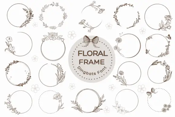
Fine circular frames with off-centre flowers, foliage and butterflies
Floral Frame is a dingbat set of wreath frames: open circles with line-drawn flowers, leaves and grasses growing around the edge, some closed with a bow and some left as a dotted ring.
Ideas for this font
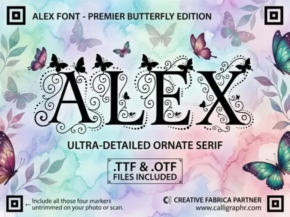
Contrast serif capitals surrounded by butterflies, dotted trails and curling tendrils
Alex is an ultra-ornate serif in capitals where every stem grows a curl, the counters fill with dotted spirals, and the whole word spreads into flourishes that reach into the margin.
Ideas for this font
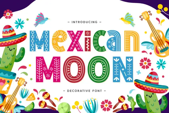
Heavy mixed case carrying fine dots, parallel curves and small geometric flower marks
Mexican Moon shows multicoloured lettering inside a busy illustrated border, where narrow pale patterns follow the broad strokes, dots and chains sit inside the M, small star-like flowers appear in the e and parallel curves travel along the counters.
Ideas for this font
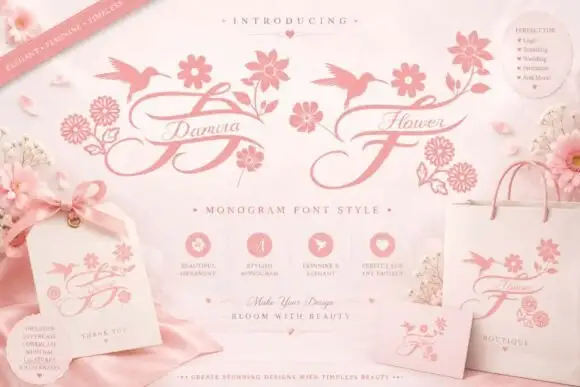
Floral bird-accented monograms
Damira Flower Monogram displays large swashed D and F forms surrounded by flowers and small birds, and the same ornamental treatment appears on a tag, a small card and a boutique bag across the cover.
Ideas for this font
Same independent foundry
Allow optional Google Analytics to measure visits and catalogue actions. Your search words and notes are not included. Privacy & storage