Neutral Sans Workhorse

Fiesta Circuit + Bareum
Lets Fiesta Circuit own the focal silhouette while handling secondary copy, sizing and subheads cleanly.
Inspect Bareum specimenDisclosure: MakerFileHub may earn a commission from qualifying purchases via paid links on this page. How our links work.
Rounded bold letters containing dots, chevrons and short circuit-like marks
Fiesta Circuit draws fat rounded capitals, fills every one with a different bright colour and then doodles circuit tracks, node dots, stars and coiled loops across the interior in white.
Paid link
Get this fontProject & layout blueprintsAt-a-glance maker compatibility
Sturdy stroke walls and open counters weed cleanly on adhesive vinyl, HTV apparel film, and cut cardstock.
Visual anatomy & craft review
Fiesta over circuit runs on a black ground spattered with paint, the letters crowding each other and tilting a few degrees so the words bounce. Each glyph carries its own set of doodle marks, some with crosses and zigzags, some with a running node line, one holding a coiled spring shape, and the white marks sit inside a thick white outline. A panel at the top calls it a playful tech display font and a round badge adds a second mood label, while the foot of the cover lists uppercase, lowercase, numbers and symbols with the actual characters. It is a colour font with a busy interior, so the word reads as a bright shape at a distance and as doodles up close.
Rounded bold letters containing dots, chevrons and short circuit-like marks
Two-font hierarchy recipes
Tested contrast partners — pairing Fiesta Circuit with grounded secondary typography.
Fiesta Circuit + Bareum
Lets Fiesta Circuit own the focal silhouette while handling secondary copy, sizing and subheads cleanly.
Inspect Bareum specimen
Fiesta Circuit + Auretha
Grounds bold display lettering with classic typographic authority on posters, badges and apparel.
Inspect Auretha specimenPractical applications
Concrete hierarchy, scale and production guidance tailored to Fiesta Circuit’s stroke geometry.
The bright fills and doodled interiors carry a lights-and-music theme without a single illustration, and the fat shapes stay friendly for a teenager's card.
Hierarchy & layout recipe
Print a 105 by 148 mm invitation: set the party name at 40 pt across two rows, keep 14 mm of clear ground beneath before the time at 10 pt, and keep 12 mm of margin so the tilt stays inside the card.
Pre-production check
The white interior marks close below 20 pt; check the printed card and keep the name at 28 pt or above.
The circuit doodles speak to a coding class, and the chunky letters still read on a workbook cover handled by young children.
Hierarchy & layout recipe
Print an A4 workbook cover: set the club title at 48 pt across two rows, keep 18 mm of clear ground beneath before the term line at 12 pt, and keep 16 mm of margin from the trim edge.
Pre-production check
Seven colours ship in the file; check the separations before planning a two-colour school print.
The playful tech character suits merchandise a studio hands out at a fair, and the heavy outline survives a die cut at small sticker size.
Hierarchy & layout recipe
Print a 50 mm round sticker: set the studio name at 14 pt on one row, keep 5 mm of clear ground beneath before the handle at 5 pt, and keep 4 mm from the lettering to the circle edge.
Pre-production check
Fine doodles clog on a small die cut; check the printed sticker proof before ordering a batch.
Technical & licence verification
Confirm included OTF/TTF/WOFF formats, full glyph tables and licence coverage on the live store page before batch production.
Closest visual alternatives
Matched across letterform anatomy, stroke behaviour and craft applications.
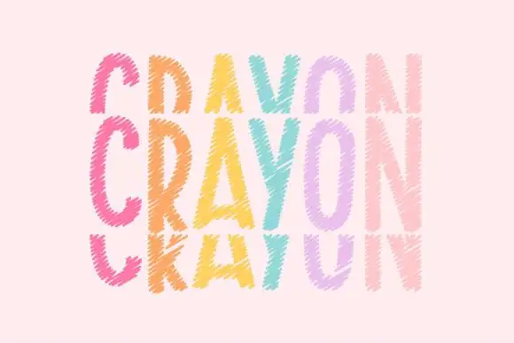
Tall crayon-textured capitals repeated in cropped upper and lower rows
Crayonfriends Stacked repeats the same tall word in three pastel rows on pale pink, where the middle row is complete while the rows above and below are cut by broad horizontal blank bands, and scratchy diagonal marks break both the coloured strokes and their edges.
Ideas for this font
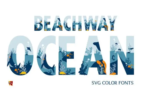
Block capitals containing layered blue underwater scenes
Beachway Ocean is a color font in which the letters are windows into a reef: each cap is filled with a painted underwater scene of fish, kelp, coral and light, with the surface of the water across the top of the shape.
Ideas for this font
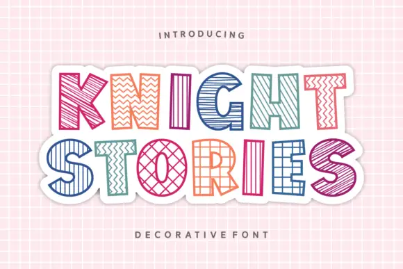
Outlined block capitals filled with varied stripes, zigzags, grids and crosshatching
Knight Stories places two colourful uppercase rows on a white sticker-like shape over a pink grid, where the broad outlined letters contain different linear patterns, from diagonals and zigzags to grids and crosshatching, one pattern per glyph.
Ideas for this font
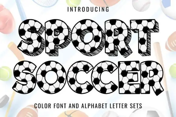
Soccer-panel display
Sport Soccer is a colour display on a pale sporting ground: capitals filled with soccer-ball panels in black and white, with hatched dark offset sides giving a shallow depth, set in two lines beneath a small introducing line, with a plain descriptor along the foot.
Ideas for this font
Same independent foundry
Allow optional Google Analytics to measure visits and catalogue actions. Your search words and notes are not included. Privacy & storage



