Editorial Serif Anchor

Fresh Lime + Kernova
Anchors Fresh Lime's fluid strokes with crisp Roman proportions on wedding suites, headers and packaging.
Inspect Kernova specimenDisclosure: MakerFileHub may earn a commission from qualifying purchases via paid links on this page. How our links work.
Tall rounded unconnected handmade display with open arches
Fresh Lime is tall rounded handmade lettering in which the letters stand separately, the arches open wide and the stroke stays even, so a two-word phrase reads as a bright sign-written label.
Paid link
Get this fontProject & layout blueprintsAt-a-glance maker compatibility
Weld or Unite overlapping script joins into one continuous vector path before sending to the blade.
Visual anatomy & craft review
The capital F rises as a tall stem with two short arms, and the letters after it keep that height: the r holds a small arm, the e closes a loose bowl, the s reverses through two even curves, the h keeps a wide open shoulder and the m holds three tall arches. Nothing connects and nothing slants, the weight is a consistent medium with rounded ends, and the narrow letterfit means the words stack closely without touching. Because the arches stay open, the face reads at 16 pt on a jar label and at 90 mm on a banner without losing its shape. There is an outlined version shown beside the solid in the sample, which is how the family is meant to be used in two colours. The pink oval, the blue dotted frame, the lemons and the small yellow badge are presentation; the lettering is the two words.
Tall · Rounded · Separate
Two-font hierarchy recipes
Tested contrast partners — pairing Fresh Lime with grounded secondary typography.
Fresh Lime + Kernova
Anchors Fresh Lime's fluid strokes with crisp Roman proportions on wedding suites, headers and packaging.
Inspect Kernova specimen
Fresh Lime + Bargain Condensed
Keeps small-scale dates, URLs, nutrition facts and care instructions crisp and legible below script titles.
Inspect Bargain Condensed specimenPractical applications
Concrete hierarchy, scale and production guidance tailored to Fresh Lime’s stroke geometry.
The tall open letters read on a curved bottle label where a compact face would squeeze, and the solid and outline versions let a label carry two colours from one family.
Hierarchy & layout recipe
Set the brand at 13 pt on a 55 by 85 mm bottle label, keep the flavour in a 6 pt sans, and leave 7 mm at the sides so the tall stems are not cut by the curve.
Pre-production check
A curved label compresses the outer stems; print one label on the actual bottle and widen the side margins rather than shrinking the type.
The tall open lettering reads across a lawn in daylight, and the separate letters stay legible against planting where a script would disappear.
Hierarchy & layout recipe
Set the greeting at 12 cm on a 600 by 400 mm board, set both names in the same face at 7 cm beneath it, and leave 10 cm of margin so the tallest stems stay on the board.
Pre-production check
Open arches can read as broken letters at distance; check the sign from three metres and close the arches slightly if they stop reading as letterforms.
The bright rounded weight holds at 12 pt on a round sticker, and the outlined version lets the stall add a second colour without a second file.
Hierarchy & layout recipe
Set the stall name at 12 pt on a 50 mm round sticker, keep the market and day in a 5 pt sans, and leave 5 mm inside the die so the stems are not clipped.
Pre-production check
An outlined version printed small closes its counters; check the sticker at final size and use the solid for anything under 14 pt.
Technical & licence verification
Confirm included OTF/TTF/WOFF formats, full glyph tables and licence coverage on the live store page before batch production.
Closest visual alternatives
Matched across letterform anatomy, stroke behaviour and craft applications.
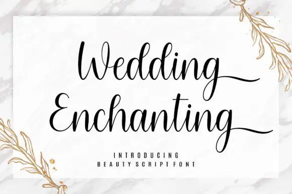
Fine wedding script with flourishes
Wedding Enchanting is a fine script in near-black on a marble and gold ground: a thin connected stroke, tall looping ascenders, long flourishes that run under the second word, and open bowls, set in two lines with a tracked caption beneath and botanical sprigs in gold at the corners.
Ideas for this font

Very slanted calligraphy with broad lower sweeps and fine hairlines
Silken Luxe is a formal calligraphy script with a steep slant, broad lower sweeps and hairlines that thin almost to nothing, drawn so two words build an ornamental diagonal across the plate.
Ideas for this font

Fine slanted calligraphy with a wide open S and long low descenders
Stylish is a fine slanted calligraphy in which the S opens very wide, the l and h lift tall loops, the connectors run thin and the y drops a long low stroke, so a short phrase reads as modern pointed-pen writing.
Ideas for this font
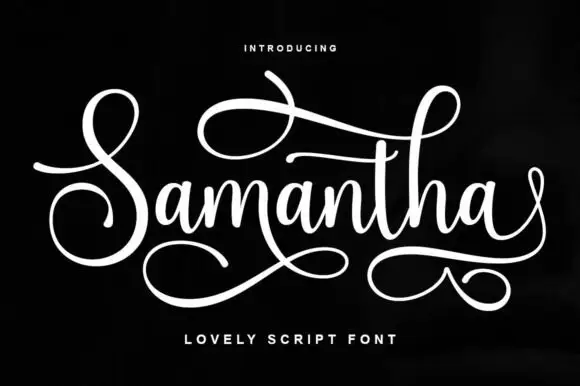
Flourished script with a long underline
Samantha is a flourished script in white on black: a tall looping capital S, a narrow connecting body and two long swashes, one crossing above the word and one curling beneath it.
Ideas for this font
Same independent foundry
Allow optional Google Analytics to measure visits and catalogue actions. Your search words and notes are not included. Privacy & storage