Neutral Sans Workhorse

Mocka + Bareum
Lets Mocka own the focal silhouette while handling secondary copy, sizing and subheads cleanly.
Inspect Bareum specimenDisclosure: MakerFileHub may earn a commission from qualifying purchases via paid links on this page. How our links work.
Geometric retro display
Mocka is a high-contrast geometric retro display in cream on tan: wide letters built from thin arcs and heavy wedges, oversized oval counters, a cut-out bowl on the k and a detached crossbar, set as one word with yellow sparkles, four-petal flowers at the corners and a small retro subtitle beneath.
Paid link
Get this fontProject & layout blueprintsAt-a-glance maker compatibility
Sturdy stroke walls and open counters weed cleanly on adhesive vinyl, HTV apparel film, and cut cardstock.
Visual anatomy & craft review
The word spans the plate and the drawing is a geometric retro display: the arcs are thin, the wedges are heavy, and the counters are oversized ovals, which makes each letter read as a shape rather than as a stroke. The detached crossbar and the cut-out bowl are the details that give the face its period character, and the specimen keeps the ground flat so the letterforms carry the sheet. The yellow sparkles and the four-petal flowers are period furniture placed at the corners and between the letters, and the subtitle beneath is set in a small retro face, which is a second voice rather than part of the same family. Because the counters are large, the face needs a reasonable size, and the tan ground keeps the cream from glaring.
Decorative, retro, geometric, playful
Two-font hierarchy recipes
Tested contrast partners — pairing Mocka with grounded secondary typography.
Mocka + Bareum
Lets Mocka own the focal silhouette while handling secondary copy, sizing and subheads cleanly.
Inspect Bareum specimen
Mocka + Askinо
Grounds bold display lettering with classic typographic authority on posters, badges and apparel.
Inspect Askinо specimenPractical applications
Concrete hierarchy, scale and production guidance tailored to Mocka’s stroke geometry.
A geometric retro display reads as a period packet, and the oversized counters stay open on a small label where a busy retro face would clot.
Hierarchy & layout recipe
Print a 70 by 50 mm label: the brand at 15 pt, the product at 7 pt, and a 1 mm rule under the brand. Keep 4 mm inside the die and print two colours on a tan stock.
Pre-production check
Check the 15 pt brand on a small label, where a thin arc can break; keep it above 0.3 mm. Confirm the 7 pt product reads at arm's length and that the label sits flat.
A geometric retro face gives a period subject its own voice, and the flat ground keeps a cover from looking like a pastiche.
Hierarchy & layout recipe
Set the title at 80 mm cap height across 195 mm, the subtitle in a 12 pt retro face, and the author at 9 pt. Print two colours on a cream stock and keep the flowers at the corners.
Pre-production check
Check the title at thumbnail size, where thin arcs can disappear; keep them above 0.4 mm. Confirm the 9 pt author survives lamination and that the flowers clear the trim.
A geometric retro face sets a decade theme in one word, and the flat shapes print cleanly in two colours at a small run.
Hierarchy & layout recipe
A3 poster: the occasion at 70 mm cap height, the date in a 20 mm retro face, and the address at 9 mm. Keep 25 mm margins and print two colours on a coloured stock.
Pre-production check
Check the poster at four metres, where the oversized counters can look empty; keep the sparkles as accents. Confirm the 9 mm address reads at arm's length and that the title fits.
Technical & licence verification
Confirm included OTF/TTF/WOFF formats, full glyph tables and licence coverage on the live store page before batch production.
Closest visual alternatives
Matched across letterform anatomy, stroke behaviour and craft applications.
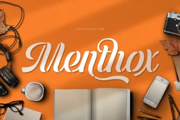
Broken-stroke stencil script
Menthox is a broken-stroke script in cream on orange: each letter is drawn as a continuous ribbon with the joins cut away, so the word reads as a stencil or a paper cut.
Ideas for this font
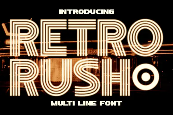
Geometric capitals built from parallel lines with a rounded inner counter
Retro Rush is a geometric capital alphabet in which every stroke is drawn as several parallel lines, so a word reads as a neon tube sign or a striped poster from the late seventies.
Ideas for this font
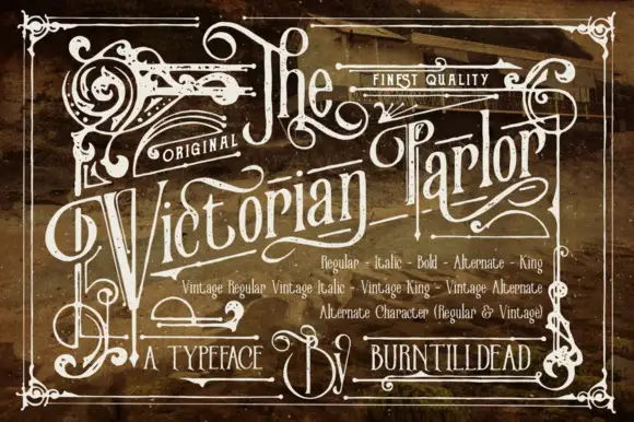
Victorian ornamental lettering
Victorian Parlor is a dense Victorian display in white on a sepia engraved ground: letters built from thin inner lines, curls and spurs, with swashes on the capitals, an inline running the length of each stroke and a frame of scrollwork around the whole plate.
Ideas for this font
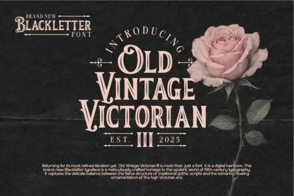
Narrow ornamental inline serifs
Old Vintage Victorian III is a narrow ornamental display serif in cream on near-black: condensed capitals with hooked serifs, a fine white inline through every stem, and small drawn fleurons above and below the block.
Ideas for this font
Same independent foundry
Allow optional Google Analytics to measure visits and catalogue actions. Your search words and notes are not included. Privacy & storage