Neutral Sans Workhorse

Old Vintage Victorian Iii + One More
Lets Old Vintage Victorian Iii own the focal silhouette while handling secondary copy, sizing and subheads cleanly.
Inspect One More specimenDisclosure: MakerFileHub may earn a commission from qualifying purchases via paid links on this page. How our links work.
Narrow ornamental inline serifs
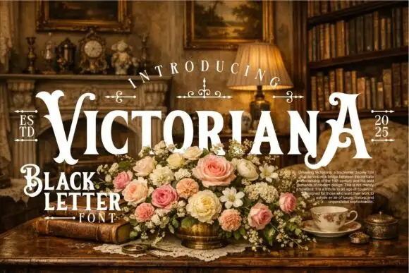
Old Vintage Victorian III is a narrow ornamental display serif in cream on near-black: condensed capitals with hooked serifs, a fine white inline through every stem, and small drawn fleurons above and below the block.
Paid link
Get this fontProject & layout blueprintsAt-a-glance maker compatibility
Sturdy stroke walls and open counters weed cleanly on adhesive vinyl, HTV apparel film, and cut cardstock.
Visual anatomy & craft review
The three words are stacked and each is set in the same capital face, and the face is a Victorian display: the O and the V carry hooked terminals, the E has a curled middle bar, the T is narrow with a wide bar and the N closes with a spur, while a fine inline runs through each heavy stem so the letters read as engraved plate rather than solid block. The proportions are condensed, the spacing is tight and the capitals fill the measure, which is what gives a short list of words the density of a vintage poster. Drawn fleurons separate the lines, a small pointed rule sits beneath the block, and a paragraph of tiny justified text fills the foot of the sheet like a specimen caption. The face is a decorative serif for posters, labels and packaging with a period voice, and it needs a large size for the inline to read.
A Victorian display face with white inline
Two-font hierarchy recipes
Tested contrast partners — pairing Old Vintage Victorian Iii with grounded secondary typography.
Old Vintage Victorian Iii + One More
Lets Old Vintage Victorian Iii own the focal silhouette while handling secondary copy, sizing and subheads cleanly.
Inspect One More specimen
Old Vintage Victorian Iii + Raffined
Grounds bold display lettering with classic typographic authority on posters, badges and apparel.
Inspect Raffined specimenPractical applications
Concrete hierarchy, scale and production guidance tailored to Old Vintage Victorian Iii’s stroke geometry.
A Victorian display face gives a themed wedding an identity in one line, and the inline reads as a printed plate rather than a modern poster.
Hierarchy & layout recipe
Print a 600 by 400 mm board: set the greeting at 90 pt over two lines, keep 24 mm of clear ground beneath before the names at 24 pt, and hold 22 mm of border on all four sides.
Pre-production check
Thin inlines disappear when a board is printed at distance; print one at the final size and check the line weight before the set.
A condensed Victorian capital sets a period tone, and the inline gives a dark cover a texture that a flat face cannot produce.
Hierarchy & layout recipe
Print a 230 by 300 mm cover: set the cover word at 90 pt over two lines, keep 26 mm of clear ground beneath before the cover lines at 11 pt, and hold 22 mm of margin on all four sides.
Pre-production check
Hooked serifs fill on newsprint; print one cover on the intended stock and check the terminals before the run.
The face reads as an old chemist's label, and the condensed capitals fit a long product name inside the narrow die of a bottle label.
Hierarchy & layout recipe
Print a 55 by 85 mm label: set the product at 14 pt over two lines, keep 6 mm of clear ground beneath before the weight at 5 pt, and hold 4 mm of margin on all four sides.
Pre-production check
An inline at fourteen points can close into a solid stem; print one on the real stock and check the counters before the order.
Technical & licence verification
Confirm included OTF/TTF/WOFF formats, full glyph tables and licence coverage on the live store page before batch production.
Closest visual alternatives
Matched across letterform anatomy, stroke behaviour and craft applications.
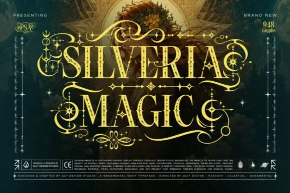
Ornate high-contrast capitals with celestial embellishments
Silveria Magic shows narrow serif capitals in pale gold with fine internal details and sharp contrasting strokes, where long sweeping extensions, crescent curls and star-shaped ornaments frame two rows over a detailed teal fantasy scene and a corner note advertises a glyph count.
Ideas for this font
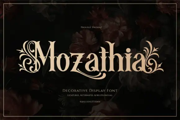
High-contrast serif with botanical flourishes
Mozathia is a high-contrast serif display in cream over a dark floral still life: mixed case with curling botanical flourishes that spring from the first and last letters, fine joins, a swollen stroke through the middle and short serifs, set as one word with a line above and two lines beneath.
Ideas for this font
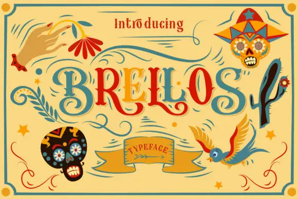
Curving serif capitals with inset accents and long low curls
Brellos is a hand-drawn folk display face with swash capitals in teal and red, a woven banner label and a set of sugar-skull and bird extras drawn in the style of Mexican paper craft.
Ideas for this font
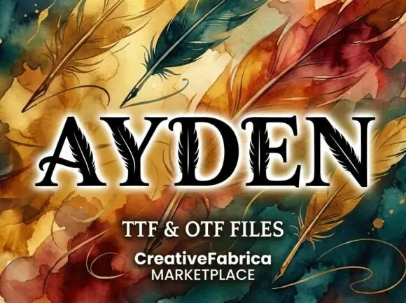
High-contrast serif capitals with thin feather-like cuts running through selected broad strokes
Ayden shows black serif capitals with pale feather-like lines inside their stems and diagonals, where a central quill-like line branches into short fine marks that appear in the broad strokes, and painted feathers, swirls and a pale glow fill the presentation around the letters.
Ideas for this font
Same independent foundry
Allow optional Google Analytics to measure visits and catalogue actions. Your search words and notes are not included. Privacy & storage