Editorial Serif Anchor

Summer Hipster + Worldstar
Anchors Summer Hipster's fluid strokes with crisp Roman proportions on wedding suites, headers and packaging.
Inspect Worldstar specimenDisclosure: MakerFileHub may earn a commission from qualifying purchases via paid links on this page. How our links work.
Bold marker script with double outline
Summer Hipster is a bold marker script in navy with a heavy white double outline: fat connected strokes, a long looping flourish under the first word and a second word that spills below the baseline.
Paid link
Get this fontProject & layout blueprintsAt-a-glance maker compatibility
Weld or Unite overlapping script joins into one continuous vector path before sending to the blade.
Visual anatomy & craft review
The phrase is stacked and set large, and the face is a fat marker script rather than a calligraphy: the S opens with a hook, the u and the m are wide, the r folds into a small hook and the whole first word ends in a flourish that loops under itself and back up into the second word. The second word is set at a slight angle and spills below, which is what makes the block read as hand-lettered signage rather than a font sheet, and the heavy white outline around the navy lettering is what lets it sit on a busy background. A third small caption at the bottom repeats the word in the same script at a fraction of the size. The specimen is drawn over an illustrated tropical beach at sunset, so the face reads as a holiday graphic. Summer Hipster is a display script for posters, apparel and event graphics, and it needs short words and plenty of space.
A fat marker script built for a poster
Two-font hierarchy recipes
Tested contrast partners — pairing Summer Hipster with grounded secondary typography.
Summer Hipster + Worldstar
Anchors Summer Hipster's fluid strokes with crisp Roman proportions on wedding suites, headers and packaging.
Inspect Worldstar specimen
Summer Hipster + Furion
Keeps small-scale dates, URLs, nutrition facts and care instructions crisp and legible below script titles.
Inspect Furion specimenPractical applications
Concrete hierarchy, scale and production guidance tailored to Summer Hipster’s stroke geometry.
A fat marker script with a flourish is a poster in itself, and the heavy outline holds the lettering over an illustration or a photograph without a panel behind it.
Hierarchy & layout recipe
Print an A2 poster: set the title at 120 pt over two lines, keep 26 mm of clear ground beneath before the details at 16 pt, and hold 20 mm of margin on all four sides.
Pre-production check
The white outline disappears if the background is pale; print one proof at the final size and check the edge contrast before the run.
A bold marker script signals a seasonal supplement from across a newsstand, and the outline lets the title sit over a photograph without a box.
Hierarchy & layout recipe
Print a 230 by 300 mm cover: set the cover word at 90 pt, keep 24 mm of clear ground beneath before the cover lines at 11 pt, and hold 20 mm of margin on all sides.
Pre-production check
Heavy outlines on uncoated stock spread; print one cover on the intended paper and check the letter edges before the run.
A marker script cut from vinyl reads at street distance, and the fat strokes survive a plotter cut where a fine script would tear.
Hierarchy & layout recipe
Print a 500 by 300 mm graphic: set the shop name at 100 pt on one line, keep 20 mm of bridge between letters, and leave 5 mm around the outline for the cutting path.
Pre-production check
Thin bridges break when the vinyl is stretched during application; print one test cut and check every join before the full run.
Technical & licence verification
Confirm included OTF/TTF/WOFF formats, full glyph tables and licence coverage on the live store page before batch production.
Closest visual alternatives
Matched across letterform anatomy, stroke behaviour and craft applications.
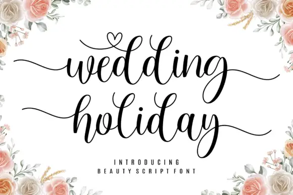
Brush script with a heart flourish
Wedding Holiday is a brush script in black on white: thick connected letters with high contrast at the joins, tall loops on the ascenders and a small heart drawn into the flourish above the first word, framed by peach roses.
Ideas for this font

Bouncing tail script with long entry and exit swashes
Farmhouse is a bouncing tail script in which the letters sit at different heights, the strokes swell on the downstroke and long swashes enter and leave the word, so a name reads as hand lettering on a painted board.
Ideas for this font
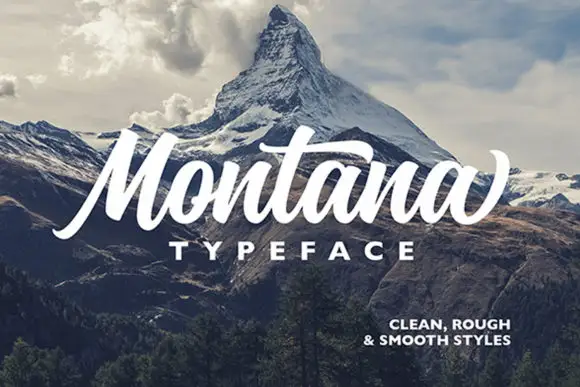
Heavy slanted brush script with a broad t bar and a rising final terminal
Montana is a heavy slanted brush script in which the stems carry dark weight, the M rises tall and angular, the t bar runs broad and the closing letter lifts into a high terminal, so a short headline reads as painted signage.
Ideas for this font
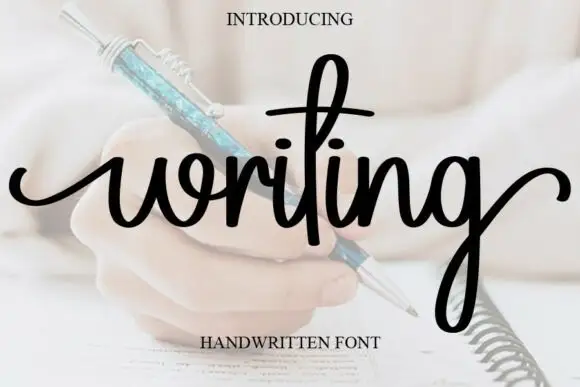
Looped handwriting with a tall ascender
Writing is a looped handwriting in black over a pale photograph of a hand with a pen: tall loops on the ascenders, small open bowls and a light even stroke, with a deep descender on the g.
Ideas for this font
Same independent foundry
Allow optional Google Analytics to measure visits and catalogue actions. Your search words and notes are not included. Privacy & storage