Neutral Sans Workhorse

Scratch Crayon + Sailors
Lets Scratch Crayon own the focal silhouette while handling secondary copy, sizing and subheads cleanly.
Inspect Sailors specimenDisclosure: MakerFileHub may earn a commission from qualifying purchases via paid links on this page. How our links work.
Crayon-filled outlined display
Scratch Crayon is an outlined display in black contours on a white sheet of graph paper: heavy capitals filled with irregular horizontal crayon strokes in red, blue, green and yellow, each letter offset slightly, with crayons scattered around the border and a tracked caption at the foot.
Paid link
Get this fontProject & layout blueprintsAt-a-glance maker compatibility
Sturdy stroke walls and open counters weed cleanly on adhesive vinyl, HTV apparel film, and cut cardstock.
Visual anatomy & craft review
The two words are stacked and the drawing is a heavy outlined capital filled with scribbled horizontal bands, so each letter reads as coloured in by hand rather than printed, and the fill varies from letter to letter. That construction sets a size floor, because the strokes inside close when the letters shrink, and the plate sets the block large enough that the scribble reads as texture. The graph paper and the scattered crayons are staging that names the audience, and the tracked caption at the foot is plain. Because the letters are heavy and the fill is busy, the face suits a card, a shirt or a party sign rather than a paragraph, and the plate is honest about that by showing two short words at display size only.
Decorative, novelty, outlined, playful
Two-font hierarchy recipes
Tested contrast partners — pairing Scratch Crayon with grounded secondary typography.
Scratch Crayon + Sailors
Lets Scratch Crayon own the focal silhouette while handling secondary copy, sizing and subheads cleanly.
Inspect Sailors specimen
Scratch Crayon + Evoire
Grounds bold display lettering with classic typographic authority on posters, badges and apparel.
Inspect Evoire specimenPractical applications
Concrete hierarchy, scale and production guidance tailored to Scratch Crayon’s stroke geometry.
A crayon-filled display reads as a child's own drawing, which sets the tone before the invitation is read. The tone is set before a single word is read.
Hierarchy & layout recipe
A6 card: the greeting at 28 pt, the details in a 9.5 pt sans, and the date at 8.5 pt. Keep 15 mm margins and print four colours on a white card. Leave 12 mm under the date for the address.
Pre-production check
Check the 28 pt greeting at home-print resolution, where the crayon strokes can merge; keep them above 1 mm. Confirm the 9.5 pt details keep a 4.5:1 contrast and that the card folds flat.
An outlined crayon face suits a children's art club, and the colour range gives a poster energy without an illustration.
Hierarchy & layout recipe
A3 poster: the club at 80 mm cap height, the ages in a 22 mm sans, and the room at 12 mm. Keep 25 mm margins and print four colours on a light stock. Hang it at child height.
Pre-production check
Check the A3 at three metres, where the crayon fill can blur into colour; keep 2 mm between letters. Confirm the 12 mm room reads at two metres and that the poster sits at child height.
A crayon display signals a shop for children's craft, and the outlined letters stay legible on a busy shelf. A busy fill still reads as one block at shelf distance.
Hierarchy & layout recipe
Print a 60 by 80 mm label: the shop at 12 pt, the line at 7.5 pt, and the phone at 6.5 pt. Keep 5 mm inside the die and keep the crayon strokes above 0.8 mm.
Pre-production check
Check the 12 pt shop on a label, where the fill can close; simplify the strokes at that size. Confirm the 6.5 pt phone reads at arm's length and that the label peels cleanly.
Technical & licence verification
Confirm included OTF/TTF/WOFF formats, full glyph tables and licence coverage on the live store page before batch production.
Closest visual alternatives
Matched across letterform anatomy, stroke behaviour and craft applications.
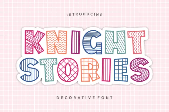
Outlined block capitals filled with varied stripes, zigzags, grids and crosshatching
Knight Stories places two colourful uppercase rows on a white sticker-like shape over a pink grid, where the broad outlined letters contain different linear patterns, from diagonals and zigzags to grids and crosshatching, one pattern per glyph.
Ideas for this font
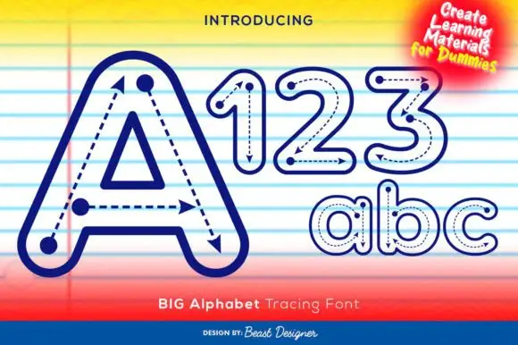
Outlined tracing letters with directional paths
Big Alphabet Tracing shows a large outlined A with dotted paths and arrowheads, and the sample also displays outlined numerals and rounded lowercase letters for practice sheets rather than display use.
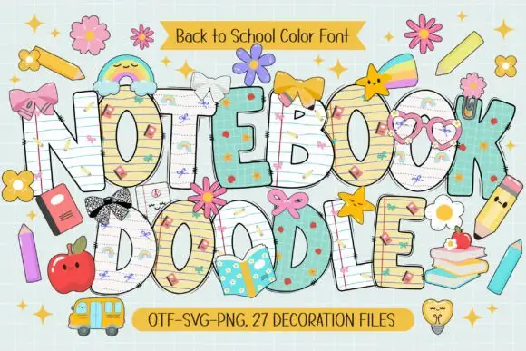
School-paper doodle colour display
Notebook Doodle is a colour display on a pale study scene: fat capitals filled with ruled paper, graph paper and star patterns, outlined in dark ink, decorated with bows, flower clips, pencils and stickers, with two ribbons that name the format list and the count of decoration files.
Ideas for this font
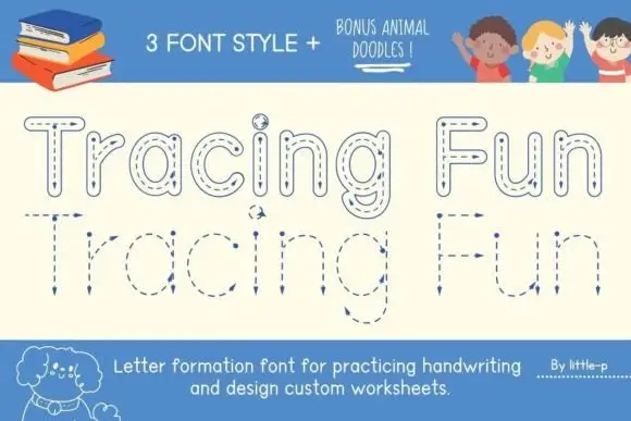
Tracing letter-formation display
Tracing Fun is a letter-formation display in blue on cream: outlined letters with dashed centre lines, arrows marking the stroke direction, and a second lower-case set with the same construction, sold with animal doodles, so the plate reads as a classroom worksheet rather than a typeface.
Ideas for this font
Same independent foundry
Allow optional Google Analytics to measure visits and catalogue actions. Your search words and notes are not included. Privacy & storage