Neutral Sans Workhorse

Victorian Parlor + Bareum
Lets Victorian Parlor own the focal silhouette while handling secondary copy, sizing and subheads cleanly.
Inspect Bareum specimenDisclosure: MakerFileHub may earn a commission from qualifying purchases via paid links on this page. How our links work.
Victorian ornamental lettering
Victorian Parlor is a dense Victorian display in white on a sepia engraved ground: letters built from thin inner lines, curls and spurs, with swashes on the capitals, an inline running the length of each stroke and a frame of scrollwork around the whole plate.
Paid link
Get this fontProject & layout blueprintsAt-a-glance maker compatibility
Sturdy stroke walls and open counters weed cleanly on adhesive vinyl, HTV apparel film, and cut cardstock.
Visual anatomy & craft review
This is a picture of a lettering system rather than a single alphabet, and the sheet lists the cuts in a block of small type at the centre — regular, italic, bold, alternate, king, plus vintage variants — which is the practical information a buyer of an ornamental face needs. The drawing is built from inline strokes and curls, so each letter is a small piece of engraving, and the plate sets the two title words at different angles to show that the face is meant to be arranged rather than set. The scrollwork frame and the engraved background are period furniture, and they make the point that this style belongs on a book cover or a parlour print. Because the letters are fine and intricate, the face works at display sizes only, and the plate is a fair warning about that.
Decorative, victorian, ornate, vintage
Two-font hierarchy recipes
Tested contrast partners — pairing Victorian Parlor with grounded secondary typography.
Victorian Parlor + Bareum
Lets Victorian Parlor own the focal silhouette while handling secondary copy, sizing and subheads cleanly.
Inspect Bareum specimen
Victorian Parlor + The Bilstein Editorial
Grounds bold display lettering with classic typographic authority on posters, badges and apparel.
Inspect The Bilstein Editorial specimenPractical applications
Concrete hierarchy, scale and production guidance tailored to Victorian Parlor’s stroke geometry.
An ornamental face sets a period title as an engraved plate, and the inline strokes hold at display size in a way a modern serif cannot imitate.
Hierarchy & layout recipe
Set the title at 90 mm cap height across 200 mm, the author in a 12 pt serif, and the imprint at 8 pt. Print one ink on a textured stock and keep the scrollwork at the corners.
Pre-production check
Check the title at 90 mm, where the inline can close on textured paper; proof one sheet. Confirm the 8 pt imprint survives lamination and that the frame clears the trim by 10 mm.
An ornate face suits a period theme on a welcome board, and the inline strokes read as lettering rather than as decoration when the board is large.
Hierarchy & layout recipe
A1 board: the greeting at 90 mm cap height, the names in a 40 mm serif, and the date at 20 mm. Keep 40 mm margins, paint one colour on a dark board, and keep the scrollwork to the corners.
Pre-production check
Check the board at five metres, where the inline can fill with paint; keep the gap above 1.5 mm. Confirm the 20 mm date reads from the door and that the frame is level.
A Victorian label marks a traditional shop, and the fine inner lines survive on a small print when the label is set at a generous size.
Hierarchy & layout recipe
Print an 80 by 50 mm label: the shop at 15 pt, the services in a 6 pt serif, and a 1 mm rule. Keep 4 mm inside the die and print two colours on a cream stock.
Pre-production check
Check the 15 pt shop on cream stock, where the inline can fill; keep it above 13 pt. Confirm the 6 pt services read at arm's length and that the label peels cleanly.
Technical & licence verification
Confirm included OTF/TTF/WOFF formats, full glyph tables and licence coverage on the live store page before batch production.
Closest visual alternatives
Matched across letterform anatomy, stroke behaviour and craft applications.
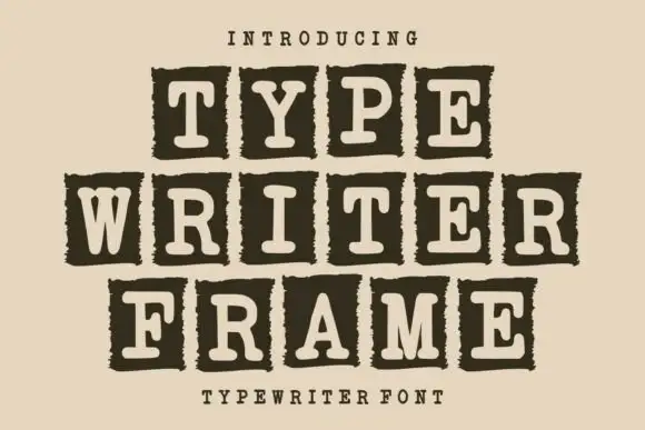
Tiled typewriter display
Typewriter Frame is a tile display in cream on a warm ground: each slab-serif capital reversed out of a dark rough-edged rectangular tile, set in three staggered rows that step inward, with a small tracked line above and a plain line beneath.
Ideas for this font
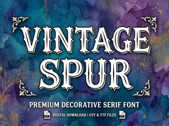
Outlined pinched serif display
Vintage Spur is an outlined decorative serif in white with a dark keyline on a purple and teal watercolour ground: wide capitals with pinched sides, pointed spurs at the shoulders, narrow inner tracks and heavy outlines, set in two lines between four drawn corner ornaments, with two plain lines at the foot.
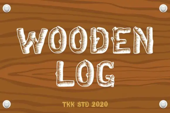
Wood-grain hatch display
Wooden Log is a rustic display on a photographic plank ground: irregular narrow capitals in white with short inward hatch marks along the strokes and occasional knot-like interruptions, set in two stacked words with a small maker line beneath, framed by four rivets.
Ideas for this font
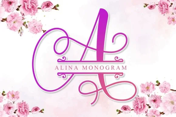
Calligraphic split-bar monogram
Alina Monogram builds ornate calligraphic capitals with an integrated centre split bar, where sweeping ribbon loops wrap each uppercase initial while a clean horizontal band runs through the middle to hold family names or a wedding date.
Ideas for this font
Same independent foundry
Allow optional Google Analytics to measure visits and catalogue actions. Your search words and notes are not included. Privacy & storage