Neutral Sans Workhorse

Menthox + Bargain Condensed
Lets Menthox own the focal silhouette while handling secondary copy, sizing and subheads cleanly.
Inspect Bargain Condensed specimenDisclosure: MakerFileHub may earn a commission from qualifying purchases via paid links on this page. How our links work.
Broken-stroke stencil script
Menthox is a broken-stroke script in cream on orange: each letter is drawn as a continuous ribbon with the joins cut away, so the word reads as a stencil or a paper cut.
Paid link
Get this fontProject & layout blueprintsAt-a-glance maker compatibility
Open counter bridges hold interior islands intact on laser-cut wood, acrylic, and mylar stencils.
Visual anatomy & craft review
Menthox fills the card in one word, and the construction is unusual: every letter is a thick ribbon of even width, and the places where strokes would meet are cut, leaving small gaps that make the word read as a stencil. The M opens with a wide curl, the e and the n are broad loops, the t lifts into a tall stem and the h and the x carry the same ribbon, and a long swash runs out beneath the word from the final letter. The surface is a warm orange paper with soft shadows falling across it, and a small caption at the top names the face. The face is a decorative script for cutting, stencilling and signage: because the strokes are separated, it works for vinyl, paper and paint without a weld step, and it needs a size where the gaps remain visible.
A script drawn in broken strokes
Two-font hierarchy recipes
Tested contrast partners — pairing Menthox with grounded secondary typography.
Menthox + Bargain Condensed
Lets Menthox own the focal silhouette while handling secondary copy, sizing and subheads cleanly.
Inspect Bargain Condensed specimen
Menthox + Grandeur – Elegant Classic Serif
Grounds bold display lettering with classic typographic authority on posters, badges and apparel.
Inspect Grandeur – Elegant Classic Serif specimenPractical applications
Concrete hierarchy, scale and production guidance tailored to Menthox’s stroke geometry.
A broken-stroke script is built for cutting, so a vinyl sign needs no weld step, and the gaps read as a deliberate finish.
Hierarchy & layout recipe
Print a 500 by 350 mm board: set the greeting at 100 pt on one row, keep 26 mm of clear ground beneath so the swash is clear of the names, and hold 22 mm of border on all sides.
Pre-production check
The gaps between strokes must stay open when the vinyl is weeded; cut one test on the real material before the set.
A stencil script reads as something cut rather than printed, which suits a studio that sells paper goods and printed cards.
Hierarchy & layout recipe
Print a 55 by 45 mm label: set the studio name at 14 pt on one row, keep 6 mm of clear ground beneath before the line at 4.5 pt, and hold 4 mm from the swash to the die line.
Pre-production check
At fourteen points the gaps fill in; print one label at the real size and check the letters before the order.
A cut-stroke word signals a feature about making rather than buying, and it holds at opener size in a single ink on uncoated paper.
Hierarchy & layout recipe
Print a 230 by 300 mm opener: set the heading at 72 pt on one row, keep 24 mm of clear ground beneath before the standfirst at 10.5 pt, and hold 20 mm of margin on both sides.
Pre-production check
Broken strokes at 72 pt on newsprint can look like a printing fault; print one opener and check the gaps read as intentional before the issue.
Technical & licence verification
Confirm included OTF/TTF/WOFF formats, full glyph tables and licence coverage on the live store page before batch production.
Closest visual alternatives
Matched across letterform anatomy, stroke behaviour and craft applications.
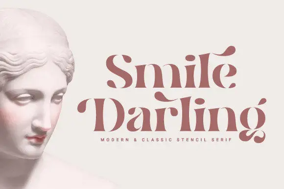
Stencil contrast serif display
Smile Darling is a stencil contrast serif in dusty rose beside a marble bust: mixed case with heavy stems, detached hairlines that float free of the letters, pointed terminals and curled spurs, set in two lines with a tracked line beneath naming the style.
Ideas for this font
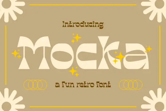
Geometric retro display
Mocka is a high-contrast geometric retro display in cream on tan: wide letters built from thin arcs and heavy wedges, oversized oval counters, a cut-out bowl on the k and a detached crossbar, set as one word with yellow sparkles, four-petal flowers at the corners and a small retro subtitle beneath.
Ideas for this font
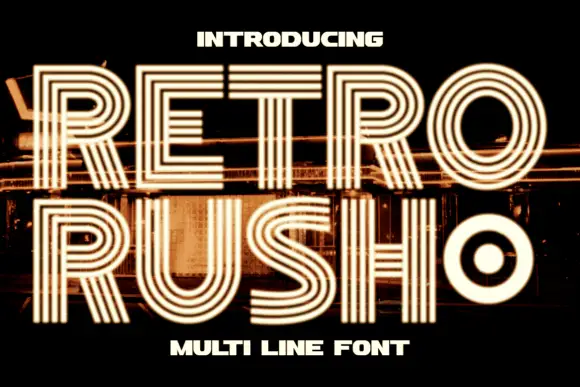
Geometric capitals built from parallel lines with a rounded inner counter
Retro Rush is a geometric capital alphabet in which every stroke is drawn as several parallel lines, so a word reads as a neon tube sign or a striped poster from the late seventies.
Ideas for this font
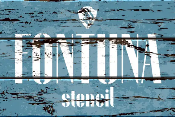
Tall high-contrast capitals shown through broad horizontal breaks and distressed wood texture
Fontuna Stencil places pale narrow capitals over heavily weathered blue boards, where fine arms meet thick vertical strokes, dark horizontal bands cross the title at several heights and a narrower mixed-case contrast repeats beneath the main row.
Ideas for this font
Same independent foundry
Allow optional Google Analytics to measure visits and catalogue actions. Your search words and notes are not included. Privacy & storage