Editorial Serif Anchor

Easter Dreaming + The Simple Editorial
Anchors Easter Dreaming's fluid strokes with crisp Roman proportions on wedding suites, headers and packaging.
Inspect The Simple Editorial specimenDisclosure: MakerFileHub may earn a commission from qualifying purchases via paid links on this page. How our links work.
Tall handmade monoline with elongated quirks and open counters
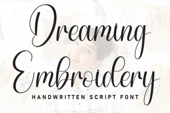
Easter Dreaming is a tall handmade alphabet in which the letters stretch upward, the stems stay an even light line and a few forms wander, so a two-word title reads as a drawing rather than as type.
Paid link
Get this fontProject & layout blueprintsAt-a-glance maker compatibility
Sturdy stroke walls and open counters weed cleanly on adhesive vinyl, HTV apparel film, and cut cardstock.
Visual anatomy & craft review
The e closes a tall eye, the a holds a narrow bowl, the s wobbles a shallow spine, the t raises a high bar, the r finishes a light arm and the g drops a straight tail, all at one even monoline weight with tall proportions and counters left wide open. The elongation is the character: the letters are almost twice as tall as they are wide, which is why the sample sets two stacked words loosely and lets the drawing behind them show through. Because the line is light and even, the face reads from 24 pt on a light ground and prints in one ink; on a busy photograph it needs a solid patch behind it. The pale pastel photograph, the basket and the small caps line beneath are presentation; the dark handmade words are the face.
Handmade · Tall · Quirky
Two-font hierarchy recipes
Tested contrast partners — pairing Easter Dreaming with grounded secondary typography.
Easter Dreaming + The Simple Editorial
Anchors Easter Dreaming's fluid strokes with crisp Roman proportions on wedding suites, headers and packaging.
Inspect The Simple Editorial specimen
Easter Dreaming + Sailors
Keeps small-scale dates, URLs, nutrition facts and care instructions crisp and legible below script titles.
Inspect Sailors specimenPractical applications
Concrete hierarchy, scale and production guidance tailored to Easter Dreaming’s stroke geometry.
The tall even line gives a spring table card its lightness, and the open counters stay legible at 30 pt on a matt card that catches the candlelight.
Hierarchy & layout recipe
Print an A6 card: set the greeting at 30 pt on two lines, set the date in a 9 pt sans beneath, and keep 14 mm of margin so the tall ascenders sit inside the trim.
Pre-production check
Tall ascenders set close to the trim look cut; check the printed card and lower the block by 4 mm.
The handmade line reads at distance as a drawn sign, and the even weight holds a two-word market header at 70 mm on a board.
Hierarchy & layout recipe
Print a 600 by 300 mm board: set the header at 70 mm, keep 30 mm of border, and set the opening times in a 20 pt sans beneath with 25 mm of clearance.
Pre-production check
An even light line printed at 70 mm on rough board looks broken; check the panel and use a smooth-faced board rather than thick paint.
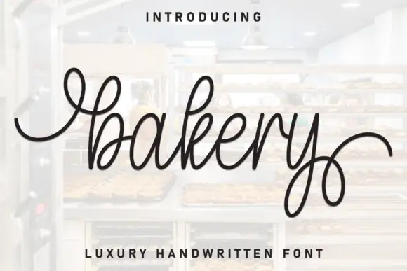
The quirky tall letters make a plain bakery box feel drawn by hand, and the light line holds at 18 pt on a smooth label.
Hierarchy & layout recipe
Print a 60 by 40 mm label: set the bakery name at 18 pt, set the flavour in a 7 pt sans beneath, and keep 4 mm of border so the tall letters are not clipped by the die.
Pre-production check
A monoline under 0.2 mm on a kraft label greys out; check the label proof and specify a coated stock if the line thins.
Technical & licence verification
Confirm included OTF/TTF/WOFF formats, full glyph tables and licence coverage on the live store page before batch production.
Closest visual alternatives
Matched across letterform anatomy, stroke behaviour and craft applications.
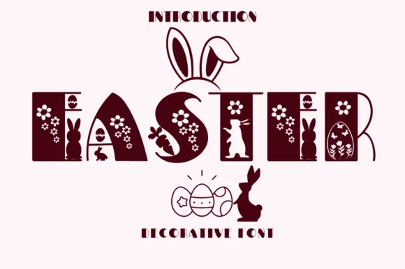
Decorative Easter capitals built as panels with cut-out motifs
Easter 2 is a decorative capital alphabet in which each letter is a solid rectangular panel with bunnies, eggs and daisies cut through it, so a word reads as a row of decorated blocks rather than as lettering.
Ideas for this font
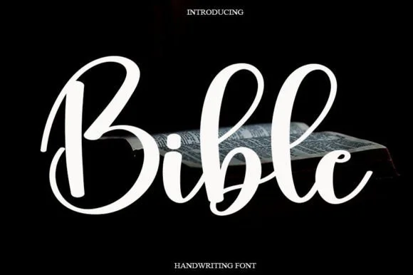
Smooth rounded marker-brush script
Bible (by Ganden Letter) is a clean, medium-bold rounded brush script with open circular loops and soft, approachable curves.
Ideas for this font
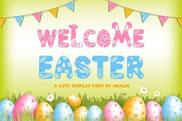
Patterned Easter-egg & bunny-ear spring banner font
Welcome Easter is a cheerful decorative display font patterning chunky letters with painted Easter-egg swirls, flowers, and popping bunny ears.
Ideas for this font
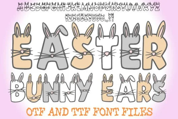
Hand-drawn bunny-eared & whiskered cartoon alphabet + numerals (OTF & TTF)
Easter Bunny Ears is a charming hand-drawn cartoon font sprouting tall rabbit ears, twitchy noses, and whiskers off every letter and number (OTF & TTF).
Ideas for this font
Same independent foundry
Allow optional Google Analytics to measure visits and catalogue actions. Your search words and notes are not included. Privacy & storage