Editorial Serif Anchor

Whiskey Thick + Gorga
Anchors Whiskey Thick's fluid strokes with crisp Roman proportions on wedding suites, headers and packaging.
Inspect Gorga specimenDisclosure: MakerFileHub may earn a commission from qualifying purchases via paid links on this page. How our links work.
Thick outlined rounded display
Whiskey Thick is a thick outlined display in black line over a photograph of whiskey glasses: rounded skeleton with heavy double contours, open interiors, a scalloped base under the letters, and a bouncy baseline, so the pair reads as a hand-drawn outline rather than as a filled typeface.
Paid link
Get this fontProject & layout blueprintsAt-a-glance maker compatibility
Weld or Unite overlapping script joins into one continuous vector path before sending to the blade.
Visual anatomy & craft review
The two words are stacked and the drawing is an outline: each letter is described by a thick contour with a second inner line running parallel, and the interiors are left transparent so the background shows through, which is what makes the face work over a photograph. The skeleton is a heavy rounded sans, and the contour follows it loosely, with small scallops at the bottom of the stems that read as drip or frill details. Spacing is tight, so the words form a band of line that lets the glass photograph show between the strokes. Because the face is all contour, it needs a contrasty background and a decent size, and the specimen places it over pale whiskey and grey cubes with two tracked captions in a light grotesque above and below.
Outlined, rounded, thick, modern
Two-font hierarchy recipes
Tested contrast partners — pairing Whiskey Thick with grounded secondary typography.
Whiskey Thick + Gorga
Anchors Whiskey Thick's fluid strokes with crisp Roman proportions on wedding suites, headers and packaging.
Inspect Gorga specimen
Whiskey Thick + One More
Keeps small-scale dates, URLs, nutrition facts and care instructions crisp and legible below script titles.
Inspect One More specimenPractical applications
Concrete hierarchy, scale and production guidance tailored to Whiskey Thick’s stroke geometry.
An outlined display reads as a drawn label rather than a printed one, and the transparent interiors let the colour of the liquid or the glass show through on a clear substrate.
Hierarchy & layout recipe
Print a 70 by 100 mm label on clear stock: the name at 20 pt with a 0.9 mm contour, the age in a 7 pt grotesque, and the volume at 6 pt. Keep 5 mm clear inside the die and check the contour against a dark and a light bottle.
Pre-production check
Check the 20 pt contour on clear stock, where a 0.9 mm line can break on the press; thicken it to 1.1 mm. Confirm the 6 pt volume reads on the shelf and that the label stays legible over amber liquid.
An outlined title lets a cover keep the photograph visible through the letters, which is a design choice a filled display cannot offer, and the contour reads at masthead size.
Hierarchy & layout recipe
Set the title at 110 mm cap height across the cover, the cover lines in a 9 pt grotesque, and the issue details at 7 pt. Keep the title over a quiet part of the photograph and give it a subtle drop shadow so the contour reads.
Pre-production check
Check the title at 110 mm over a busy photograph, where the contour can disappear; add a shadow or a soft panel. Confirm the cover lines read at newsstand distance and that the contour holds at thumbnail size.
An outlined graphic prints as a single screen and reads as a sketch on fabric, which is the right tone for a tasting night rather than a formal event.
Hierarchy & layout recipe
Print a 250 mm chest graphic: the phrase at 55 mm cap height, the date at 20 mm, and one ink on a mid-tone shirt. Keep the contour at 3 mm so the screen holds it and place the graphic 80 mm below the collar.
Pre-production check
Check the screen at actual mesh, where a contour under 2 mm fills; thicken it for fabric. Wash-test one shirt and confirm the contour stays clean after five cycles.
Technical & licence verification
Confirm included OTF/TTF/WOFF formats, full glyph tables and licence coverage on the live store page before batch production.
Closest visual alternatives
Matched across letterform anatomy, stroke behaviour and craft applications.
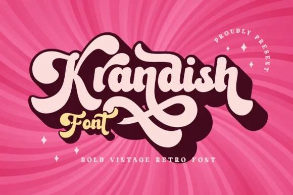
Chunky 1970s swash-tail retro brush script
Krandish is a heavy, cream-smooth 1970s retro script featuring dramatic looping swash capitals and thick figure-eight underline tails.
Ideas for this font
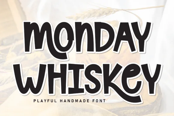
Playful hand-drawn caps with offset outline
Monday Whiskey is a playful hand-drawn display in near-black with a white contour and a heavy offset shadow, set over a warm sepia photograph: fat irregular caps, a bouncing baseline, an E drawn with uneven arms and an S that swings open, with a tracked caption beneath.
Ideas for this font
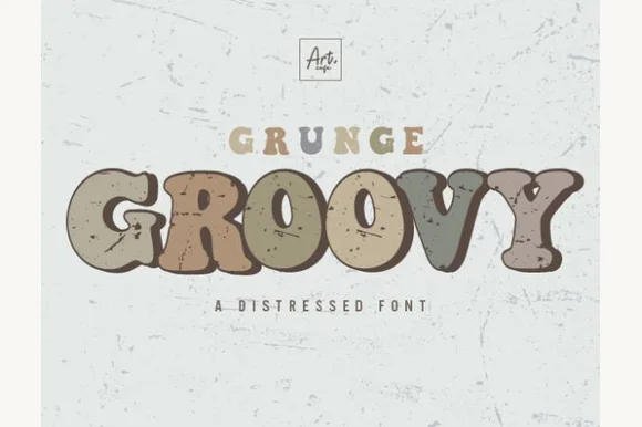
Speckle-distressed 1970s groovy retro display
Grunge Groovy blends plump 1970s bell-bottom groovy curves with weathered thrift-store stamp speckles!
Ideas for this font
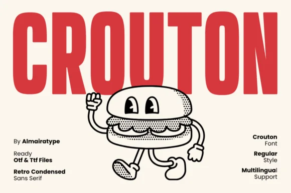
Friendly rounded 1970s burger-joint & mascot condensed sans (OTF/TTF)
Crouton is a cheerful, rounded-terminal condensed sans channeling vintage burger-shack menus and rubber-hose cartoon packaging (OTF, TTF & Multilingual)!
Ideas for this font
Same independent foundry
Allow optional Google Analytics to measure visits and catalogue actions. Your search words and notes are not included. Privacy & storage