Neutral Sans Workhorse

Grunge Groovy + Base Edge
Lets Grunge Groovy own the focal silhouette while handling secondary copy, sizing and subheads cleanly.
Inspect Base Edge specimenDisclosure: MakerFileHub may earn a commission from qualifying purchases via paid links on this page. How our links work.
Speckle-distressed 1970s groovy retro display
Grunge Groovy blends plump 1970s bell-bottom groovy curves with weathered thrift-store stamp speckles!
Paid link
Get this fontProject & layout blueprintsAt-a-glance maker compatibility
Fine grain and micro-texture excel in 300 DPI print, sublimation, and screen print rather than small vinyl weeding.
Visual anatomy & craft review
Grunge Groovy is a plump 1970s retro display in capitals with bell-bottom curves and an ink-pitted speckle that sits inside the fill and along the outlines. The shapes are wide and soft, the counters are small ovals, and the dark outline gives the face a sticker-like edge that holds at 15 mm on a mug and at 120 mm on a poster. Because the distress is fine, it needs about 10 mm before it reads as age rather than noise, and it is at its best in two or three muted colours on a warm paper ground rather than on a pure white shelf.
Thrift-groovy-70s · Pitted-retro · Desert-taupe
Two-font hierarchy recipes
Tested contrast partners — pairing Grunge Groovy with grounded secondary typography.
Grunge Groovy + Base Edge
Lets Grunge Groovy own the focal silhouette while handling secondary copy, sizing and subheads cleanly.
Inspect Base Edge specimen
Grunge Groovy + Kernova
Grounds bold display lettering with classic typographic authority on posters, badges and apparel.
Inspect Kernova specimenPractical applications
Concrete hierarchy, scale and production guidance tailored to Grunge Groovy’s stroke geometry.
Speckled 1970s capitals read as a print that has been through a thrift-store wash, which is exactly the provenance a vintage pop-up is selling. Wide, plump forms hold a short shop name on a tote at 60 mm.
Hierarchy & layout recipe
Tee print 280 x 160 mm, word 65 mm, 35 mm margins. Tote panel 300 x 300 mm, word 70 mm, 30 mm to the seam. Mug wrap 200 x 85 mm, word 26 mm, 10 mm from the handle.
Pre-production check
A speckled fill under a ceramic decal can look like a dirty print after firing. Request one fired mug for approval, and if the speckle reads as dirt, use the clean alternate for the mug and keep the distressed cut for apparel.
Wide seventies curves read as a holiday souvenir rather than a modern promotion, which suits a camp or surf line. The heavy outline survives a die-cut sticker where a hairline face would tear.
Hierarchy & layout recipe
Shirt print 180 x 120 mm, word 40 mm on a 220 mm chest. Sticker 75 mm wide die-cut, word 18 mm, 3 mm die margin. Programme A5, cover 40 mm, 30 mm margins.
Pre-production check
Die-cut stickers with an outline need a 2 mm clear border, or the blade clips the fill and leaves a white sliver. Print one sticker and inspect the cut edge against a dark surface before ordering the sheet.
Groovy curves set a decade theme in a single word, which saves a party from needing licensed graphics. Small oval counters hold at 20 mm on a topper without closing.
Hierarchy & layout recipe
Invite A6, title 22 mm, details 4.5 mm on 6 mm leading, 10 mm margins. Topper 130 x 110 mm, title 50 mm, 8 mm stick slot. Sticker 40 mm round, word 7 mm, 2 mm die margin.
Pre-production check
Cake toppers are printed on 2 mm card and pushed into a sugar surface, so ink close to the slot can transfer. Keep the artwork above the 8 mm slot line and check one assembled topper before the party.
Technical & licence verification
Confirm included OTF/TTF/WOFF formats, full glyph tables and licence coverage on the live store page before batch production.
Closest visual alternatives
Matched across letterform anatomy, stroke behaviour and craft applications.
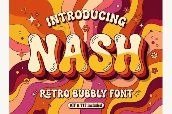
Groovy 1970s psychedelic lava-lamp bubble display (OTF & TTF)
Nash is a cheerful 1970s psychedelic bubble display font swelling bottom-heavy groovy curves for retro shirts, posters, and mugs (OTF & TTF).
Ideas for this font
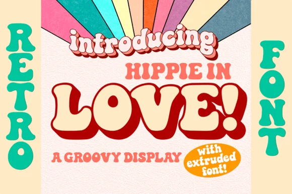
1970s groovy bell-bottom display with matched Extruded font
Hippie in Love is a chunky 1970s retro display family bundled with a dedicated Extruded shadow font for instant 3D poster lettering.
Ideas for this font
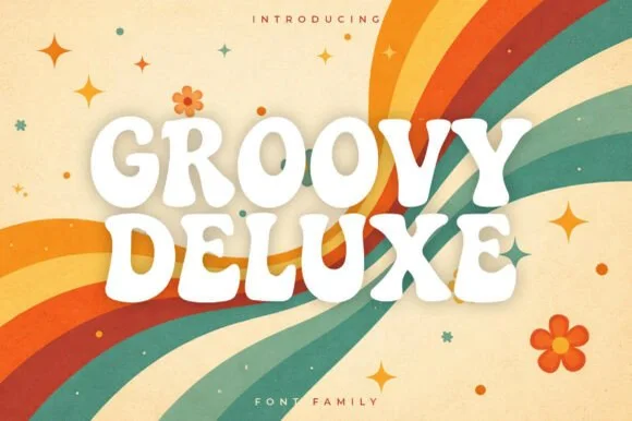
Soft groovy 1970s poster display family
Groovy Deluxe is a clean, upbeat 1970s retro display font family with softly pinched waists, plump rounded feet, and clear open counters.
Ideas for this font
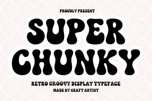
Retro groovy bubble display
Super Chunky is a retro groovy display in black on a pink quatrefoil ground: extremely fat letters with swelling strokes, small round counters and wobbly edges, stacked in two lines with a tracked caption beneath, so the pair reads as a hand-painted seventies poster rather than a modern sans.
Same independent foundry
Allow optional Google Analytics to measure visits and catalogue actions. Your search words and notes are not included. Privacy & storage