Neutral Sans Workhorse

Monday Whiskey + Clyne Sans
Lets Monday Whiskey own the focal silhouette while handling secondary copy, sizing and subheads cleanly.
Inspect Clyne Sans specimenDisclosure: MakerFileHub may earn a commission from qualifying purchases via paid links on this page. How our links work.
Playful hand-drawn caps with offset outline
Monday Whiskey is a playful hand-drawn display in near-black with a white contour and a heavy offset shadow, set over a warm sepia photograph: fat irregular caps, a bouncing baseline, an E drawn with uneven arms and an S that swings open, with a tracked caption beneath.
Paid link
Get this fontProject & layout blueprintsAt-a-glance maker compatibility
Sturdy stroke walls and open counters weed cleanly on adhesive vinyl, HTV apparel film, and cut cardstock.
Visual anatomy & craft review
The two words are stacked and the drawing is hand lettering at heavy weight: the strokes vary, the outlines wobble, and the letters lean at slightly different angles, which keeps the pair looking drawn rather than set. The white contour separates the letters from the photograph and the offset shadow, drawn to one side at a fixed distance, gives the block its cut-paper depth. Because the shapes are irregular, the face reads as a craft product, and the specimen sets the pair large enough that the wobble is visible without becoming noise. The ground is a warm still life of bread and a bowl, and the caption beneath is tracked caps in a small grotesque, which is the one neutral voice on the plate.
Handwritten, playful, outlined, warm
Two-font hierarchy recipes
Tested contrast partners — pairing Monday Whiskey with grounded secondary typography.
Monday Whiskey + Clyne Sans
Lets Monday Whiskey own the focal silhouette while handling secondary copy, sizing and subheads cleanly.
Inspect Clyne Sans specimen
Monday Whiskey + Marquis - Elegant Modern Serif
Grounds bold display lettering with classic typographic authority on posters, badges and apparel.
Inspect Marquis - Elegant Modern Serif specimenPractical applications
Concrete hierarchy, scale and production guidance tailored to Monday Whiskey’s stroke geometry.
A hand-drawn label reads as a small batch, and the contour keeps the lettering legible on a busy food photograph where a plain face would be lost.
Hierarchy & layout recipe
Print a 60 by 80 mm label: the product at 15 pt with a 1.5 mm contour, the weight in a 6 pt sans, and 4 mm inside the die. Keep the offset shadow at 1 mm so it prints cleanly on an uncoated stock.
Pre-production check
Check the 15 pt product on kraft, where a contour can fill with texture; reduce it below 18 pt. Confirm the 6 pt weight reads on the shelf and that the offset does not blur at the die edge.
A warm hand-drawn face suits a food-led celebration, and the irregular shapes keep a home-printed card from looking like a template.
Hierarchy & layout recipe
A6 card: the greeting at 30 pt, the details in a 9 pt sans, and a 3 mm border. Keep 12 mm margins, keep the offset shadow under 2 mm, and print one ink on a cream card.
Pre-production check
Check the 30 pt greeting at home-print resolution, where the shadow can merge with the contour; increase the gap. Confirm the 9 pt details keep a 4.5:1 contrast and that the border clears the descenders.
A hand-drawn banner reads across a market, and the heavy irregular strokes stay visible against the produce behind the stall.
Hierarchy & layout recipe
Print 900 by 400 mm: the stall name at 130 mm cap height, the prices in a 22 mm sans, and a 6 mm border. Keep 25 mm margins and print the name in one ink over a light panel so the contour does the separating work.
Pre-production check
Check the banner at four metres, where the uneven letters can look like a mistake; keep the variation on the baseline subtle. Confirm the 22 mm prices read at two metres and that the border clears the eyelets.
Technical & licence verification
Confirm included OTF/TTF/WOFF formats, full glyph tables and licence coverage on the live store page before batch production.
Closest visual alternatives
Matched across letterform anatomy, stroke behaviour and craft applications.
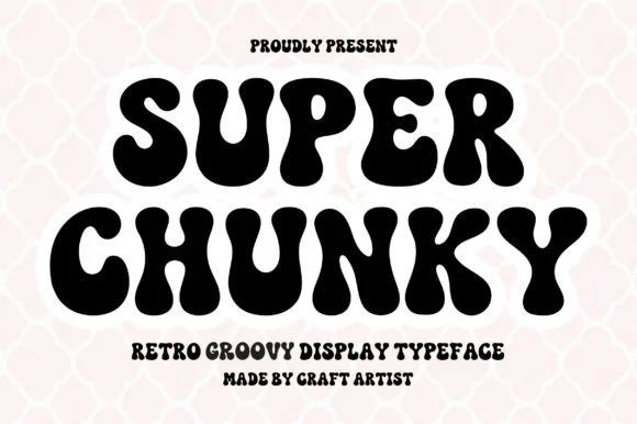
Retro groovy bubble display
Super Chunky is a retro groovy display in black on a pink quatrefoil ground: extremely fat letters with swelling strokes, small round counters and wobbly edges, stacked in two lines with a tracked caption beneath, so the pair reads as a hand-painted seventies poster rather than a modern sans.
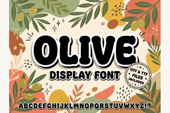
Chunky organic botanical-retro block sans (OTF & TTF)
Olive is a stout, softly rounded organic display sans with gently tapered stems and warm 1970s Mediterranean market charm (OTF & TTF).
Ideas for this font
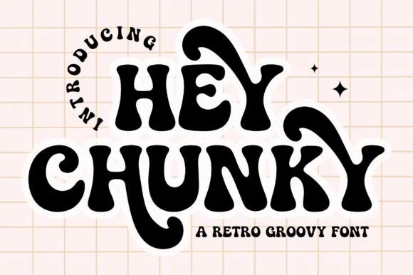
Swash-tailed 1970s psychedelic & groovy serif display
Hey Chunky is an expressive 1970s groovy display font kicking long, flamboyant retro swash tails off 'H', 'Y', 'C', and 'K'!
Ideas for this font
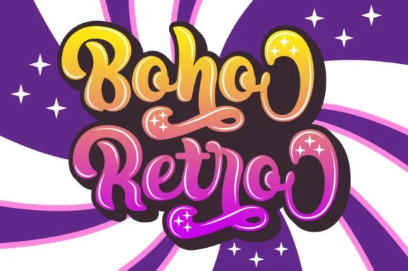
Swirled 1970s psychedelic bubble script-display
Boho Retro is a plump, heavy-looped 1970s groovy display script with curled swash caps and pillowy connected lowercase bowls.
Ideas for this font
Same independent foundry
Allow optional Google Analytics to measure visits and catalogue actions. Your search words and notes are not included. Privacy & storage