Editorial Serif Anchor

Autumn + Askinо
Anchors Autumn's fluid strokes with crisp Roman proportions on wedding suites, headers and packaging.
Inspect Askinо specimenDisclosure: MakerFileHub may earn a commission from qualifying purchases via paid links on this page. How our links work.
Tall narrow capitals with uneven stroke weight
Autumn shows upright handmade-looking capitals with long open vertical forms on a white field, where the U strokes vary markedly in thickness, a narrow T crossbar contrasts with broad A and M shapes and softly coloured leaves sit around the edges of the frame.
Paid link
Get this fontProject & layout blueprintsAt-a-glance maker compatibility
Weld or Unite overlapping script joins into one continuous vector path before sending to the blade.
Visual anatomy & craft review
The strokes stay upright and open, the weight shifts from thick to thin inside a single letter, the crossbar narrows and the A and M spread wide. That uneven weight is the character: the word reads as a marker lettering job rather than a designed cap row, which is why the sample sets one word on a plain ground. The leaves are separate artwork and the cover notes no decoration in the glyphs themselves. Keep 40 pt so the thin strokes stay visible and keep the seasonal imagery out of the type claim.
Tall narrow capitals with uneven stroke weight
Two-font hierarchy recipes
Tested contrast partners — pairing Autumn with grounded secondary typography.
Autumn + Askinо
Anchors Autumn's fluid strokes with crisp Roman proportions on wedding suites, headers and packaging.
Inspect Askinо specimen
Autumn + Godthem
Keeps small-scale dates, URLs, nutrition facts and care instructions crisp and legible below script titles.
Inspect Godthem specimenPractical applications
Concrete hierarchy, scale and production guidance tailored to Autumn’s stroke geometry.
The marker capitals give a shop a hand-painted sign feel, and the open verticals read across a doorway where a script would fail.
Hierarchy & layout recipe
Paint a 600 by 300 mm board: set the shop name at 54 mm on one row, keep 22 mm of clear ground beneath before the hours at 14 pt, and keep 26 mm of border so the thin strokes survive the cut.
Pre-production check
Thin strokes under 3 mm blur when hand painted; check the mask artwork and use vinyl instead.
The informal caps suit a classroom label, and the varied stroke weight keeps the name from looking like a printed office sign.
Hierarchy & layout recipe
Print a 300 by 150 mm plate: set the room name at 42 pt on one row, keep 16 mm of clear ground beneath before the teacher line at 11 pt, and keep 18 mm of margin for the fixings.
Pre-production check
The leaves are not part of the font; check the artwork files before promising any decoration.
The handmade caps give a small printed note warmth, and the open forms leave real space for a hand-written message beneath.
Hierarchy & layout recipe
Print a 105 by 148 mm card: set the greeting at 28 pt on one row, keep 18 mm of clear ground beneath for a handwritten line, and keep 16 mm of margin at each side.
Pre-production check
The uneven weight looks like a printing fault at 18 pt; check the proof and keep the greeting at 24 pt.
Technical & licence verification
Confirm included OTF/TTF/WOFF formats, full glyph tables and licence coverage on the live store page before batch production.
Closest visual alternatives
Matched across letterform anatomy, stroke behaviour and craft applications.
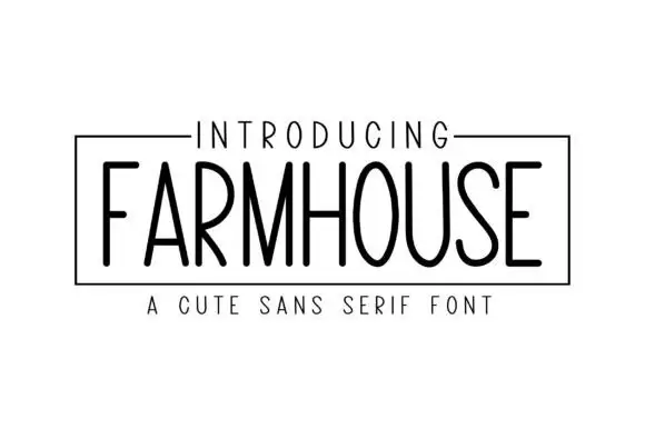
Tall light capitals with long oval O bowls and narrow straight diagonal joins
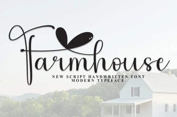
Farmhouse Blackcraft draws a tall skinny sans by hand, keeps the strokes slightly uneven and the letters narrow, and sets the word in black inside a thin ruled frame.
Ideas for this font
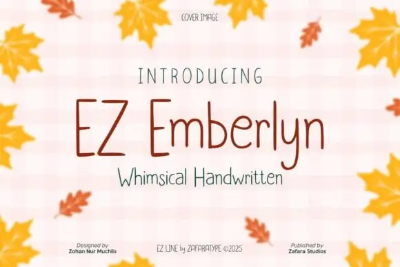
Fine tall separate print
Ez Emberlyn is a fine handwritten print face in which the letters stand separately, the stems run tall, the m and n keep rounded tops and the y descends in a narrow line, so a short phrase reads as careful pen writing without any joins.
Ideas for this font
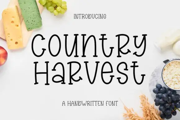
Tall hand-drawn mixed case with small feet and uneven crossbars
Country Harvest shows black two-line lettering on a white food-styled cover. Tall slim bodies mix upper- and lowercase shapes, including a narrow rounded o, an open curved y and a wide crossbar on the t, while the lower line sets a small rounded a beside a prominent capital-like R.
Ideas for this font
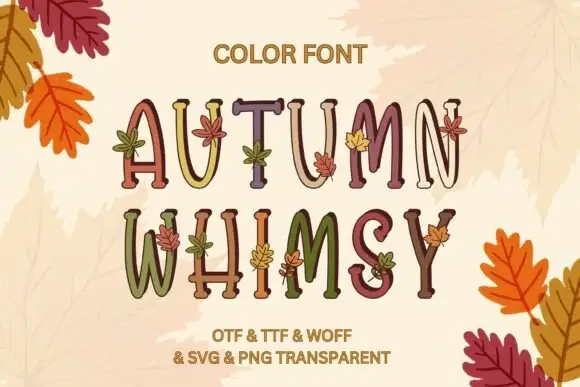
Slim uneven serif capitals with little leaves across muted fills
Autumn Whimsy sets slender rounded colour capitals in a warm autumn palette — mustard, plum, olive, cream — and grows small oak and maple leaves out of the top of each letter.
Ideas for this font
Same independent foundry
Allow optional Google Analytics to measure visits and catalogue actions. Your search words and notes are not included. Privacy & storage