Neutral Sans Workhorse

Welcome Someone + Mansory
Lets Welcome Someone own the focal silhouette while handling secondary copy, sizing and subheads cleanly.
Inspect Mansory specimenDisclosure: MakerFileHub may earn a commission from qualifying purchases via paid links on this page. How our links work.
Tall rounded monoline display with keyline
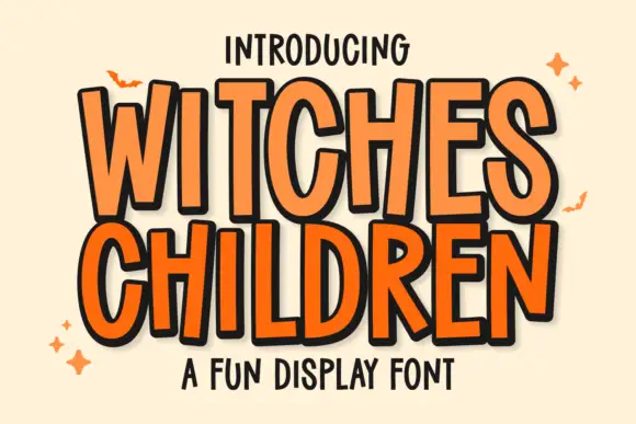
Welcome Someone is a tall rounded monoline display in orange with a white keyline: narrow capitals of even stroke weight, softly squared corners, a slight bounce, and a wide white outline that separates the word from a pale ground.
Paid link
Get this fontProject & layout blueprintsAt-a-glance maker compatibility
Sturdy stroke walls and open counters weed cleanly on adhesive vinyl, HTV apparel film, and cut cardstock.
Visual anatomy & craft review
The two words are stacked and fill the width, and the drawing is a friendly geometric: the stems are tall and even, the shoulders of the W and the M are rounded rather than angular, and the O stays a tall oval, so the pair reads as a sign rather than a logo. The keyline is a wide white stroke that follows every letter at a constant offset, which is what keeps the orange readable against the cream and gives the word a sticker-like edge without a shadow. The letters are spaced tightly and the word bounces gently, so the block reads as hand-set rather than mechanical. The ground is a plain cream, and the two caption lines are set in a rounded handwritten face, which keeps the page in one soft voice.
Friendly, rounded, tall, monoline
Two-font hierarchy recipes
Tested contrast partners — pairing Welcome Someone with grounded secondary typography.
Welcome Someone + Mansory
Lets Welcome Someone own the focal silhouette while handling secondary copy, sizing and subheads cleanly.
Inspect Mansory specimen
Welcome Someone + Majestic Letters
Grounds bold display lettering with classic typographic authority on posters, badges and apparel.
Inspect Majestic Letters specimenPractical applications
Concrete hierarchy, scale and production guidance tailored to Welcome Someone’s stroke geometry.
A tall rounded display reads as a hand-painted sign, and the white keyline keeps the mark visible on a coloured wall or a busy photograph.
Hierarchy & layout recipe
Print a 700 by 400 mm sign: the name at 120 mm cap height with a 5 mm keyline, the opening times in a 24 mm sans, and a 4 mm rule beneath. Keep the keyline even around every letter and print in one colour plus white.
Pre-production check
Check the keyline at 5 mm on the printed sign, where it must stay constant around the tight curves of the O; inspect at full size. Confirm the 24 mm times read from four metres and that the rule clears the descenders.
A friendly tall display reads as a homemade banner rather than a commercial one, which is the right register for a family celebration.
Hierarchy & layout recipe
Print 900 by 400 mm: the phrase at 160 mm cap height with a 6 mm keyline, the name in a 40 mm rounded sans, and a small star at each end. Keep 30 mm margins so the keyline never reaches the edge.
Pre-production check
Check the banner at five metres, where a wide keyline can close the gap between two letters; keep the letter spacing at least one keyline wide. Confirm the 40 mm name reads at three metres and that the stars sit clear of the type.
A soft rounded display reads as welcoming rather than institutional, and the tall letters stay readable from the end of a corridor.
Hierarchy & layout recipe
Print an A4 sign: the phrase at 50 mm cap height, the teacher's name at 22 mm, and a 2 mm keyline. Keep 18 mm margins and print on a light card so the keyline is not needed for contrast indoors.
Pre-production check
Check the sign at three metres, where the bounce can make the baseline look crooked; keep the letters level for a formal sign. Confirm the 22 mm name reads from down the corridor and that the sign does not glare under ceiling lights.
Technical & licence verification
Confirm included OTF/TTF/WOFF formats, full glyph tables and licence coverage on the live store page before batch production.
Closest visual alternatives
Matched across letterform anatomy, stroke behaviour and craft applications.
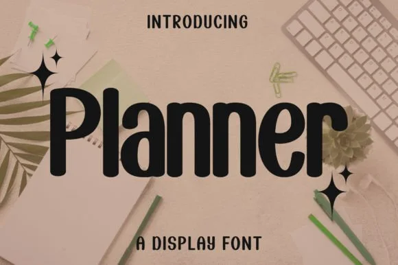
Bold condensed rounded-terminal display sans
Planner is a clean, bold condensed display sans (not a messy script) featuring smooth rounded terminals and tall, space-saving lowercase.
Ideas for this font
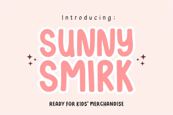
Rounded caps with white contour
Sunny Smirk is a rounded caps display in coral pink with a thick white contour on a pale ground: wide letters with soft corners, a high waist and open counters, a slight bounce, four-point sparkles at the sides and a tracked note beneath about its intended use.
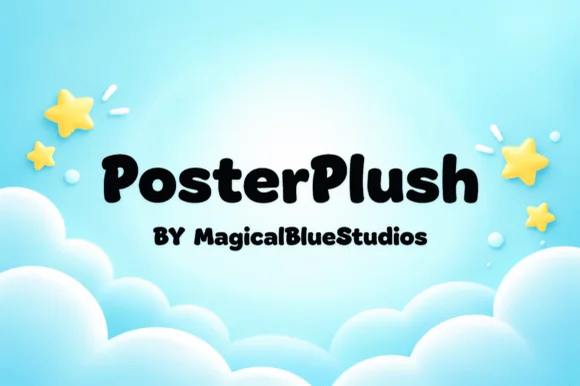
Heavy plush hand-drawn rounded poster display
Posterplush is a bold, velvety-thick rounded display font combining heavy black poster mass with warm hand-drawn softness.
Ideas for this font
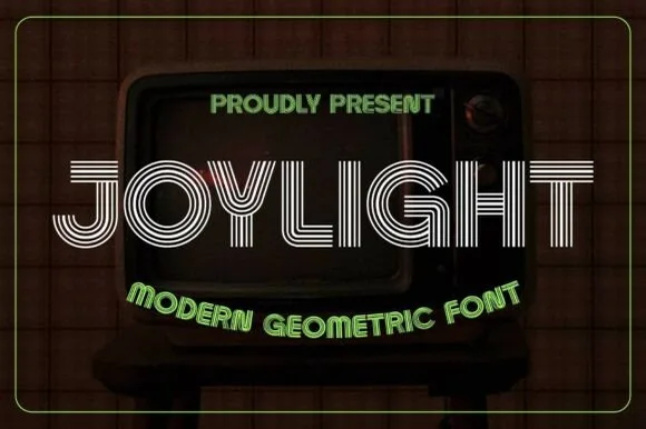
5-line concentric 1980s CRT-TV & synth-funk multiline sans
Joylight is a sleek retro-futuristic multilinear display font tracing geometric uppercase letters in five crisp parallel neon-ready tracks.
Ideas for this font
Same independent foundry
Allow optional Google Analytics to measure visits and catalogue actions. Your search words and notes are not included. Privacy & storage