Neutral Sans Workhorse

Joylight + Miniplate
Lets Joylight own the focal silhouette while handling secondary copy, sizing and subheads cleanly.
Inspect Miniplate specimenDisclosure: MakerFileHub may earn a commission from qualifying purchases via paid links on this page. How our links work.
5-line concentric 1980s CRT-TV & synth-funk multiline sans
Joylight is a sleek retro-futuristic multilinear display font tracing geometric uppercase letters in five crisp parallel neon-ready tracks.
Paid link
Get this fontProject & layout blueprintsAt-a-glance maker compatibility
Sturdy stroke walls and open counters weed cleanly on adhesive vinyl, HTV apparel film, and cut cardstock.
Visual anatomy & craft review
Joylight is a multilinear display in caps that traces each geometric letter with five parallel tracks, so a word reads as a glowing CRT readout rather than a solid shape. The tracks are thin and evenly spaced, which means the face lives or dies on print resolution: close the gaps and the word becomes a slab, break a track and it becomes noise. It needs roughly 40 mm for five tracks to stay separate, and it is best as white or neon on dark, or as a single ink on a pale ground for print.
CRT-multiline · Retro-future · Geometric
Two-font hierarchy recipes
Tested contrast partners — pairing Joylight with grounded secondary typography.
Joylight + Miniplate
Lets Joylight own the focal silhouette while handling secondary copy, sizing and subheads cleanly.
Inspect Miniplate specimen
Joylight + The Bilstein Editorial
Grounds bold display lettering with classic typographic authority on posters, badges and apparel.
Inspect The Bilstein Editorial specimenPractical applications
Concrete hierarchy, scale and production guidance tailored to Joylight’s stroke geometry.
Five-track letterforms read as a 1980s screen, which is the reference a synth or retro-tech feature borrows for an opener. The parallel lines give a headline its own texture without a background image, and one neon ink on black keeps the print affordable for a small run.
Hierarchy & layout recipe
Opener 420 x 297 mm, headline 130 mm, body 9/13 pt, 15 mm margins. Poster A2, word 300 mm, details 22/28 pt, 30 mm margins and 20 mm trim. Sleeve 312 x 312 mm, word 200 mm, credits 7 pt.
Pre-production check
At 300 mm the five tracks need 0.6 mm each with 0.6 mm gaps, and a 300 dpi raster print merges the middle tracks into a grey band. Supply vector art and specify 0.5 mm minimum line, and check one poster at 1:1 before the run.
Multiline letterforms read as a lit arcade cabinet, which is what a retro games bar is branding. The tracks translate directly to bent neon and to a printed menu that imitates it, so a sign and a card share one look at two budgets.
Hierarchy & layout recipe
Neon sign 1200 x 400 mm, word 260 mm, 80 mm margins and 60 mm clear of the transformer box. Menu 105 x 297 mm, sections 16 mm, items 8/11 pt, 10 mm margins. Card 85 x 55 mm, name 9 mm, 5 mm margins.
Pre-production check
A bent-neon version needs the tracks mapped to glass and each letter becomes five bulbs wide, so a 260 mm word doubles in footprint and overruns the window. Redraw the sign to three tracks for neon, and approve a full-size paper template on the glass first.
Screen-track lettering reads as a themed decade party, which is what a milestone birthday is built around. The parallel lines cut cleanly as a banner word at 140 mm, and a single bright ink on black card makes the invite feel like a flyer from the period.
Hierarchy & layout recipe
Invite A6, word 40 mm, details 8/11 pt, 12 mm margins. Banner 900 x 300 mm, word 140 mm, 40 mm margins and 20 mm clear of each eyelet. Cup wrap 200 x 90 mm, word 20 mm, 10 mm from the rim.
Pre-production check
A 40 mm invite word leaves each track under 0.3 mm and a home laser printer drops alternate tracks so the word reads as a dashed outline. Keep the invite word at 55 mm or print on a digital press, and check one card before the batch.
Technical & licence verification
Confirm included OTF/TTF/WOFF formats, full glyph tables and licence coverage on the live store page before batch production.
Closest visual alternatives
Matched across letterform anatomy, stroke behaviour and craft applications.
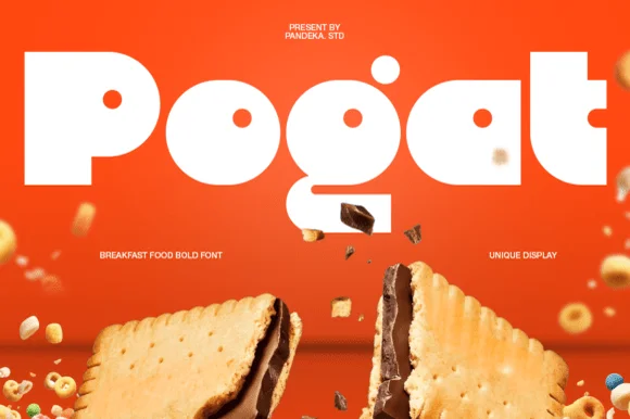
Ultra-fat heavy-packaging & cereal-box geometric display
Pogat is an ultra-heavy, slab-thick retro packaging font with massive ink mass and tiny circular pinhole counters built for snack and food branding!
Ideas for this font
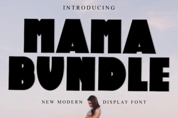
Fat condensed display with notched counters
Mama Bundle is a fat condensed display in black on a pale sky: extremely heavy strokes, counters reduced to narrow slots, letters set almost touching, and small notches cut into the tops of the M and the A that keep the mass from reading as a solid block.
Ideas for this font
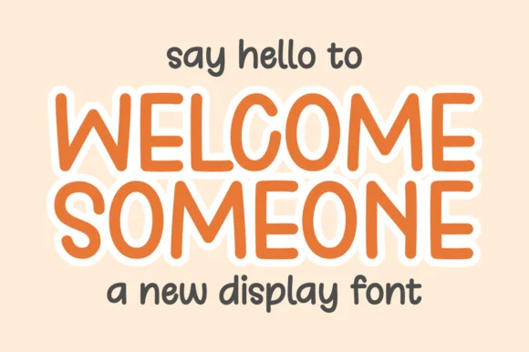
Tall rounded monoline display with keyline
Welcome Someone is a tall rounded monoline display in orange with a white keyline: narrow capitals of even stroke weight, softly squared corners, a slight bounce, and a wide white outline that separates the word from a pale ground.
Ideas for this font
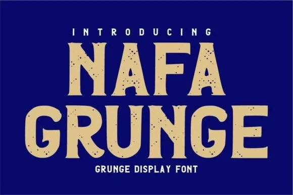
Rough-edged vintage sign-painter & stencil-notched sans
Nafa Grunge is a bold vintage sans-display font pairing subtly notched outer contours with clean, solid interiors.
Ideas for this font
Same independent foundry
Allow optional Google Analytics to measure visits and catalogue actions. Your search words and notes are not included. Privacy & storage