Neutral Sans Workhorse

Sunny Smirk + Sailors
Lets Sunny Smirk own the focal silhouette while handling secondary copy, sizing and subheads cleanly.
Inspect Sailors specimenDisclosure: MakerFileHub may earn a commission from qualifying purchases via paid links on this page. How our links work.
Rounded caps with white contour
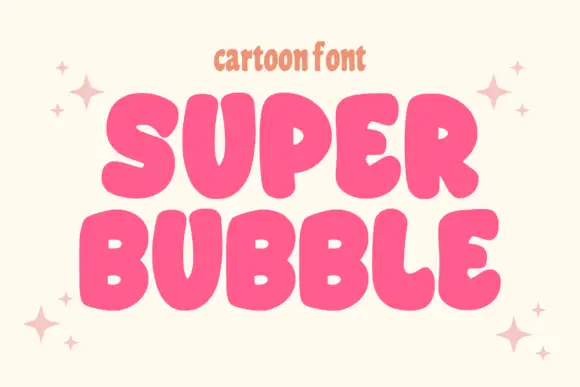
Sunny Smirk is a rounded caps display in coral pink with a thick white contour on a pale ground: wide letters with soft corners, a high waist and open counters, a slight bounce, four-point sparkles at the sides and a tracked note beneath about its intended use.
Paid link
Get this fontProject & layout blueprintsAt-a-glance maker compatibility
Sturdy stroke walls and open counters weed cleanly on adhesive vinyl, HTV apparel film, and cut cardstock.
Visual anatomy & craft review
The word is set in two lines and each letter is a wide rounded form: the strokes are even, the corners are soft, and the contour is heavy enough to act as a sticker edge, which is what makes the face suitable for kids' merchandise. The bounce is mild and consistent, so the block reads as cheerful rather than wobbly, and the open counters keep it legible at small sizes on a tote or a tee. Because the contour surrounds each letter, the face can be placed on any background without a colour change, and the specimen proves it on a pale ground with sparkles at both sides. The tracked note beneath names the target use in a condensed sans, which is the only other type on the plate.
Rounded, playful, kids, friendly
Two-font hierarchy recipes
Tested contrast partners — pairing Sunny Smirk with grounded secondary typography.
Sunny Smirk + Sailors
Lets Sunny Smirk own the focal silhouette while handling secondary copy, sizing and subheads cleanly.
Inspect Sailors specimen
Sunny Smirk + Augler
Grounds bold display lettering with classic typographic authority on posters, badges and apparel.
Inspect Augler specimenPractical applications
Concrete hierarchy, scale and production guidance tailored to Sunny Smirk’s stroke geometry.
A rounded contour face reads as a sticker, and the even stroke stays open at 40 mm where a busier display would clot on a die cut.
Hierarchy & layout recipe
Die-cut six 40 mm stickers: the phrases at 12 pt, the names at 8 pt, and 2 mm clear to each die. Keep the smallest counter at 4 mm and print three colours on white vinyl.
Pre-production check
Check the die cut at 40 mm, where the contour can swallow a counter; enlarge it. Confirm the stickers peel cleanly and that the contour holds on a curved bottle.
A rounded label reads as friendly packaging, and the contour lets one artwork sit on a white, kraft or coloured pack without a redesign.
Hierarchy & layout recipe
Print a 55 mm round label: the brand at 13 pt, the flavour in a 6 pt sans, and a sparkle. Keep 4 mm inside the die and print two colours on a white stock so the contour stays crisp.
Pre-production check
Check the 13 pt brand, where the contour can merge with the background; keep the contrast. Confirm the 6 pt flavour reads on the shelf and that the label sits flat on a curved tin.
A rounded friendly face reads from a distance across a school hall, and the flat colours keep a school's in-house print run inexpensive for a single afternoon event.
Hierarchy & layout recipe
A2 print: the fair at 130 mm cap height, the times in a 20 mm sans, and a 5 mm rule. Keep 30 mm margins and print three flat colours on a white ground so the contour stays separate.
Pre-production check
Check the A2 at five metres, where the contour can read as a blur; keep it at a fixed weight. Confirm the 20 mm times read at three metres and that the rule clears the sparkles.
Technical & licence verification
Confirm included OTF/TTF/WOFF formats, full glyph tables and licence coverage on the live store page before batch production.
Closest visual alternatives
Matched across letterform anatomy, stroke behaviour and craft applications.
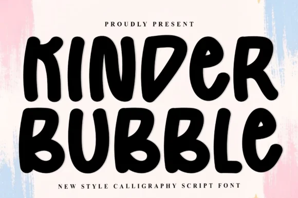
Heavy hand-cut playroom block display
Kinder Bubble is a bold, solid-black hand-drawn block display font with soft organic edges and playful mixed-case letterforms.
Ideas for this font
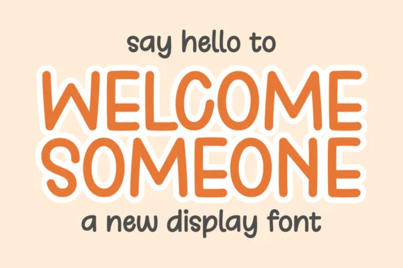
Tall rounded monoline display with keyline
Welcome Someone is a tall rounded monoline display in orange with a white keyline: narrow capitals of even stroke weight, softly squared corners, a slight bounce, and a wide white outline that separates the word from a pale ground.
Ideas for this font
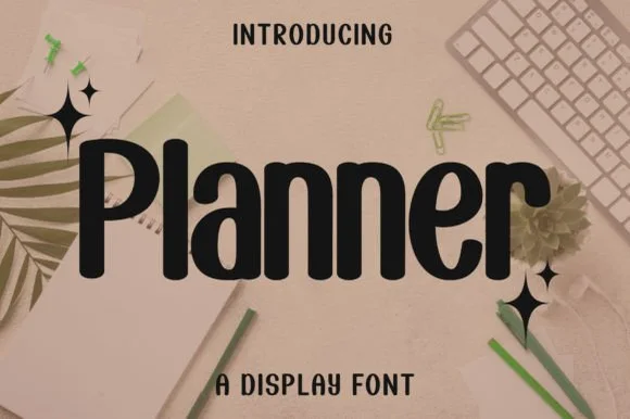
Bold condensed rounded-terminal display sans
Planner is a clean, bold condensed display sans (not a messy script) featuring smooth rounded terminals and tall, space-saving lowercase.
Ideas for this font
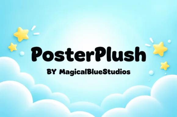
Heavy plush hand-drawn rounded poster display
Posterplush is a bold, velvety-thick rounded display font combining heavy black poster mass with warm hand-drawn softness.
Ideas for this font
Same independent foundry
Allow optional Google Analytics to measure visits and catalogue actions. Your search words and notes are not included. Privacy & storage