Modern Grotesque Body

Tattoo Lettering + Sailors
Creates crisp high-hierarchy contrast beneath Tattoo Lettering headlines across menus, websites and labels.
Inspect Sailors specimenDisclosure: MakerFileHub may earn a commission from qualifying purchases via paid links on this page. How our links work.
Letterpress tattoo lettering
Tattoo Lettering is a decorative plate in cream on charcoal: a swollen display alphabet with notched spurs and heavy serifs, set in two lines with a thin ornamental rule above and below, a small tracked label at the left and a boxed note at the foot naming the collection.
Paid link
Get this fontProject & layout blueprintsAt-a-glance maker compatibility
Sturdy stroke walls and open counters weed cleanly on adhesive vinyl, HTV apparel film, and cut cardstock.
Visual anatomy & craft review
The plate is a period composition rather than a specimen grid: an ornamental hairline rule runs across the top, the two lines are centred beneath it, and a second rule closes the frame at the foot. The letterforms are a letterpress display — heavy serifs, notched spurs, a swollen waist — which reads as tattoo flash from the early twentieth century without a blackletter. Because the letters are heavy and the serifs are wide, the face holds at a small size and on skin, which is what a tattoo lettering set is for. The small tracked label and the boxed note are set in a light serif, and the palette is one ink on a dark ground, which keeps the ornamental rules visible without a second colour.
Decorative, letterpress, vintage, ornamental
Two-font hierarchy recipes
Tested contrast partners — pairing Tattoo Lettering with grounded secondary typography.
Tattoo Lettering + Sailors
Creates crisp high-hierarchy contrast beneath Tattoo Lettering headlines across menus, websites and labels.
Inspect Sailors specimen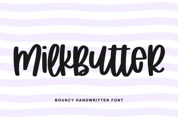
Tattoo Lettering + Milkbutter
Adds a warm human signature touch for 1-to-3-word callouts without competing against structured serif capitals.
Inspect Milkbutter specimenPractical applications
Concrete hierarchy, scale and production guidance tailored to Tattoo Lettering’s stroke geometry.
A letterpress display reads as flash-sheet lettering, and the heavy serifs stay legible at the size a tattoo flash poster is viewed from.
Hierarchy & layout recipe
A2 portrait: the event at 110 mm cap height, the artists in a 14 mm serif, and the date at 24 mm. Keep 30 mm margins, print cream on a dark ground, and keep the ornamental rules above and below the block.
Pre-production check
Check the poster at five metres, where the notched spurs can fill; keep the notches above 3 mm. Confirm the 14 mm artists read at two metres and that the rules stay clear of the type block.
A letterpress display reads as an old label on a shelf, and the heavy serifs print cleanly at a small size on an uncoated stock where a fine serif would sink into the fibre.
Hierarchy & layout recipe
Print a 60 by 90 mm label: the product at 16 pt, the strength in a 7 pt serif, and the volume at 6 pt. Keep 5 mm inside the die and print one ink on a textured stock so the notches read as impression.
Pre-production check
Check the 16 pt product on a textured label, where a notch can fill; keep the size above 13 pt. Confirm the 6 pt volume reads on the bottle and that the ornamental rule clears the die.
A letterpress display gives a vintage-themed wedding its tone, and the heavy letters hold in paint on a board seen from the far end of a room.
Hierarchy & layout recipe
A1 board: the greeting at 90 mm cap height, the names in a 40 mm serif, and the date at 22 mm. Keep 40 mm margins, paint one colour on a dark board, and keep the ornamental rules inside the frame.
Pre-production check
Check the board at four metres, where the notches can read as damage; keep them consistent. Confirm the 22 mm date reads from the door and that the rules do not crowd the names.
Technical & licence verification
Confirm included OTF/TTF/WOFF formats, full glyph tables and licence coverage on the live store page before batch production.
Closest visual alternatives
Matched across letterform anatomy, stroke behaviour and craft applications.
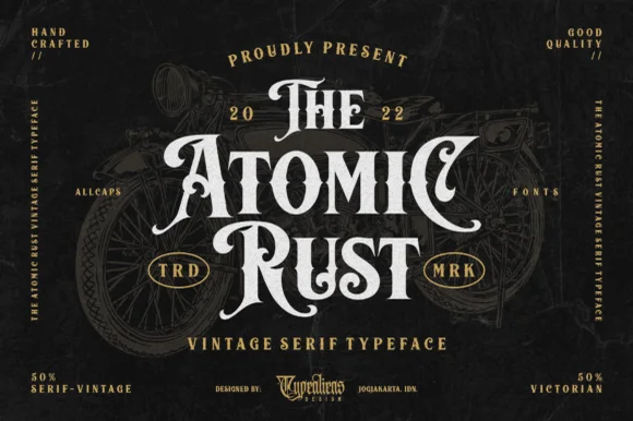
Victorian custom-motorcycle & heritage tattoo display serif
Atomic Rust is an all-caps Victorian heritage serif armed with median stem thorns, curled swash legs, and classic garage-emblem swagger.
Ideas for this font

Bold letterpress-inked vintage editorial serif
Worldstar is a bold vintage editorial serif (NOT casual handwriting!) featuring warm bracketed curves and subtle antique letterpress edge ink.
Ideas for this font
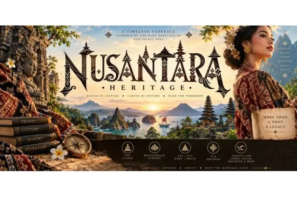
Carved Southeast-Asian temple & batik ornamental serif
Nusantara Heritage is an ornate cultural display serif inspired by Indonesian archipelago temple carvings, tropical flora, and traditional craft motifs.
Ideas for this font
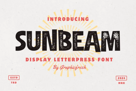
Chunky hand-cut vintage letterpress sans display
Sunbeam is a bold, wide-stance vintage sans display typeface pairing hand-carved organic contours with subtle letterpress speckle texture.
Ideas for this font
Same independent foundry
Allow optional Google Analytics to measure visits and catalogue actions. Your search words and notes are not included. Privacy & storage



