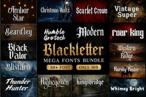
Neutral Sans Workhorse

Kingsbridge + Saltriver Grotesk
Lets Kingsbridge own the focal silhouette while handling secondary copy, sizing and subheads cleanly.
Inspect Saltriver Grotesk specimenDisclosure: MakerFileHub may earn a commission from qualifying purchases via paid links on this page. How our links work.
Narrow Gothic strokes with curled descenders and split terminals
Kingsbridge sets silver-blackletter capitals on a dark heraldic scene, the strokes tall and angular, the K throwing a long entry swash and the g closing in a hooked tail that curls under the word.
Paid link
Get this fontProject & layout blueprintsAt-a-glance maker compatibility
Sturdy stroke walls and open counters weed cleanly on adhesive vinyl, HTV apparel film, and cut cardstock.
Visual anatomy & craft review
The wordmark fills the centre of a black composition built from a crown, a sword, a shield with a rampant lion and a moonlit castle, so the type has to hold its own against a lot of metal. Letterforms are condensed with heavy verticals and sharp diamond finials, the lowercase keeping narrow bowls and pointed shoulders, and a ribbon banner below carries a two-line motto in tracked capitals. The silver is a mock-up treatment on the artwork rather than a property of the face. Because the strokes are dense and the counters narrow, the face wants a dark ground, a generous size and no competing ornament behind the letters.
Narrow Gothic strokes with curled descenders and split terminals
Two-font hierarchy recipes
Tested contrast partners — pairing Kingsbridge with grounded secondary typography.
Kingsbridge + Saltriver Grotesk
Lets Kingsbridge own the focal silhouette while handling secondary copy, sizing and subheads cleanly.
Inspect Saltriver Grotesk specimen
Kingsbridge + Evoire
Grounds bold display lettering with classic typographic authority on posters, badges and apparel.
Inspect Evoire specimenPractical applications
Concrete hierarchy, scale and production guidance tailored to Kingsbridge’s stroke geometry.
The face has the printed weight of a book spine, and the mixed case keeps a long title from turning into an unreadable band at cover size.
Hierarchy & layout recipe
Print a 152 by 229 mm cover: set the title at 54 pt across two lines, keep 20 mm of clear ground beneath before the author line at 12 pt, and keep 18 mm of margin from the trim.
Pre-production check
Narrow counters fill in offset printing; check the proof on the chosen uncoated paper stock.
The heraldic letterforms give a shop a crest-like mark, and the heavy strokes survive a small embroidered badge without closing up.
Hierarchy & layout recipe
Print a 90 mm round badge: set the shop name at 18 pt on one row, keep 8 mm of clear ground beneath before the street at 6 pt, and keep 6 mm from the art to the circle edge.
Pre-production check
Fine finials break down in embroidery; check the stitched proof before ordering the patch run.
The gothic weight sits inside a dark seasonal palette without any horror cliche, and the swash gives a short event name one focal flourish.
Hierarchy & layout recipe
Print an A2 poster: set the name at 120 pt on one row, keep 30 mm of clear ground beneath before the date at 18 pt, and keep 26 mm of border so the swash stays in the sheet.
Pre-production check
The entry swash adds width; check the layout at final size before the poster artwork is approved.
Technical & licence verification
Confirm included OTF/TTF/WOFF formats, full glyph tables and licence coverage on the live store page before batch production.
Closest visual alternatives
Matched across letterform anatomy, stroke behaviour and craft applications.
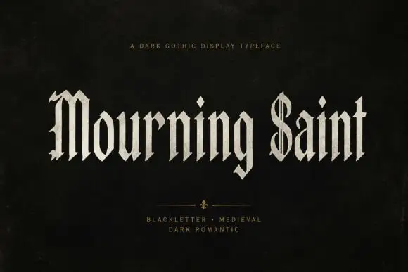
Slender blackletter display
Mourning Saint is a slender blackletter in bone on black: mixed case with a split M, a parallel-lined S, narrow bodies, sharp spurs and a tall x-height, set in two words across the sheet with a small tracked line above and two tracked lines beneath a drawn divider.
Ideas for this font
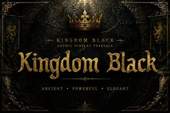
Weighty serif-like Gothic with rounded bowls and tapered sharp tips
Kingdom Black is a gothic display face filled with a textured gold, presented as a royal title plate with a crown above, lion banners at the sides and an ornamental frame.
Ideas for this font
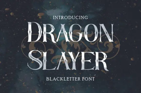
Thin tall capitals with irregular sharp joins and broad round bowls
Dragon Slayer draws a blackletter very tall and thin, keeps the contrast between stems and joins high and ends the strokes in spikes, so the word reads as a row of blades rather than a medieval text face.
Ideas for this font
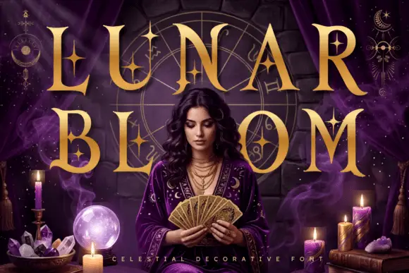
Celestial star-accented display
Lunar Bloom is a decorative display in gold over a purple scene with a figure holding a fan: tall contrast capitals with four-point star accents set inside the strokes and beside them, with crescents and star charts floating in the corners and a tracked line along the foot.
Same independent foundry
Allow optional Google Analytics to measure visits and catalogue actions. Your search words and notes are not included. Privacy & storage