Modern Grotesque Body

Saddlewick + Borsen
Creates crisp high-hierarchy contrast beneath Saddlewick headlines across menus, websites and labels.
Inspect Borsen specimenDisclosure: MakerFileHub may earn a commission from qualifying purchases via paid links on this page. How our links work.
Condensed western capitals with stem ornaments
Saddlewick is a condensed western slab in dark brown on leather: very tall capitals, squared serifs and small nicked ornaments cut into the stems, with a spur and a star in the counters.
Paid link
Get this fontProject & layout blueprintsAt-a-glance maker compatibility
Sturdy stroke walls and open counters weed cleanly on adhesive vinyl, HTV apparel film, and cut cardstock.
Visual anatomy & craft review
The name fills the width of a round badge in one line, and the letters are narrow and heavy: the S and the D carry small cuts in the middle of their stems, the A closes with a spur, the W meets in a flat vertex and the serifs are thick slabs with square corners. A thin outline rules the badge, a longhorn skull sits above the word with the establishment date either side, and a second line below sets the trade in a smaller capital set between two stars. The whole specimen is printed on a leather texture, so the face reads as a stamped brand rather than a page of type. Saddlewick is a display face with a strong regional voice: it is built for badges, signs, packaging and event marks, it needs a lot of width for a long word, and it should not be used for running text.
A tall western slab built for a badge
Two-font hierarchy recipes
Tested contrast partners — pairing Saddlewick with grounded secondary typography.
Saddlewick + Borsen
Creates crisp high-hierarchy contrast beneath Saddlewick headlines across menus, websites and labels.
Inspect Borsen specimen
Saddlewick + Handwritten
Adds a warm human signature touch for 1-to-3-word callouts without competing against structured serif capitals.
Inspect Handwritten specimenPractical applications
Concrete hierarchy, scale and production guidance tailored to Saddlewick’s stroke geometry.
A condensed slab inside a badge does the work of a logo on a cover, and the leather texture and the longhorn read the genre before the headline does.
Hierarchy & layout recipe
Print a 230 by 300 mm cover: set the badge word at 54 pt inside a 150 mm circle, keep 26 mm of clear ground beneath before the cover lines at 11 pt, and hold 20 mm of margin.
Pre-production check
Small stem cuts fill in at print size; print one cover on the intended stock and check the ornaments before the run.
A western slab gives a barn wedding its own visual language, and the badge format turns a plain board into a piece of scenery.
Hierarchy & layout recipe
Print a 600 by 400 mm board: set the names at 60 pt inside a 260 mm ring, keep 24 mm of clear ground beneath before the date line at 18 pt, and hold 24 mm of border.
Pre-production check
Tight counters close at large sizes over a textured surface; print one board at the final size and check the counters before the set.
A condensed western slab set in a ring is a complete identity in one line, which is what a small heritage event needs on a programme and a poster.
Hierarchy & layout recipe
Print a 148 by 210 mm programme cover: set the event name at 40 pt inside an 80 mm circle, keep 16 mm of clear ground beneath before the date at 9 pt, and hold 14 mm of margin.
Pre-production check
A long event name will not fit a ring; print one cover at the finished size and check the fitting before the run.
Technical & licence verification
Confirm included OTF/TTF/WOFF formats, full glyph tables and licence coverage on the live store page before batch production.
Closest visual alternatives
Matched across letterform anatomy, stroke behaviour and craft applications.
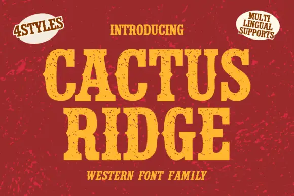
Tall notched Western slabs with small scattered erosion marks
Cactus Ridge shows yellow Western capitals on red, where pinched midsections and long broad slab ends create a tall sign shape and small dark chips interrupt the fill without any complete outline.
Ideas for this font
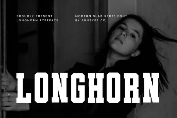
Very condensed clean slab
Longhorn is a very condensed slab in white over a black-and-white portrait: narrow capitals with thick square slabs, clipped rectangular bowls and flat terminals, set as one word across the lower third, with two small tracked notes at the upper left and right.
Ideas for this font
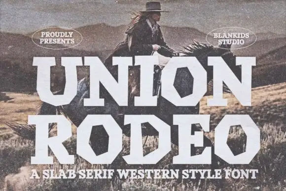
Broad geometric Western blocks with strongly polygonal bowls
Union Rodeo sets a western slab in huge white capitals, its corners chamfered and its stems notched, so the word looks stencilled on a barn door rather than set in a modern face.
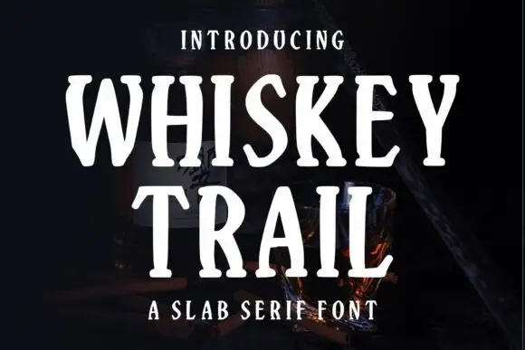
Narrow irregular slab
Whiskey Trail is a narrow irregular slab in cream over a dark still life of a bottle and a glass: tall capitals with soft angled slab ends, uneven stems and open bowls, set in two lines with a small tracked line above and a plain line beneath.
Ideas for this font
Same independent foundry
Allow optional Google Analytics to measure visits and catalogue actions. Your search words and notes are not included. Privacy & storage