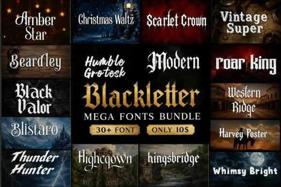
Editorial Serif Anchor

Black Ink Brush + Amor Hadena
Anchors Black Ink Brush's fluid strokes with crisp Roman proportions on wedding suites, headers and packaging.
Inspect Amor Hadena specimenDisclosure: MakerFileHub may earn a commission from qualifying purchases via paid links on this page. How our links work.
Rough slanted brush capitals with dry edges and a heavy lean
Black Ink Brush is rough slanted brush lettering in which the strokes stay heavy through the middle and fray at the ends, and the whole phrase leans hard to the right.
Paid link
Get this fontProject & layout blueprintsAt-a-glance maker compatibility
Weld or Unite overlapping script joins into one continuous vector path before sending to the blade.
Visual anatomy & craft review
The letters are drawn as separate brush strokes rather than as a connected script: the B is one loaded stem plus two rough bowls, the I is a single dry stroke, the N carries two heavy diagonals and the K splays from a single point. Ends fray and split where the brush lifted, the insides of the strokes show streaks where the ink ran thin, and the lean stays constant at roughly fifteen degrees, which is what gives the phrase its speed. Weight is heavy but uneven, and the fit is tight enough that the two stacked words read as one mark. Splatter around the sample is a separate decorative element, not part of the typeface. The cream ground, the red accent word and the small stamp are presentation; the lettering is the words.
Rough · Brushed · Angled
Two-font hierarchy recipes
Tested contrast partners — pairing Black Ink Brush with grounded secondary typography.
Black Ink Brush + Amor Hadena
Anchors Black Ink Brush's fluid strokes with crisp Roman proportions on wedding suites, headers and packaging.
Inspect Amor Hadena specimen
Black Ink Brush + Clyne Sans
Keeps small-scale dates, URLs, nutrition facts and care instructions crisp and legible below script titles.
Inspect Clyne Sans specimenPractical applications
Concrete hierarchy, scale and production guidance tailored to Black Ink Brush’s stroke geometry.
The rough brush reads as painted by hand on a window or a wall, and the heavy lean gives a small studio a mark with movement at no extra cost.
Hierarchy & layout recipe
Set the studio name at 20 cm across the window, keep the opening hours in a clean sans at 4 cm, and hold 12 cm of clearance so the frayed ends are not cut by the frame.
Pre-production check
Vinyl loses the dry fray; check a cut at full size and keep the thinnest stroke 3 mm or accept a simplified edge before plotting.
The rough brush suits a garment print, and the tight stacked fit lets a two-word name fill a chest without a second element.
Hierarchy & layout recipe
Set the first word at 80 mm across a 260 mm chest, set the second at 60 mm beneath with 6 mm of gap, and keep 20 mm from the collar seam so the print stays on the panel.
Pre-production check
A dry brush tip under 1 mm disappears in screen print; check a pull on the actual garment and thicken the smallest tips before the run.
The heavy rough lettering gives a music cover its tone without an illustration, and the lean keeps the line moving across the page.
Hierarchy & layout recipe
Set the cover line at 72 pt on the upper third, keep the issue details in a 9 pt sans, and leave 20 mm of margin so the frayed ends stay inside the safe area.
Pre-production check
Rough edges on coated stock can look like a printing fault; check the proof at final size and keep the line on the rougher uncoated stock.
Technical & licence verification
Confirm included OTF/TTF/WOFF formats, full glyph tables and licence coverage on the live store page before batch production.
Closest visual alternatives
Matched across letterform anatomy, stroke behaviour and craft applications.

Angular brush capitals with split ends
Rebel Marks is an angular brush face in red and white on black: bold capital letters brushed with flat angled strokes, ragged split ends and a tilted baseline, surrounded by scribbles, badges and a stencil mark.
Ideas for this font
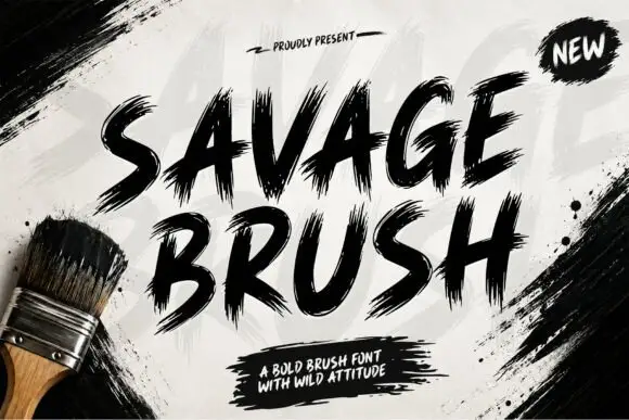
Heavy dry-brush textured script
Savage Brush is a heavy dry-brush script in black on a whitewashed wall: very thick strokes with torn, split edges, short loops and a hard forward lean, printed beside a house brush on the sheet.
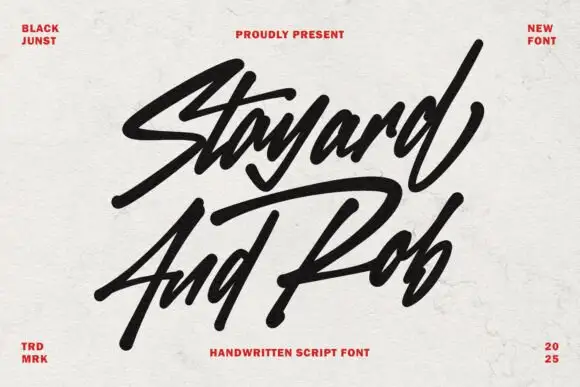
Angular marker script with sharp terminals
Stayard and Rob is a bold marker script in black on off-white paper: angled strokes, sharp cut terminals and a fast forward lean, with small red caps in the corners as the only decoration.
Ideas for this font
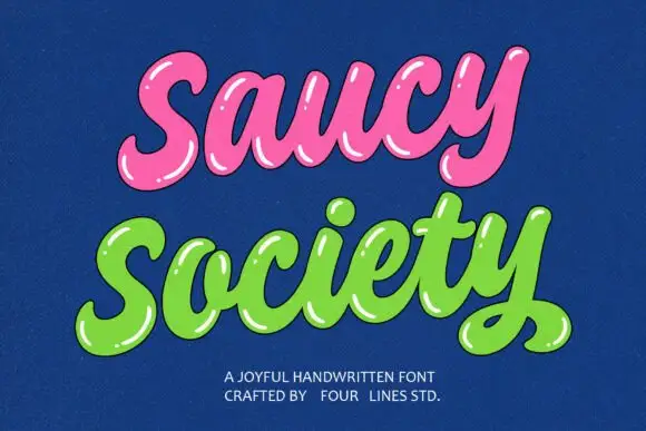
Glossy bubble script with highlights
Saucy Society is a glossy bubble script in pink and green on deep blue: fat inflated letters, drawn white highlights along the top of every stroke, and a soft shadow that makes the words look like blown sweets.
Ideas for this font
Same independent foundry
Allow optional Google Analytics to measure visits and catalogue actions. Your search words and notes are not included. Privacy & storage