Neutral Sans Workhorse

Stars + Kohilo
Lets Stars own the focal silhouette while handling secondary copy, sizing and subheads cleanly.
Inspect Kohilo specimenDisclosure: MakerFileHub may earn a commission from qualifying purchases via paid links on this page. How our links work.
Star-perforated display
Stars is a novelty display in white on a night-sky gradient: heavy irregular capitals perforated by five-point stars of different sizes, with a stippled line above and a stippled caption beneath, plus a small hand-drawn badge at the foot.
Paid link
Get this fontProject & layout blueprintsAt-a-glance maker compatibility
Sturdy stroke walls and open counters weed cleanly on adhesive vinyl, HTV apparel film, and cut cardstock.
Visual anatomy & craft review
The word spans the plate and the drawing is a heavy capital whose counters are replaced by scattered star holes, so the letters read as cut paper over a night sky. That construction sets a size floor, because the smallest stars close when the letters shrink, and the plate sets the word large enough that every hole is visible. The stippled lines above and beneath are the same treatment applied at a smaller size, which usefully shows the limit of the effect, and the badge at the foot is a studio mark. The night-sky gradient is staging that supplies the colour through the holes. It suits a party sign, a child's card and a shirt rather than a heading in a document, and the plate is honest about that by showing one word only.
Decorative, novelty, stars, playful
Two-font hierarchy recipes
Tested contrast partners — pairing Stars with grounded secondary typography.
Stars + Kohilo
Lets Stars own the focal silhouette while handling secondary copy, sizing and subheads cleanly.
Inspect Kohilo specimen
Stars + Amor Hadena
Grounds bold display lettering with classic typographic authority on posters, badges and apparel.
Inspect Amor Hadena specimenPractical applications
Concrete hierarchy, scale and production guidance tailored to Stars’s stroke geometry.
A star-perforated display lets the background colour show through, which turns a plain sign into a night scene. The sky shows through the letters as the colour.
Hierarchy & layout recipe
A2 print: the greeting at 90 mm cap height, the name at 40 mm, and the time at 18 mm. Keep 28 mm margins and print one colour on a dark stock. Leave 26 mm under the time for the address.
Pre-production check
Check the A2 at four metres, where a small star can close; keep the smallest above 4 mm. Confirm the 18 mm time reads at two metres and that the letters stay separated.
A perforated face reads as cut paper on a card, and the holes give the design depth without a photograph. A party card gains depth from the holes.
Hierarchy & layout recipe
A6 card: the greeting at 26 pt, the details in a 9.5 pt sans, and the date at 8.5 pt. Keep 15 mm margins and print two colours on a dark card. Leave 14 mm at the foot for the address line.
Pre-production check
Check the 26 pt greeting at home-print resolution, where a star can fill; keep the smallest above 1.5 mm. Confirm the 9.5 pt details keep a 4.5:1 contrast and that the card folds flat.
A star-cut display names the subject in the lettering, and the heavy shapes read across a corridor notice board. A club poster names its subject in the type.
Hierarchy & layout recipe
A3 poster: the club at 75 mm cap height, the meeting time in a 20 mm sans, and the room at 11 mm. Keep 25 mm margins and print two colours on a dark stock.
Pre-production check
Check the A3 at four metres, where the holes can merge into noise; keep 3 mm between stars. Confirm the 11 mm room reads at two metres and that the poster sits at eye height.
Technical & licence verification
Confirm included OTF/TTF/WOFF formats, full glyph tables and licence coverage on the live store page before batch production.
Closest visual alternatives
Matched across letterform anatomy, stroke behaviour and craft applications.
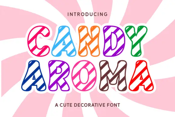
Rounded hollow capitals crossed by broad diagonal candy-like stripes
Candy Aroma draws fat sweet-shop letters, fills each one with diagonal candy stripes in a bright colour, and outlines every shape in white so the word looks cut out of a paper bag.
Ideas for this font
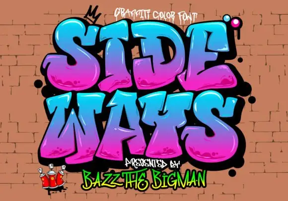
Rounded graffiti blocks with cyan-to-magenta shading and black depth
Sideways is a graffiti colour face in which the letters are fat, tilted blocks with a heavy black outline, a magenta-to-cyan gradient and a soft highlight, presented on a brick wall with sprayed drips.
Ideas for this font
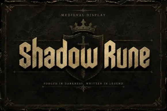
Squared narrow blackletter
Shadow Rune is a squared narrow blackletter in bone on a dark stone ground: capitals with diagonal shoulders, a clipped S, blunt stems and a small scale texture, set as two words across a shield device with a small tracked line above and a plain line beneath.
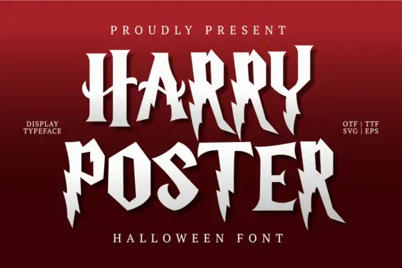
Irregular pointed capitals with lightning-like cuts and long legs
Harry Poster is a fantasy display face whose caps are cut with lightning: the stems break into jagged steps, the terminals end in points and every letter carries a hard shadow offset to one side.
Ideas for this font
Same independent foundry
Allow optional Google Analytics to measure visits and catalogue actions. Your search words and notes are not included. Privacy & storage