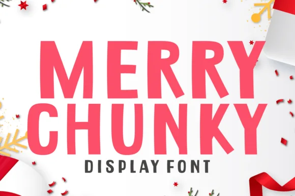
Neutral Sans Workhorse

Candy Aroma + Clyne Sans
Lets Candy Aroma own the focal silhouette while handling secondary copy, sizing and subheads cleanly.
Inspect Clyne Sans specimenDisclosure: MakerFileHub may earn a commission from qualifying purchases via paid links on this page. How our links work.
Rounded hollow capitals crossed by broad diagonal candy-like stripes
Candy Aroma draws fat sweet-shop letters, fills each one with diagonal candy stripes in a bright colour, and outlines every shape in white so the word looks cut out of a paper bag.
Paid link
Get this fontProject & layout blueprintsAt-a-glance maker compatibility
Sturdy stroke walls and open counters weed cleanly on adhesive vinyl, HTV apparel film, and cut cardstock.
Visual anatomy & craft review
CANDY over AROMA fills the card, each letter a different colour with white diagonal stripes running through the fill, a white keyline outside, and a soft pink pinwheel ground turning behind the words. The shapes are heavy and round with tight spacing, so the two rows read as one block, and the stripe angle is the same in every letter, which holds the set together where a free mix of angles would look like a scrapbook. A line of small serif caps at the top introduces the face and a single line at the foot names the style, and nothing else is on the card. The stripes are wide enough to survive a small reproduction and fine enough to keep the letters from looking flat, and the white keyline is what lets two colours sit side by side without a hard edge. It is a display face for sweets, parties and children's products, and at under about 20 pt the stripes collapse.
Rounded hollow capitals crossed by broad diagonal candy-like stripes
Two-font hierarchy recipes
Tested contrast partners — pairing Candy Aroma with grounded secondary typography.
Candy Aroma + Clyne Sans
Lets Candy Aroma own the focal silhouette while handling secondary copy, sizing and subheads cleanly.
Inspect Clyne Sans specimen
Candy Aroma + Raffined
Grounds bold display lettering with classic typographic authority on posters, badges and apparel.
Inspect Raffined specimenPractical applications
Concrete hierarchy, scale and production guidance tailored to Candy Aroma’s stroke geometry.
The candy fill says what is inside the box, and the white keyline lets the word sit on a pink ground without an extra panel behind it.
Hierarchy & layout recipe
Print a 105 by 148 mm card: set the greeting at 48 pt across two rows, keep 16 mm of clear ground beneath before the shop address at 7 pt, and hold 14 mm from the white edge to the card trim.
Pre-production check
Narrow stripes moire on cheap card stock; print one card on the actual board and look at the stripes under a lamp.
The lettering names the table from across a room, and the white outline keeps each colour separate where a plain colour font would turn into a jumble of shapes.
Hierarchy & layout recipe
Print a 300 by 450 mm sign: set the word at 130 pt on one row, keep 24 mm of clear ground beneath before the price at 16 pt, and hold 22 mm of border so no white keyline is cut at the edges.
Pre-production check
Colour letters need white ink under the bright tones; print one sign on the real material and check the pink before the set.
The stripes read at a glance from a queue, and the bright palette matches a van's paint without a second colour scheme to design around.
Hierarchy & layout recipe
Print a 220 by 150 mm window sticker: set the shop name at 60 pt on one row, keep 20 mm of clear ground beneath before the menu line at 10 pt, and hold 18 mm from the outline to the sticker edge.
Pre-production check
Vinyl stickers fade in strong sun within a season; print one and leave it on glass for a fortnight before the batch.
Technical & licence verification
Confirm included OTF/TTF/WOFF formats, full glyph tables and licence coverage on the live store page before batch production.
Closest visual alternatives
Matched across letterform anatomy, stroke behaviour and craft applications.
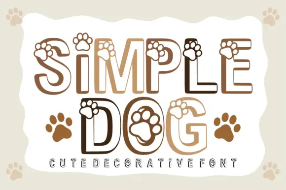
Paw-print outlined display
Simple Dog is an outlined rounded display in warm browns on a pale ground: light caps drawn as a heavy contour with paw prints overlapping the upper edges and sitting inside the counters, with two solid paw prints beside the second line and a tracked line at the foot.
Ideas for this font
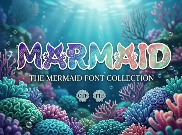
Scale-filled outlined display
Marmaid is a rounded outlined display on an underwater scene: heavy caps drawn as a light face with a white contour, filled with fine scale patterns and small marine shapes, in a gradient of teal, lilac and coral against a photographed reef.
Ideas for this font
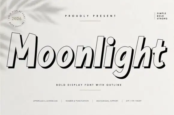
Heavy slanted display with outline
Moonlight is a forward-sloping heavy display in black on white: fat mixed-case letters drawn as a pale face with a bold contour and a black offset shadow, with a round badge at the upper left, a rule above the word and a row of tracked notes at the foot.
Ideas for this font
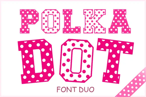
Angular slab-serif capitals alternating solid dotted and hollow dotted treatments
Polka Dot draws its capitals as octagons with the corners cut straight off, then punches a scatter of round holes through the fill so every letter looks like a punched paper tag.
Ideas for this font
Same independent foundry
Allow optional Google Analytics to measure visits and catalogue actions. Your search words and notes are not included. Privacy & storage