Neutral Sans Workhorse

Harry Poster Regular Font + One More
Lets Harry Poster Regular Font own the focal silhouette while handling secondary copy, sizing and subheads cleanly.
Inspect One More specimenDisclosure: MakerFileHub may earn a commission from qualifying purchases via paid links on this page. How our links work.
Irregular pointed capitals with lightning-like cuts and long legs
Harry Poster is a fantasy display face whose caps are cut with lightning: the stems break into jagged steps, the terminals end in points and every letter carries a hard shadow offset to one side.
Paid link
Get this fontProject & layout blueprintsAt-a-glance maker compatibility
Sturdy stroke walls and open counters weed cleanly on adhesive vinyl, HTV apparel film, and cut cardstock.
Visual anatomy & craft review
HARRY over POSTER fills the card in a pale silver-white on a deep red ground, and each letter is cut from straight segments with stepped notches along the edges, so the word looks struck by lightning. The shadow is a flat dark offset at the lower right rather than a soft drop, which keeps the silhouette sharp, and the letterforms stay square and readable underneath the cuts. Two small blocks of type at the sides name the style and the formats, and a spaced line at the foot names the occasion the face is made for. The design is a poster face: the cuts are large enough to read at a distance, and the whole word holds together because the counters stay open and the shadow does the separating work between adjacent letters.
Irregular pointed capitals with lightning-like cuts and long legs
Two-font hierarchy recipes
Tested contrast partners — pairing Harry Poster Regular Font with grounded secondary typography.
Harry Poster Regular Font + One More
Lets Harry Poster Regular Font own the focal silhouette while handling secondary copy, sizing and subheads cleanly.
Inspect One More specimen
Harry Poster Regular Font + Stanza
Grounds bold display lettering with classic typographic authority on posters, badges and apparel.
Inspect Stanza specimenPractical applications
Concrete hierarchy, scale and production guidance tailored to Harry Poster Regular Font’s stroke geometry.
The lightning cuts name the theme in one word, and the hard shadow keeps the letters separate on a dark ground where a flat face would merge.
Hierarchy & layout recipe
Print an A2 poster: set the event name at 120 pt across two rows, keep 30 mm of clear ground beneath before the time at 14 pt, and hold 26 mm of margin so the jagged points stay inside the sheet.
Pre-production check
Jagged points break on textured stock; print one poster on the intended paper and check the sharpest step.
The face sets the theme before the details are read, and the heavy shapes keep a short name readable on a small card in a child's hands.
Hierarchy & layout recipe
Print a 105 by 148 mm invitation: set the name at 40 pt across two rows, keep 15 mm of clear ground beneath before the details at 8 pt, and hold 12 mm of margin from the shadow side to the card edge.
Pre-production check
The offset shadow crowds the line below; print one card at the finished size and check the gap before the batch.
The lettering signals the genre at thumbnail size, and the flat shadow keeps the title readable over a painted cover image.
Hierarchy & layout recipe
Print a 135 by 216 mm cover: set the title at 58 pt across two rows, keep 22 mm of clear ground beneath before the author at 11 pt, and hold 16 mm from the widest letter to the trim.
Pre-production check
Shadow offsets print solid on uncoated covers; print one cover on the real stock and check the separation before the run.
Technical & licence verification
Confirm included OTF/TTF/WOFF formats, full glyph tables and licence coverage on the live store page before batch production.
Closest visual alternatives
Matched across letterform anatomy, stroke behaviour and craft applications.
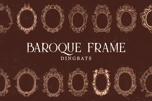
Intricate oval baroque frames with curling crowns and fine inner rings
Baroque Frame Dingbats is a set of oval cartouche frames drawn with acanthus scrolls, shell crests and bead mouldings, each one a typable character that can be dropped around a name.
Ideas for this font
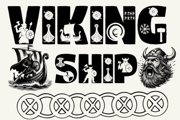
Figure-cut block display
Viking Ship is a black display on a white ground: heavy irregular capitals carrying pale cut-out figures of ships, warriors, shields, hammers and runes, set in two lines with engraved warriors at the sides and a chain of ring patterns drawn along the foot.
Ideas for this font
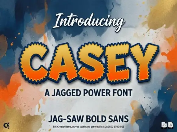
Heavy sans capitals surrounded by closely spaced sharp triangular teeth
Casey is a bold display face whose outer edge is cut into a sawtooth, filled with an orange-to-yellow gradient and outlined in navy, so a word looks cut from a jagged sticker.
Ideas for this font
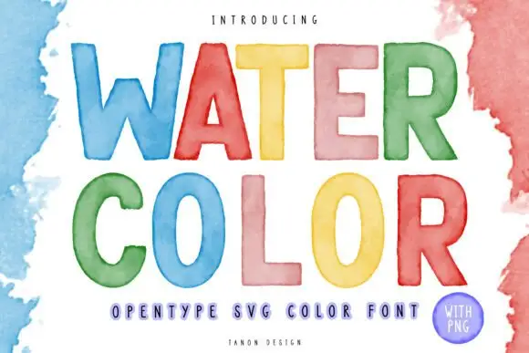
Watercolour-washed block
Watercolor is a colour display on a white ground with loose watercolour washes at the edges: simple rounded capitals, each filled with a translucent-looking wash in blue, red, yellow, pink, green or orange, with a tracked descriptor beneath and a small credit line at the foot.
Ideas for this font
Same independent foundry
Allow optional Google Analytics to measure visits and catalogue actions. Your search words and notes are not included. Privacy & storage