Editorial Serif Anchor

Line Sketch + Things
Anchors Line Sketch's fluid strokes with crisp Roman proportions on wedding suites, headers and packaging.
Inspect Things specimenDisclosure: MakerFileHub may earn a commission from qualifying purchases via paid links on this page. How our links work.
Thin monoline sketch serif
Line Sketch is a thin monoline serif in black on paper: tall narrow letterforms, hairlines of even weight, slab-ish serifs drawn with a slight wobble, and a hand-ruled feel that makes the two words look drawn with a fine pen rather than set from a font.
Paid link
Get this fontProject & layout blueprintsAt-a-glance maker compatibility
Weld or Unite overlapping script joins into one continuous vector path before sending to the blade.
Visual anatomy & craft review
The two words are stacked and the drawing starts from a serif skeleton but is rendered with a single even stroke: there is no thick-to-thin contrast at all, which is unusual for a serif and is what gives the face its sketched quality. The serifs are short and slightly uneven, the crossbars of the A and the H overshoot a little, and the verticals wobble by a fraction of a millimetre, so the word reads as something ruled by hand. Because the stroke is thin, the face needs generous spacing and a clean ground, which the specimen provides with a photograph of an open notebook. The plate is otherwise empty apart from a small tracked introduction above, a brushed block caption beneath, and a maker's mark at the foot, so the type carries the whole page.
Sketchy, thin, serif, hand-drawn
Two-font hierarchy recipes
Tested contrast partners — pairing Line Sketch with grounded secondary typography.
Line Sketch + Things
Anchors Line Sketch's fluid strokes with crisp Roman proportions on wedding suites, headers and packaging.
Inspect Things specimen
Line Sketch + Lemon Milk Pro FTR
Keeps small-scale dates, URLs, nutrition facts and care instructions crisp and legible below script titles.
Inspect Lemon Milk Pro FTR specimenPractical applications
Concrete hierarchy, scale and production guidance tailored to Line Sketch’s stroke geometry.
A thin sketch serif gives a pamphlet the look of hand-lettered stationery, and the even stroke prints cleanly at small sizes where a high-contrast serif would break on uncoated paper.
Hierarchy & layout recipe
A5 cover: the title at 34 pt, the poet in a 9 pt roman, and the press mark at 7 pt. Keep 18 mm margins and print one ink on an uncoated cream stock so the sketch quality reads as pen rather than as a printing artefact.
Pre-production check
Check the 34 pt title on uncoated stock, where the thin stroke can look pale; keep the ink solid and the size above 24 pt. Confirm the 9 pt poet reads under shop light and that the wobble does not look like a registration fault.
A thin sketch serif suits an informal outdoor wedding where a formal script would feel overdressed, and the light stroke keeps the menu from competing with the table decoration.
Hierarchy & layout recipe
A5 menu: the courses at 12 pt with 18 pt leading, the heading at 24 pt, and the date at 8 pt caps. Keep 20 mm margins, print one ink on a cream card, and set the heading in the same face so the page stays quiet.
Pre-production check
Check the 12 pt courses at arm's length, where a thin serif can lose its serifs; keep the ink weight consistent. Confirm the menu reads in shade at an outdoor table and that the heading clears the fold by 10 mm.
A drawn-looking serif signals a studio that makes things by hand, and the monoline construction means the mark reduces to a stamp or a small web header without clogging.
Hierarchy & layout recipe
A4 letterhead: the studio name at 22 pt, the address in an 8 pt roman, and a 0.3 pt rule. Keep 25 mm margins and print the name in one ink on an uncoated stock so the sketch edge stays visible.
Pre-production check
Check the 22 pt name on the press, where a thin stroke can drop out on textured paper; proof the stock. Confirm the 8 pt address reads at arm's length and that the name still works at 12 pt in an email signature.
Technical & licence verification
Confirm included OTF/TTF/WOFF formats, full glyph tables and licence coverage on the live store page before batch production.
Closest visual alternatives
Matched across letterform anatomy, stroke behaviour and craft applications.
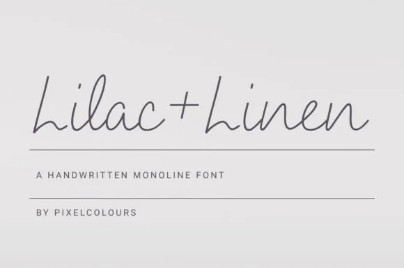
Airy fine-pen architectural monoline handwritten font
Lilac and Linen is an ultra-clean, slender monoline handwritten font blending tall open capitals with airy semi-connected pen lowercase.
Ideas for this font
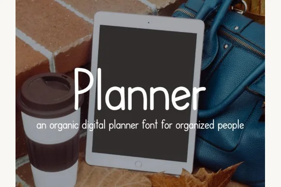
Neat iPad Apple-Pencil monoline digital-planner print sans
Planner is a tidy, upright monoline print font engineered specifically to look like neat Apple-Pencil handwriting inside GoodNotes & Notability planners!
Ideas for this font
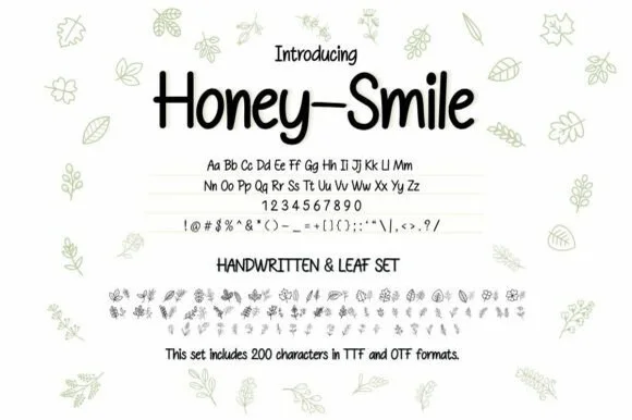
Neat tall handwritten print sans + botanical leaf dingbat bundle (OTF & TTF)
Honey–smile ('Honey-Smile') is a clean tall handwritten print sans bundled with matching botanical leaf illustrations across 200 characters (TTF & OTF)!
Ideas for this font
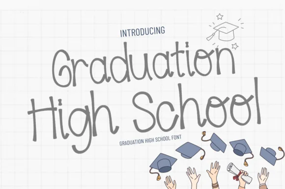
Neat tall disconnected classroom marker print sans
Graduation High School is a tidy, tall disconnected monoline print sans (zero slab serifs!) built for readable senior memory boards & invitations.
Ideas for this font
Same independent foundry
Allow optional Google Analytics to measure visits and catalogue actions. Your search words and notes are not included. Privacy & storage