Modern Grotesque Body

Rolla + Montreal
Creates crisp high-hierarchy contrast beneath Rolla headlines across menus, websites and labels.
Inspect Montreal specimenDisclosure: MakerFileHub may earn a commission from qualifying purchases via paid links on this page. How our links work.
Soft retro serif display
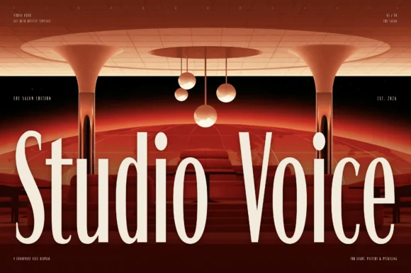
Rolla is a soft retro serif in cream on a dark blurred ground: a single heavy weight, rounded bracket where the serifs meet the stems, a large x-height, and letters that are wide and generous without any ornament.
Paid link
Get this fontProject & layout blueprintsAt-a-glance maker compatibility
Sturdy stroke walls and open counters weed cleanly on adhesive vinyl, HTV apparel film, and cut cardstock.
Visual anatomy & craft review
The word is set large across the middle of the frame, and the drawing is a display serif with the sharpness taken out: the serifs are thick and curve into the stems rather than meeting at a hard angle, the stress is nearly vertical, and the bowls of the o and the a are wide enough that the word reads as friendly rather than formal. There is no italic and no flourish in the sample, which is the point, because the face is a single workhorse display that a designer can set without decision fatigue. The contrast between thick and thin is moderate, so the word holds at small sizes as well as at poster size, and the tracking is normal for a serif, which keeps the rhythm even. The ground is a dark, out-of-focus photograph, and the cream type is the only bright element, so the specimen reads as a title card rather than a type catalogue page.
Soft, retro, warm, understated
Two-font hierarchy recipes
Tested contrast partners — pairing Rolla with grounded secondary typography.
Rolla + Montreal
Creates crisp high-hierarchy contrast beneath Rolla headlines across menus, websites and labels.
Inspect Montreal specimen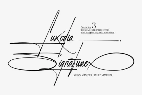
Rolla + Luxodia Signature
Adds a warm human signature touch for 1-to-3-word callouts without competing against structured serif capitals.
Inspect Luxodia Signature specimenPractical applications
Concrete hierarchy, scale and production guidance tailored to Rolla’s stroke geometry.
A soft serif gives a section opener warmth without the formality of a didone, which suits a magazine whose pages are mostly photography and short text.
Hierarchy & layout recipe
Set the section name at 72 pt in cream on a dark photograph, the standfirst in a 10 pt serif beneath, and the folio in 8 pt caps. Keep the type at least 20 mm from the image's brightest area so the contrast holds without a scrim.
Pre-production check
Check the word over the photograph at 72 pt, where a soft serif can lose its serifs against a busy image; add a light scrim if the local contrast falls below 3:1. Confirm the 10 pt standfirst stays readable at that contrast and that the folio is not lost in the image.
A soft retro serif carries a home-made, honest tone that suits preserves, and because the weight is heavy it stays legible on a small round label.
Hierarchy & layout recipe
Print a 65 mm round label: the name at 20 pt, the fruit in 7 pt caps, and the weight in 6.5 pt. Keep 5 mm clear inside the die and use a single dark ink on a cream label so the soft serifs read as printed rather than stamped.
Pre-production check
Check the name at 20 pt on the round label, where the wide letterforms can run past the label's top arc; set the line on a shallower chord. Confirm the 6.5 pt weight reads on the glass curve and that the ink does not fill the bracket of the serifs.
A soft serif reads as a yearbook cover without the stiffness of a classic roman, and a single heavy weight keeps a busy cover from looking like several designs.
Hierarchy & layout recipe
Set the year at 90 pt on a 210 by 280 mm cover, the school name in 18 pt, and the motto in 9 pt caps. Keep the type in one colour on a full-bleed photograph and reserve the lower third for a group image.
Pre-production check
Check the cover over the photograph, where cream on a pale sky loses contrast; move the type to the darker band. Confirm the 18 pt school name reads at arm's length and that the 9 pt motto survives the school's print run.
Technical & licence verification
Confirm included OTF/TTF/WOFF formats, full glyph tables and licence coverage on the live store page before batch production.
Closest visual alternatives
Matched across letterform anatomy, stroke behaviour and craft applications.
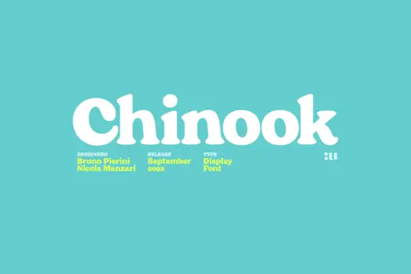
Heavy soft display serif with small rounded counters and a single weight
Chinook is a heavy display serif in which the stems are fat, the serifs are soft and the counters close to small rounded shapes, so a single word reads as a mid-century shop sign.
Ideas for this font
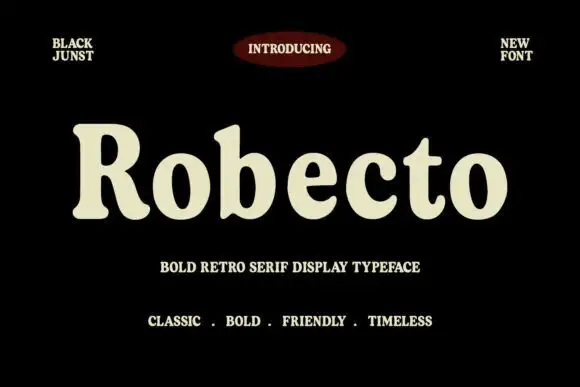
Heavy soft retro serif
Robecto is a heavy soft serif in cream on black: mixed case with thick stems, narrow counters, rounded shoulder ends and short bracketed serifs, set as one large word under a red oval badge and between two small tracked notes, with three tracked lines beneath that name its character.
Ideas for this font
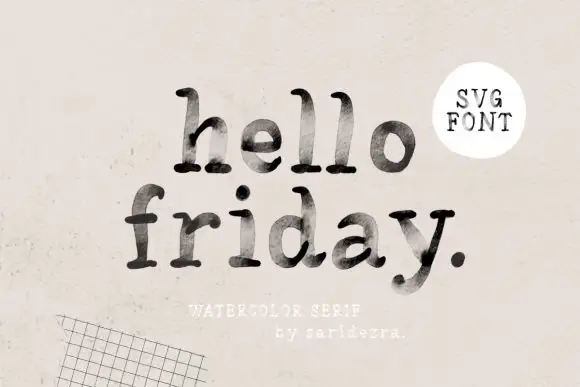
Lowercase typewriter-like forms with mottled gray-black interiors
Hello Friday is a lowercase typewriter-style serif in which the feet round off, the ascenders keep small upper terminals and the fill mottles from pale grey to near black, so a short line reads as uneven ink on a machine-typed page.
Ideas for this font
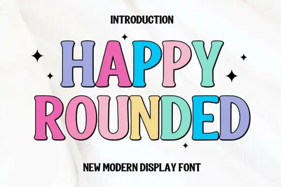
Tall display capitals with softly flared ends and gently bowed stems
Happy Rounded is a tall display serif in which the stems bow gently, the ends flare into soft spurs and the bowls stay wide, so a greeting reads as friendly lettering rather than as a formal title.
Ideas for this font
Same independent foundry
Allow optional Google Analytics to measure visits and catalogue actions. Your search words and notes are not included. Privacy & storage