Modern Grotesque Body

Happy Rounded + Swaraga
Creates crisp high-hierarchy contrast beneath Happy Rounded headlines across menus, websites and labels.
Inspect Swaraga specimenDisclosure: MakerFileHub may earn a commission from qualifying purchases via paid links on this page. How our links work.
Tall display capitals with softly flared ends and gently bowed stems
Happy Rounded is a tall display serif in which the stems bow gently, the ends flare into soft spurs and the bowls stay wide, so a greeting reads as friendly lettering rather than as a formal title.
Paid link
Get this fontProject & layout blueprintsAt-a-glance maker compatibility
Sturdy stroke walls and open counters weed cleanly on adhesive vinyl, HTV apparel film, and cut cardstock.
Visual anatomy & craft review
The H bows its uprights and finishes with rounded spurs, the O closes a narrow oval while the U opens wide, the R keeps a compact bowl over a short rounded leg and the D swells before it returns to the stem. The mismatch between a narrow O and a wide U is the character: it keeps the line lively, which is why the sample sets two even lines with generous air between them. The flared ends need clearance, so the face reads best from 26 pt and weeding stays clean from three quarters of an inch of cap height. The pastel ground, the confetti dots and the small caption beneath are presentation; the dark display words are the face.
Tall · Flared · Friendly
Two-font hierarchy recipes
Tested contrast partners — pairing Happy Rounded with grounded secondary typography.
Happy Rounded + Swaraga
Creates crisp high-hierarchy contrast beneath Happy Rounded headlines across menus, websites and labels.
Inspect Swaraga specimen
Happy Rounded + Simple Alphabet
Adds a warm human signature touch for 1-to-3-word callouts without competing against structured serif capitals.
Inspect Simple Alphabet specimenPractical applications
Concrete hierarchy, scale and production guidance tailored to Happy Rounded’s stroke geometry.
The flared capitals stay warm without turning sugary, and the tall proportions carry a two-word greeting at 48 pt on a printed cover.
Hierarchy & layout recipe
Print a 210 mm square cover: set the greeting at 48 pt on two lines, keep 14 mm between the baselines so the flares do not collide, and set the name in a 12 pt sans 20 mm below.
Pre-production check
Flared ends on stacked lines touch when the leading drops under 12 mm; check the proof and open the gap rather than shrinking the letters.
The upright bows suit a printed label band, and the consistent cap height keeps a range name tidy at 22 pt across a narrow strip.
Hierarchy & layout recipe
Print a 120 by 35 mm band: set the range name at 22 pt, keep 8 mm of clear band either side, and set the paper weight and sheet count in a 7 pt sans beneath.
Pre-production check
A band that runs to the die edge trims the flares; check the imposed label and keep 8 mm from every cut.
The soft serif reads clearly at child height, and the firm stems keep a two-word sign legible at 60 mm on a laminated board.
Hierarchy & layout recipe
Print a 400 by 200 mm board: set the sign at 60 mm, keep 25 mm of border, and laminate with a matte pouch so the soft spurs do not catch the ceiling lights.
Pre-production check
A glossy laminate over flared ends throws highlights; check the mounted sign from three metres and use matte film.
Technical & licence verification
Confirm included OTF/TTF/WOFF formats, full glyph tables and licence coverage on the live store page before batch production.
Closest visual alternatives
Matched across letterform anatomy, stroke behaviour and craft applications.
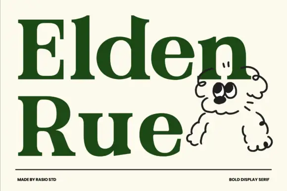
Bold display serif with wide bowls and a low contrast
Elden Rue is a bold display serif in which the bowls run wide, the contrast stays low and the serifs stay blunt, so a two-word title reads as a confident printed masthead rather than as a delicate one.
Ideas for this font
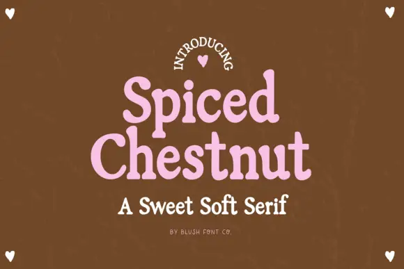
Sweet soft serif with rounded serifs
Spiced Chestnut is a sweet soft serif in pink on brown: heavy rounded letters with softened slab serifs, generous curves and a comfortable weight, set as two stacked words with a line beneath in the same family.
Ideas for this font
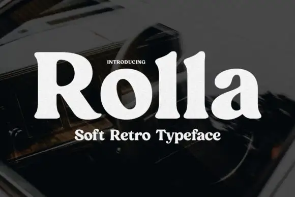
Soft retro serif display
Rolla is a soft retro serif in cream on a dark blurred ground: a single heavy weight, rounded bracket where the serifs meet the stems, a large x-height, and letters that are wide and generous without any ornament.
Ideas for this font
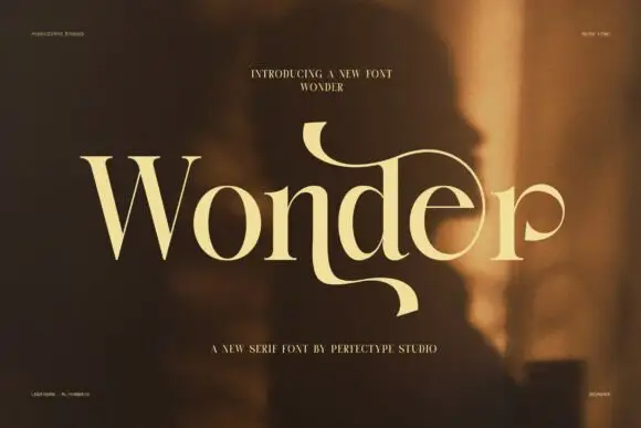
Elegant serif with dramatic swashes
Wonder is an elegant serif in cream on a warm blurred portrait: high contrast, a W drawn with long diagonal strokes, and a d whose ascender turns into a swash that loops back over the word and ends in a fine point.
Same independent foundry
Allow optional Google Analytics to measure visits and catalogue actions. Your search words and notes are not included. Privacy & storage