Modern Grotesque Body

Chinook + Nyxar
Creates crisp high-hierarchy contrast beneath Chinook headlines across menus, websites and labels.
Inspect Nyxar specimenDisclosure: MakerFileHub may earn a commission from qualifying purchases via paid links on this page. How our links work.
Heavy soft display serif with small rounded counters and a single weight
Chinook is a heavy display serif in which the stems are fat, the serifs are soft and the counters close to small rounded shapes, so a single word reads as a mid-century shop sign.
Paid link
Get this fontProject & layout blueprintsAt-a-glance maker compatibility
Sturdy stroke walls and open counters weed cleanly on adhesive vinyl, HTV apparel film, and cut cardstock.
Visual anatomy & craft review
The C opens as a broad crescent with a soft terminal, the h keeps a thick stem and a rounded shoulder, the i carries a square-ish dot and the o closes a small counter that is almost a slit, all at a heavy weight with low contrast and generously rounded joins. That combination of weight and small counters is what gives the face its period look: the letters read as solid forms rather than as a skeleton with weight added. A single word fills a wide panel at 60 pt and stays legible from a distance, which is how a shop name is used. The counters are the limit — below 20 pt the o and the e begin to fill. The turquoise ground, the white ink, the small credits and the latin text beneath are presentation; the serif is the word shown.
Soft · Heavy · Display
Two-font hierarchy recipes
Tested contrast partners — pairing Chinook with grounded secondary typography.
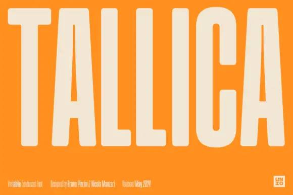
Chinook + Nyxar
Creates crisp high-hierarchy contrast beneath Chinook headlines across menus, websites and labels.
Inspect Nyxar specimen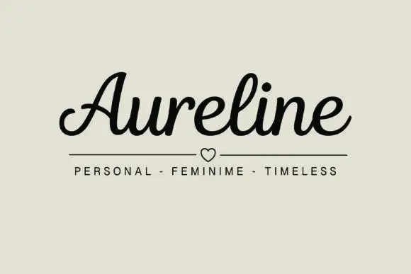
Chinook + Aureline
Adds a warm human signature touch for 1-to-3-word callouts without competing against structured serif capitals.
Inspect Aureline specimenPractical applications
Concrete hierarchy, scale and production guidance tailored to Chinook’s stroke geometry.
The soft heavy serif reads at 15 cm on a fascia and looks painted rather than set, which is what a small food business wants above its window.
Hierarchy & layout recipe
Print a 900 by 300 mm fascia panel: set the shop name at 15 cm across the centre, set the category in a 4 cm sans beneath, and keep 10 cm of border so the small counters stay clear of the panel edge and the fixings.
Pre-production check
A small counter at 15 cm through a router or a cutter can break through; check the vector at full size and widen the join between the counter and the stem.
The heavy serif gives a cover title weight without a bold sans, and the small counters keep it from reading as a plain slab at 72 pt.
Hierarchy & layout recipe
Print an A4 cover: set the title at 72 pt across the upper half, set the standfirst in an 11 pt serif beneath, and keep 18 mm of margin so the soft terminals are not trimmed by the bleed.
Pre-production check
A soft terminal printed on newsprint spreads; check a press proof and keep the face above 40 pt on uncoated stock.
The soft serif reads on a bottle label at 14 pt and gives a small producer a mark that looks printed rather than designed in a template.
Hierarchy & layout recipe
Print a 60 by 85 mm label: set the brand at 14 pt, set the flavour in a 6 pt caps sans beneath, and keep 6 mm of margin so the rounded counters are not cut where the label wraps the bottle.
Pre-production check
A label wrapped on a small bottle closes its counters visually; check a labelled bottle and keep the brand above 12 pt on the curve.
Technical & licence verification
Confirm included OTF/TTF/WOFF formats, full glyph tables and licence coverage on the live store page before batch production.
Closest visual alternatives
Matched across letterform anatomy, stroke behaviour and craft applications.
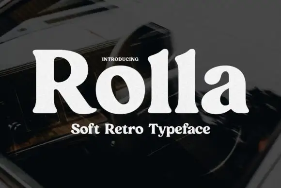
Soft retro serif display
Rolla is a soft retro serif in cream on a dark blurred ground: a single heavy weight, rounded bracket where the serifs meet the stems, a large x-height, and letters that are wide and generous without any ornament.
Ideas for this font
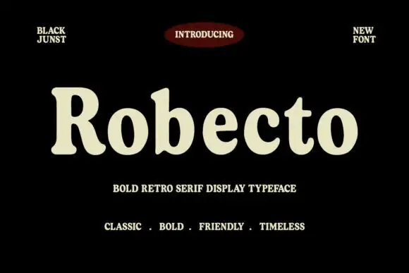
Heavy soft retro serif
Robecto is a heavy soft serif in cream on black: mixed case with thick stems, narrow counters, rounded shoulder ends and short bracketed serifs, set as one large word under a red oval badge and between two small tracked notes, with three tracked lines beneath that name its character.
Ideas for this font
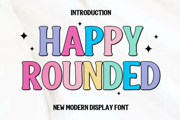
Tall display capitals with softly flared ends and gently bowed stems
Happy Rounded is a tall display serif in which the stems bow gently, the ends flare into soft spurs and the bowls stay wide, so a greeting reads as friendly lettering rather than as a formal title.
Ideas for this font
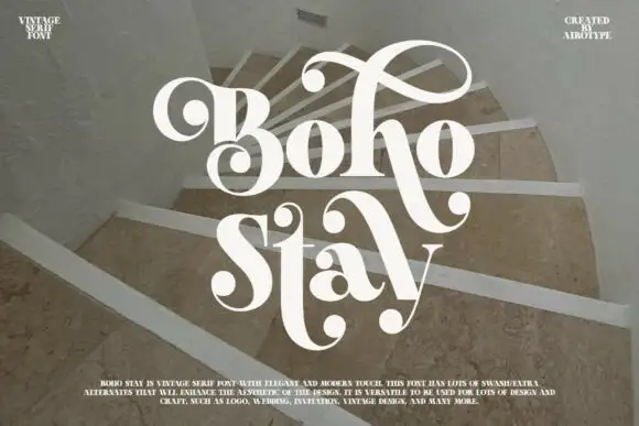
Heavy soft serifs with large ball-ended looping swashes
Boho Stay is a heavy soft serif in which the letters carry strong thick-thin contrast, the counters stay tight and large curled swashes with ball ends frame the capital, rise over the first row and sweep between the two title lines.
Ideas for this font
Same independent foundry
Allow optional Google Analytics to measure visits and catalogue actions. Your search words and notes are not included. Privacy & storage