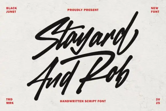
Modern Grotesque Body

Robecto + Bareum
Creates crisp high-hierarchy contrast beneath Robecto headlines across menus, websites and labels.
Inspect Bareum specimenDisclosure: MakerFileHub may earn a commission from qualifying purchases via paid links on this page. How our links work.
Heavy soft retro serif
Robecto is a heavy soft serif in cream on black: mixed case with thick stems, narrow counters, rounded shoulder ends and short bracketed serifs, set as one large word under a red oval badge and between two small tracked notes, with three tracked lines beneath that name its character.
Paid link
Get this fontProject & layout blueprintsAt-a-glance maker compatibility
Sturdy stroke walls and open counters weed cleanly on adhesive vinyl, HTV apparel film, and cut cardstock.
Visual anatomy & craft review
The word fills the plate and the drawing is a heavy serif with softened corners: the stems are thick, the counters are narrow, and the serifs are short with rounded brackets, so the face reads as a friendly retro display rather than as a book serif. That construction is what makes it work on packaging and signage, and it also sets the limitation, because the narrow counters close at small sizes. The red oval badge and the corner notes are product graphics, and the tracked line beneath names the style while the last line offers four adjectives, which is marketing copy rather than evidence. Because the letterforms are heavy and round, the face suits a label, a box and a shop sign, and the plate sets it large enough to judge the shoulders honestly.
Serif, heavy, retro, friendly
Two-font hierarchy recipes
Tested contrast partners — pairing Robecto with grounded secondary typography.
Robecto + Bareum
Creates crisp high-hierarchy contrast beneath Robecto headlines across menus, websites and labels.
Inspect Bareum specimen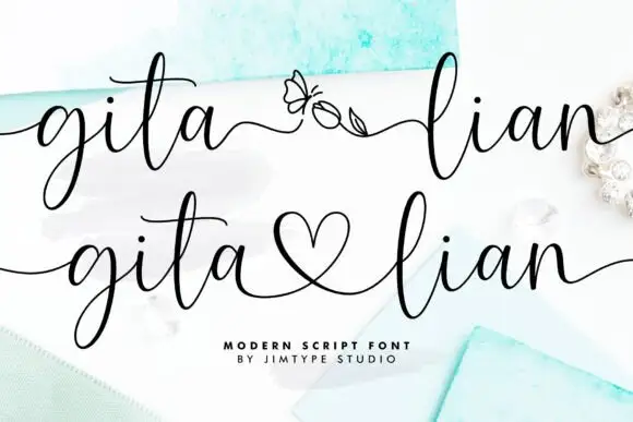
Robecto + Gita Lian
Adds a warm human signature touch for 1-to-3-word callouts without competing against structured serif capitals.
Inspect Gita Lian specimenPractical applications
Concrete hierarchy, scale and production guidance tailored to Robecto’s stroke geometry.
A heavy soft serif reads as warm and substantial, which suits a bakery box where a hairline face would look thin and clinical.
Hierarchy & layout recipe
Print a 90 by 60 mm label: the bakery at 16 pt, the product at 9 pt, and the weight at 7 pt. Keep 5 mm inside the die and keep the narrowest counter above 1.2 mm.
Pre-production check
Check the 16 pt name on a small box, where a narrow counter can fill; open it or drop to one line. Confirm the 7 pt weight reads at arm's length and that the label takes a fold.
A retro serif gives a diner the period register in one word, and the thick stems hold on a lit fascia at night. The period reads before the copy does.
Hierarchy & layout recipe
Fabricate a 1,100 by 380 mm sign: the name at 120 mm cap height, the menu line in a 24 mm sans, and a 4 mm rule. Keep 26 mm margins and specify an even backlight.
Pre-production check
Check the sign at 120 mm, where the rounded shoulders can fill with light; keep 6 mm between strokes. Confirm the 24 mm menu reads at three metres and that the rule clears the fixings.
A heavy serif gives a party card a period feel without a second illustration, and the warm weight prints cleanly at home.
Hierarchy & layout recipe
A6 card: the greeting at 24 pt, the details in a 9.5 pt sans, and the date at 8.5 pt. Keep 15 mm margins and print two colours on a cream card. Leave 12 mm at the foot for the address.
Pre-production check
Check the 24 pt greeting at home-print resolution, where a narrow counter can block; keep it above 26 pt. Confirm the 9.5 pt details keep a 4.5:1 contrast and that the card folds flat.
Technical & licence verification
Confirm included OTF/TTF/WOFF formats, full glyph tables and licence coverage on the live store page before batch production.
Closest visual alternatives
Matched across letterform anatomy, stroke behaviour and craft applications.
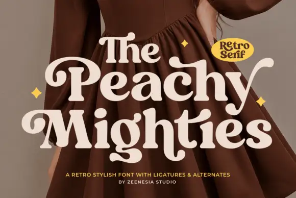
Heavy soft serifs with curled initials and generous lower hooks
Peach Mighties is a heavy soft serif in which the strokes stay thick and round, the counters shrink, the capital P curls inward and the y and lower terminals sweep out into broad soft hooks.
Ideas for this font
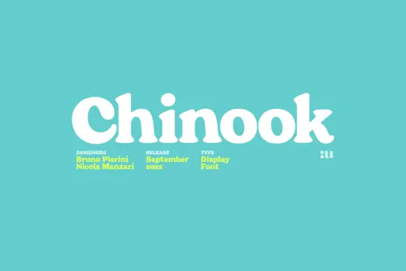
Heavy soft display serif with small rounded counters and a single weight
Chinook is a heavy display serif in which the stems are fat, the serifs are soft and the counters close to small rounded shapes, so a single word reads as a mid-century shop sign.
Ideas for this font
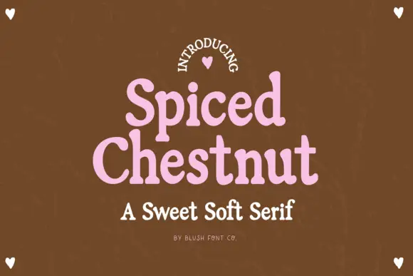
Sweet soft serif with rounded serifs
Spiced Chestnut is a sweet soft serif in pink on brown: heavy rounded letters with softened slab serifs, generous curves and a comfortable weight, set as two stacked words with a line beneath in the same family.
Ideas for this font
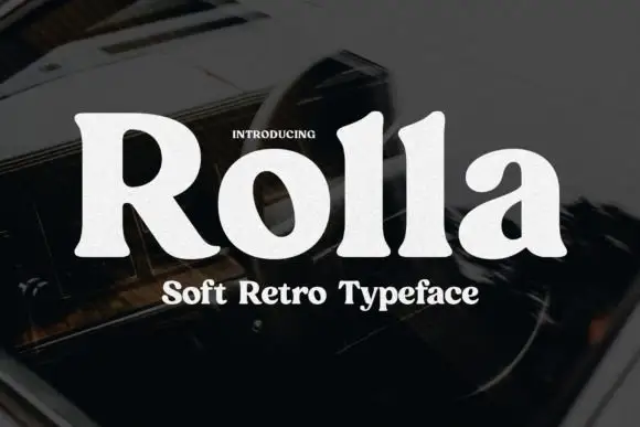
Soft retro serif display
Rolla is a soft retro serif in cream on a dark blurred ground: a single heavy weight, rounded bracket where the serifs meet the stems, a large x-height, and letters that are wide and generous without any ornament.
Ideas for this font
Same independent foundry
Allow optional Google Analytics to measure visits and catalogue actions. Your search words and notes are not included. Privacy & storage