Modern Grotesque Body

Hello Friday + One More
Creates crisp high-hierarchy contrast beneath Hello Friday headlines across menus, websites and labels.
Inspect One More specimenDisclosure: MakerFileHub may earn a commission from qualifying purchases via paid links on this page. How our links work.
Lowercase typewriter-like forms with mottled gray-black interiors
Hello Friday is a lowercase typewriter-style serif in which the feet round off, the ascenders keep small upper terminals and the fill mottles from pale grey to near black, so a short line reads as uneven ink on a machine-typed page.
Paid link
Get this fontProject & layout blueprintsAt-a-glance maker compatibility
Fine grain and micro-texture excel in 300 DPI print, sublimation, and screen print rather than small vinyl weeding.
Visual anatomy & craft review
The l and h lift plain ascenders with rounded tops, the y descends below the line beside a full stop, the feet keep rounded slab shapes and the interiors vary in tone rather than holding one flat colour. The mottled fill is the character: it suggests a worn ribbon instead of a clean digital letter, which is why the sample sets two short lowercase lines. Because the tone varies, the face wants 20 pt before a pale patch loses the stroke, and a coat change should be checked on the chosen surface. The paper photograph is a ground; the lettering is the face.
Typewriter · Mottled · Rounded feet
Two-font hierarchy recipes
Tested contrast partners — pairing Hello Friday with grounded secondary typography.
Hello Friday + One More
Creates crisp high-hierarchy contrast beneath Hello Friday headlines across menus, websites and labels.
Inspect One More specimen
Hello Friday + Handmade Calligraphy
Adds a warm human signature touch for 1-to-3-word callouts without competing against structured serif capitals.
Inspect Handmade Calligraphy specimenPractical applications
Concrete hierarchy, scale and production guidance tailored to Hello Friday’s stroke geometry.
The typewriter tone suits a note card, and the lowercase body keeps a short line intimate at 26 pt across an A6 sheet in one ink. Lowercase keeps a note card informal rather than ceremonial.
Hierarchy & layout recipe
Print an A6 card: set the line at 26 pt across the upper third, keep 12 mm of clear ground beneath for the y descender, and leave the lower half blank for a written message. Keep the card flat rather than folded at the centre.
Pre-production check
A pale ink patch printed on a light card disappears at 18 pt; check the proof and keep the line at 24 pt or above.
The mottled typewriter gives a pull quote texture, and the lowercase setting keeps a short sentence warm at 30 pt in a printed column. Lowercase also keeps a long quote from shouting.
Hierarchy & layout recipe
Print a 210 mm page: set the quote at 30 pt on three lines on a 70 mm measure, set the attribution at 9 pt in a small caps beneath with 10 mm of clear ground, and keep the block on a plain ground.
Pre-production check
A quote printed over an image loses the pale patches; check the page and keep the block on white. Keep 12 mm of white under the last line.
The typewriter feel suits a print shop label, and the rounded feet stay clear at 18 pt on a 50 mm panel in one colour. The rounded feet keep a small label from looking technical.
Hierarchy & layout recipe
Print a 50 by 30 mm label: set the studio name at 18 pt in lowercase, set the town in a 6 pt caps beneath with 4 mm of clear ground, and keep 4 mm of border on every side. Centre the name on the panel.
Pre-production check
A mottled fill printed on kraft turns muddy; check the proof and print on a pale label stock. A matte stock holds the mottle better than gloss.
Technical & licence verification
Confirm included OTF/TTF/WOFF formats, full glyph tables and licence coverage on the live store page before batch production.
Closest visual alternatives
Matched across letterform anatomy, stroke behaviour and craft applications.
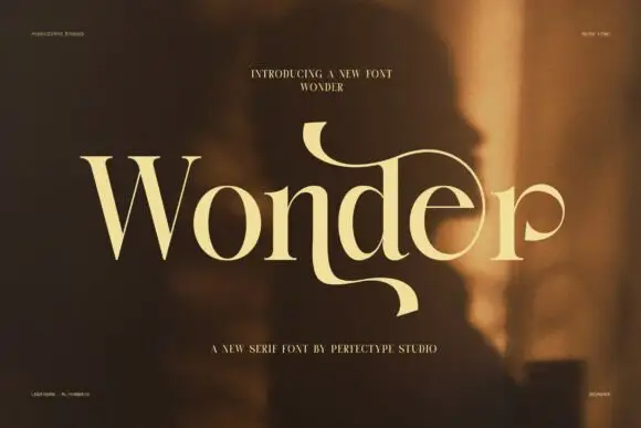
Elegant serif with dramatic swashes
Wonder is an elegant serif in cream on a warm blurred portrait: high contrast, a W drawn with long diagonal strokes, and a d whose ascender turns into a swash that loops back over the word and ends in a fine point.
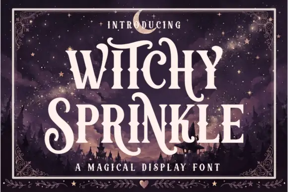
Magical display serif with elongated spurs and pointed curls
Witchy Sprinkle is a magical display serif in which the stems rise into elongated spurs, the terminals curl into points and the contrast stays high, so a two-word title reads as a hand-drawn storybook sign.
Ideas for this font
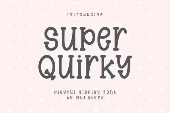
Quirky serif with uneven feet and a bouncy baseline
Super Quirky is a playful serif in warm grey on pale pink: fat rounded letters with small quirky serifs, uneven feet and a baseline that rises and falls, set as two stacked words with a tracked line beneath.
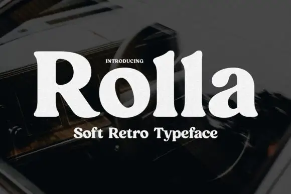
Soft retro serif display
Rolla is a soft retro serif in cream on a dark blurred ground: a single heavy weight, rounded bracket where the serifs meet the stems, a large x-height, and letters that are wide and generous without any ornament.
Ideas for this font
Same independent foundry
Allow optional Google Analytics to measure visits and catalogue actions. Your search words and notes are not included. Privacy & storage