Neutral Sans Workhorse

Retro Kingdom + Modern Heritage
Lets Retro Kingdom own the focal silhouette while handling secondary copy, sizing and subheads cleanly.
Inspect Modern Heritage specimenDisclosure: MakerFileHub may earn a commission from qualifying purchases via paid links on this page. How our links work.
Grunge slab display with worn texture
Retro Kingdom is a grunge slab display in tan and white on weathered wood: two lines of heavy caps with squared slabs, chipped edges and speckled interiors, the first line solid tan, the second white with a hollow outline treatment, so the pair reads as a stencilled sign on old timber.
Paid link
Get this fontProject & layout blueprintsAt-a-glance maker compatibility
Fine grain and micro-texture excel in 300 DPI print, sublimation, and screen print rather than small vinyl weeding.
Visual anatomy & craft review
The two lines are set at the same width and the drawing is a wide slab with heavy serifs, but the texture does everything: the edges are chipped irregularly, the interiors carry flecks and scratches, and the second line reverses to white with a thin outline inside the letter, which is a different treatment of the same skeleton. Because the slabs are wide and the letters are spaced loosely, the words read as a sign rather than as a logo, and the wear stays consistent in scale across both lines, which is what makes the texture look like a printed plate instead of a filter. The wood ground continues the story, and the two tracked lines above and below are set in a plain condensed sans, so the worn display is the only textured element on the page.
Grunge, slab, textured, bold
Two-font hierarchy recipes
Tested contrast partners — pairing Retro Kingdom with grounded secondary typography.
Retro Kingdom + Modern Heritage
Lets Retro Kingdom own the focal silhouette while handling secondary copy, sizing and subheads cleanly.
Inspect Modern Heritage specimen
Retro Kingdom + Askinо
Grounds bold display lettering with classic typographic authority on posters, badges and apparel.
Inspect Askinо specimenPractical applications
Concrete hierarchy, scale and production guidance tailored to Retro Kingdom’s stroke geometry.
A grunge slab reads as painted timber lettering, and the worn texture tells a reclaimed-furniture story that a clean serif could not carry.
Hierarchy & layout recipe
Paint a 1,000 by 500 mm board: the name at 140 mm cap height, the stock line in a 24 mm condensed sans, and a 6 mm rule. Keep the wear at one scale so the two lines look cut from the same plate, and paint two colours on bare timber.
Pre-production check
Check the board at 15 m, where the chips can make a word unreadable; use the least worn cut for the first line. Confirm the 24 mm stock line reads at three metres and that the timber grain does not fight the speckles.
A worn slab sets an old-fashioned autumn fair, and the two treatments give a single poster a headline and a sub-head without a second typeface.
Hierarchy & layout recipe
A2 portrait: the headline at 120 mm cap height in the solid style, the sub-head at 60 mm in the outline style, the details in a 12 mm sans, and a 5 mm border. Keep the details off the worn ground so the small type stays clean.
Pre-production check
Check the outline sub-head at 60 mm, where a thin inner line can break in print; thicken it. Confirm the 12 mm details read at two metres and that the two treatments do not read as two different families.
A grunge slab gives a local history a period feel, and the worn texture carries the idea of an old sign on a cover that would otherwise need a photograph.
Hierarchy & layout recipe
Set the title at 90 mm cap height on a 240 mm cover, the subtitle in a 10 pt sans, and the author in 9 pt caps. Print two colours on a textured stock so the wear reads as print rather than as a digital overlay.
Pre-production check
Check the title at thumbnail size, where the wear reduces the contrast; keep the solid line for the strongest word. Confirm the 9 pt author survives the matte lamination and that the title clears the trim by 15 mm.
Technical & licence verification
Confirm included OTF/TTF/WOFF formats, full glyph tables and licence coverage on the live store page before batch production.
Closest visual alternatives
Matched across letterform anatomy, stroke behaviour and craft applications.
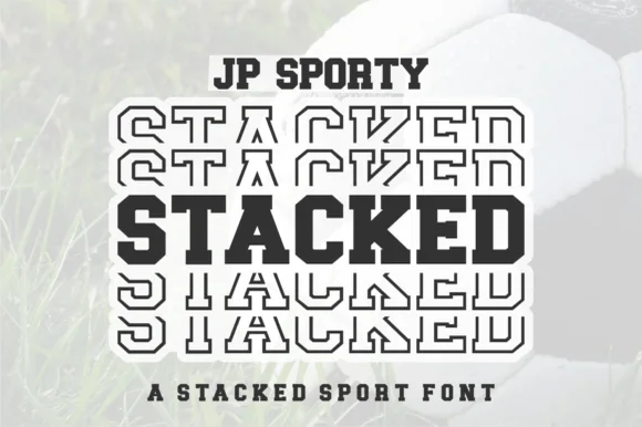
Dual-case solid + sliced-echo stacked sport sans (Uppercase + Lowercase!)
Jp Sporty Stacked is a clever 2-in-1 crafter sport sans: type UPPERCASE for solid athletic blocks and LOWERCASE for half-sliced outlined repeat echoes!
Ideas for this font
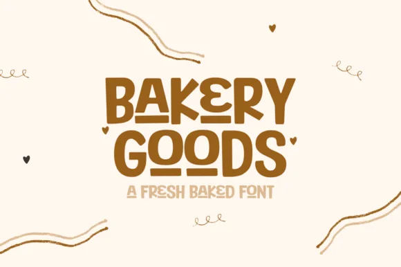
Vintage interlocking geometric sans + striped inline bakery display
Bakery Goods is a punchy mid-century packaging display font (NOT a cursive script!) interlocking bold geometric capitals with tiny heart accents!
Ideas for this font
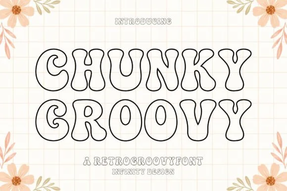
Clean flat monoline 1970s groovy outline display
Chunky Groovy is a crisp, flat monoline 1970s outline display font (shadow-free!) tracing bell-bottom retro curves in an even black contour.
Ideas for this font
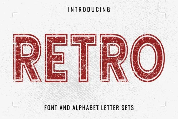
Distressed outline slab
Retro is a distressed outline slab in red on a white textured ground: letters drawn as a double contour with a worn, chipped edge, heavy square serifs and flat tops, so the word reads as a stamp from a mail-order catalogue rather than a solid display.
Same independent foundry
Allow optional Google Analytics to measure visits and catalogue actions. Your search words and notes are not included. Privacy & storage