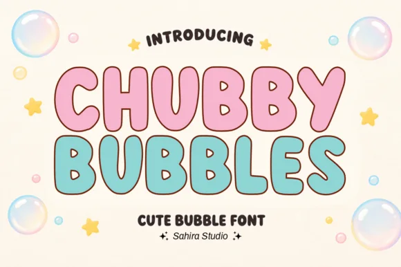
Neutral Sans Workhorse

Monogram Slab Serif + Montreal
Lets Monogram Slab Serif own the focal silhouette while handling secondary copy, sizing and subheads cleanly.
Inspect Montreal specimenDisclosure: MakerFileHub may earn a commission from qualifying purchases via paid links on this page. How our links work.
Split varsity monogram initial
Monogram Slab Serif is a single split initial in white on a soft interior scene: a varsity-like M drawn in two halves with slab feet, an inset outline that follows every contour, and a horizontal band that cuts through the middle, with the family name set in a small slab above and below.
Paid link
Get this fontProject & layout blueprintsAt-a-glance maker compatibility
Sturdy stroke walls and open counters weed cleanly on adhesive vinyl, HTV apparel film, and cut cardstock.
Visual anatomy & craft review
The plate is a monogram design rather than a text face, and the single large letter is the correct way to show it, because the inset outline and the middle band are the product and they only read at size. The drawing is a varsity slab with the letter split into two halves and a band across the join, so the mark reads as a collegiate patch, and the inset gives it a layered construction that survives a cut or a foil pass. That construction sets a large size floor, because the inset closes first. The interior scene is staging. It suits a school crest, a team mark and a package label.
Decorative, monogram, varsity, layered
Two-font hierarchy recipes
Tested contrast partners — pairing Monogram Slab Serif with grounded secondary typography.
Monogram Slab Serif + Montreal
Lets Monogram Slab Serif own the focal silhouette while handling secondary copy, sizing and subheads cleanly.
Inspect Montreal specimen
Monogram Slab Serif + Bright Golden
Grounds bold display lettering with classic typographic authority on posters, badges and apparel.
Inspect Bright Golden specimenPractical applications
Concrete hierarchy, scale and production guidance tailored to Monogram Slab Serif’s stroke geometry.
A split monogram gives a team a crest, and the inset outline converts to a layered cut without redrawing the mark. The inset converts to a cut.
Hierarchy & layout recipe
Set the initial at 50 mm on a jacket patch, 30 mm on a certificate and 18 mm on a sticker, in one colour with a second for the inset. Keep the inset gap above 0.8 mm.
Pre-production check
Check the 18 mm sticker, where the inset can close; keep it above 0.8 mm. Confirm the 50 mm patch embroiders without a jump stitch and that the band aligns across the join.
A collegiate monogram gives a barber a mark, and the split construction reads on a window in vinyl at night. It reads as a window mark.
Hierarchy & layout recipe
Cut a 400 by 400 mm mark: the initial at 380 mm, one colour plus the inset, and a 3 mm contour. Keep 20 mm clear space and fit the mark square to the pane.
Pre-production check
Check the cut at 380 mm, where a 3 mm inset can tear on weeding; widen it to 5 mm. Confirm the mark reads from the pavement and that the contour clears the frame.
A monogram label reads as team branding, and the split letter holds a single-initial mark on a small bottle. It reads as team branding.
Hierarchy & layout recipe
Print a 50 by 80 mm label: the initial at 26 mm, the flavour at 8 pt, and two colours on a coated stock. Keep 4 mm inside the die and keep the inset above 0.5 mm.
Pre-production check
Check the 26 mm initial on a curved bottle, where the inset can fill; keep it above 0.5 mm. Confirm the flavour reads on the shelf and that the label holds in a cooler.
Technical & licence verification
Confirm included OTF/TTF/WOFF formats, full glyph tables and licence coverage on the live store page before batch production.
Closest visual alternatives
Matched across letterform anatomy, stroke behaviour and craft applications.
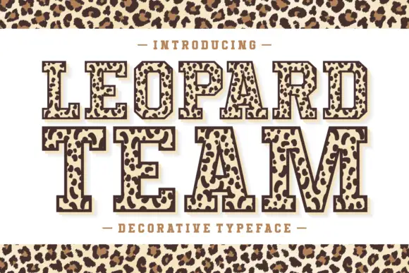
Leopard-filled varsity slab
Leopard Team is an outlined varsity slab in dark brown on cream: heavy caps drawn with a contour and filled with irregular leopard rosettes, on a light keyline with a dark offset shadow, with a tracked line above and beneath and a leopard band across the top and bottom of the sheet.
Ideas for this font
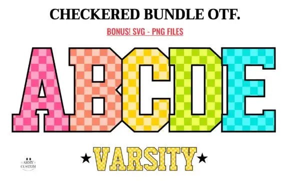
Tall varsity-style blocks filled with bright two-tone checks
Checkered Back to School shows tall angular slab capitals filled with pink, peach, yellow, lime and turquoise checks: the B and D keep small squared counters, the A opens a narrow rectangle, a thin black outline bounds the pattern and a smaller line below repeats the structure at reduced scale.
Ideas for this font

Slab capitals with football lace details across the middle
Football is a slab capital alphabet in which the round letters carry a laced seam across their middle, so a word reads as a printed ball rather than as plain athletic lettering.
Ideas for this font
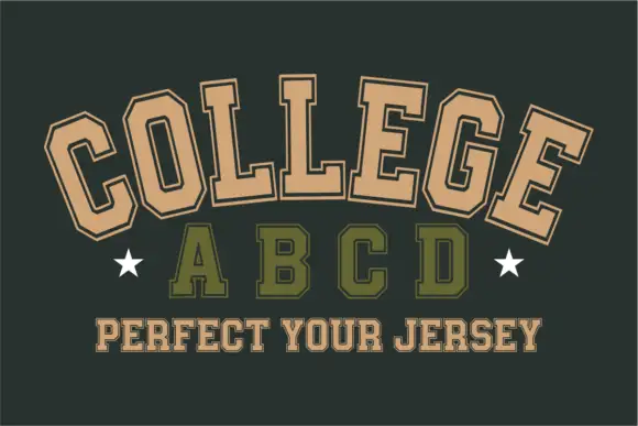
Angular outlined varsity blocks shown along an arc
College Abcd sets tan collegiate capitals along an upward arc above a smaller olive row: the O and C clip their corners, the slab feet spread broad and a fine dark line runs inside the thick strokes as an inline edge.
Ideas for this font
Same independent foundry
Allow optional Google Analytics to measure visits and catalogue actions. Your search words and notes are not included. Privacy & storage