Neutral Sans Workhorse

Bakery Goods + Lemon Milk Pro FTR
Lets Bakery Goods own the focal silhouette while handling secondary copy, sizing and subheads cleanly.
Inspect Lemon Milk Pro FTR specimenDisclosure: MakerFileHub may earn a commission from qualifying purchases via paid links on this page. How our links work.
Vintage interlocking geometric sans + striped inline bakery display
Bakery Goods is a punchy mid-century packaging display font (NOT a cursive script!) interlocking bold geometric capitals with tiny heart accents!
Paid link
Get this fontProject & layout blueprintsAt-a-glance maker compatibility
Sturdy stroke walls and open counters weed cleanly on adhesive vinyl, HTV apparel film, and cut cardstock.
Visual anatomy & craft review
Bakery Goods is a mid-century packaging display that interlocks bold geometric capitals — tucking the E and R bars together — and adds tiny heart accents, with a separate striped inline style for subheads. The interlock fixes the tracking, so the word behaves as one plate, and the inline subhead only works at size. It needs roughly 28 mm for the tuck and the hearts to read, and it is best in golden brown on flour cream or a single dark ink on kraft.
Mid-century-bakery · Interlocking-caps · Striped-subtext
Two-font hierarchy recipes
Tested contrast partners — pairing Bakery Goods with grounded secondary typography.
Bakery Goods + Lemon Milk Pro FTR
Lets Bakery Goods own the focal silhouette while handling secondary copy, sizing and subheads cleanly.
Inspect Lemon Milk Pro FTR specimen
Bakery Goods + The Lumina Awesome
Grounds bold display lettering with classic typographic authority on posters, badges and apparel.
Inspect The Lumina Awesome specimenPractical applications
Concrete hierarchy, scale and production guidance tailored to Bakery Goods’s stroke geometry.
Interlocking mid-century caps read as a flour-sack package, which is what a bakery prints on a box. The fixed tracking makes a two-word name behave as one mark at 44 mm, and the striped inline gives the subhead a second tier without a second font.
Hierarchy & layout recipe
Carton 200 x 150 x 80 mm, word 44 mm on the lid, 25 mm margins. Bag label 90 x 60 mm, name 16 mm, 4 mm die margin. Subhead 210 x 40 mm, inline 24 mm, 10 mm margins.
Pre-production check
The striped inline closes at 24 mm on a kraft bag and reads as a grey band under the name. Keep the inline above 30 mm or use the solid style for small formats, and check one printed bag.
Interlocked caps read as a package band tied round a boxed gift, which is what a staff thank-you is. The heavy forms print in one ink on a band, and the tiny hearts keep the tone warm without a greeting-card script.
Hierarchy & layout recipe
Card 148 x 105 mm, heading 16 mm, message 8/11 pt, 12 mm margins. Band 600 x 80 mm, word 30 mm, 20 mm margins. Sign 600 x 400 mm, word 110 mm, 40 mm margins.
Pre-production check
A band folded round a box corner cracks where the letter crosses the crease. Keep the word 20 mm clear of each fold, and check one wrapped box before the batch.
Mid-century packaging caps read as a sweet counter, which is what a birthday cake order comes in. The interlock gives the name one-plate strength on a 44 mm lid, and the hearts add charm without an illustration.
Hierarchy & layout recipe
Cake box 250 x 250 x 120 mm, word 60 mm on the lid, 30 mm margins. Bag label 90 x 60 mm, name 16 mm, 4 mm die margin. Menu 210 x 297 mm, items 9/12 pt, 15 mm margins.
Pre-production check
A cake box lid printed in one colour on kraft mottles across a 60 mm solid fill and the word looks stained. Print on a white board or add an underlay, and check one assembled box before the order.
Technical & licence verification
Confirm included OTF/TTF/WOFF formats, full glyph tables and licence coverage on the live store page before batch production.
Closest visual alternatives
Matched across letterform anatomy, stroke behaviour and craft applications.
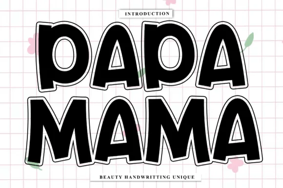
Fat rounded outlined sticker caps
Papa Mama is a fat rounded display in black with a white outline on a pink grid: very heavy caps with soft corners, generous counters, a slight lean on some letters, and a thick cut-out outline that reads as a sticker or a die-cut shape.
Ideas for this font
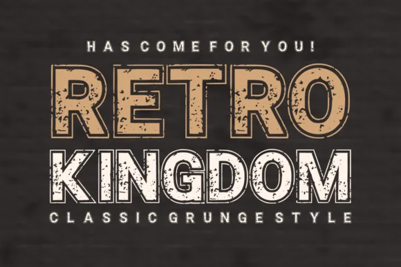
Grunge slab display with worn texture
Retro Kingdom is a grunge slab display in tan and white on weathered wood: two lines of heavy caps with squared slabs, chipped edges and speckled interiors, the first line solid tan, the second white with a hollow outline treatment, so the pair reads as a stencilled sign on old timber.
Ideas for this font
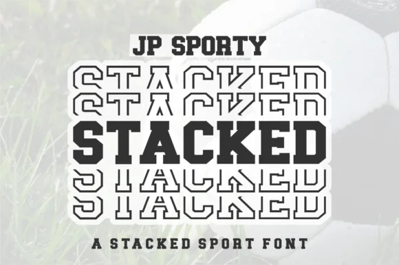
Dual-case solid + sliced-echo stacked sport sans (Uppercase + Lowercase!)
Jp Sporty Stacked is a clever 2-in-1 crafter sport sans: type UPPERCASE for solid athletic blocks and LOWERCASE for half-sliced outlined repeat echoes!
Ideas for this font
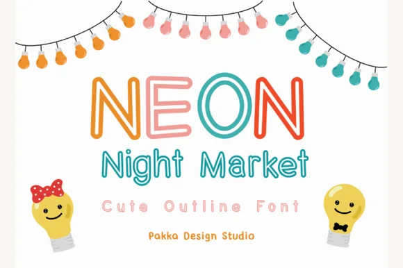
Rounded outlined display with a matching lowercase
Neon Night Market is a rounded display face drawn as an outline rather than a solid: uniform stroke thickness, bullet-rounded terminals, a chunky uppercase and a shorter lowercase that lets the same width run as a two-line lockup.
Ideas for this font
Same independent foundry
Allow optional Google Analytics to measure visits and catalogue actions. Your search words and notes are not included. Privacy & storage