Modern Grotesque Body

Retro + Nyxar
Creates crisp high-hierarchy contrast beneath Retro headlines across menus, websites and labels.
Inspect Nyxar specimenDisclosure: MakerFileHub may earn a commission from qualifying purchases via paid links on this page. How our links work.
Distressed outline slab
Retro is a distressed outline slab in red on a white textured ground: letters drawn as a double contour with a worn, chipped edge, heavy square serifs and flat tops, so the word reads as a stamp from a mail-order catalogue rather than a solid display.
Paid link
Get this fontProject & layout blueprintsAt-a-glance maker compatibility
Fine grain and micro-texture excel in 300 DPI print, sublimation, and screen print rather than small vinyl weeding.
Visual anatomy & craft review
The word is set once, large, and the drawing is an outline in which the fill is left empty: each letter is described by a thick contour with a thin inner line, and the edges are eaten away by speckles, which makes the shape read as a rubber stamp that has been used many times. The serifs are square blocks and the tops are flat, so the skeleton stays a slab even though the interior is missing, and the spacing is tight enough that the word reads as one plate. Because the strokes are hollow, the face needs a contrasty ground and a large size, which the specimen provides with a white textured sheet and a hairline corner frame. Two tracked captions above and below are set in a small grotesque, so the only texture on the page is the outline itself.
Outline, distressed, retro, bold
Two-font hierarchy recipes
Tested contrast partners — pairing Retro with grounded secondary typography.
Retro + Nyxar
Creates crisp high-hierarchy contrast beneath Retro headlines across menus, websites and labels.
Inspect Nyxar specimen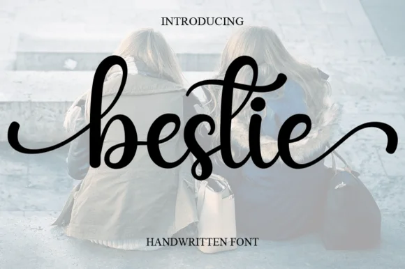
Retro + Bestie
Adds a warm human signature touch for 1-to-3-word callouts without competing against structured serif capitals.
Inspect Bestie specimenPractical applications
Concrete hierarchy, scale and production guidance tailored to Retro’s stroke geometry.
An outline slab reads as a rubber stamp, which is exactly the identity a vintage shop wants, and the hollow letterforms keep a self-inking stamp legible at 30 mm.
Hierarchy & layout recipe
Order a 40 mm stamp: the name at 8 mm cap height, the web address in a 3 mm grotesque, and 2 mm clear to the stamp edge. Keep the contour at 0.6 mm so the rubber holds it and test one impression on a paper bag.
Pre-production check
Check the 8 mm impression, where a contour under 0.5 mm closes; thicken it for the die. Confirm the name reads on a kraft bag and that the speckled edge does not turn into a solid block after ten impressions.
An outline slab gives a cover a printed, machine-stamped quality that a solid display cannot, and the hollow letters let a photograph show through the title.
Hierarchy & layout recipe
Set the title at 140 mm cap height across the cover, the subtitle in a 10 pt grotesque, and the year at 9 pt. Keep the title over a quiet part of the image and give it a subtle knockout so the contour stays visible.
Pre-production check
Check the title at 140 mm over a busy photograph, where the contour can disappear; choose a flat area or add a one-step shadow. Confirm the 9 pt year reads at newsstand distance and that the title holds at thumbnail size.
An outline graphic prints as a single screen and looks like a worn transfer on fabric, which suits a retro party more than a clean modern mark.
Hierarchy & layout recipe
Print a 250 mm chest graphic: the phrase at 55 mm cap height, the date at 18 mm, and one ink on a mid-tone shirt. Keep the contour at 2.5 mm so the screen holds it after washing.
Pre-production check
Check the screen at actual mesh, where a contour under 2 mm fills; thicken it for fabric. Wash-test one shirt and confirm the date stays legible after five cycles.
Technical & licence verification
Confirm included OTF/TTF/WOFF formats, full glyph tables and licence coverage on the live store page before batch production.
Closest visual alternatives
Matched across letterform anatomy, stroke behaviour and craft applications.
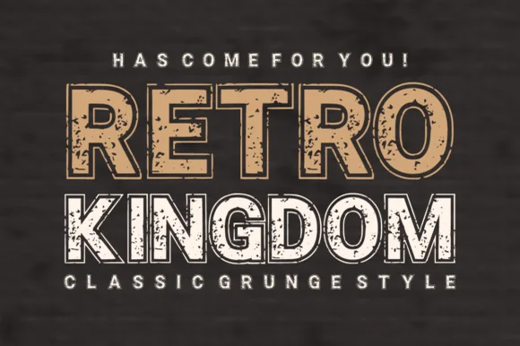
Grunge slab display with worn texture
Retro Kingdom is a grunge slab display in tan and white on weathered wood: two lines of heavy caps with squared slabs, chipped edges and speckled interiors, the first line solid tan, the second white with a hollow outline treatment, so the pair reads as a stencilled sign on old timber.
Ideas for this font
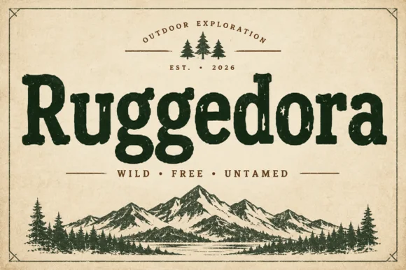
Worn Cooper-style vintage outdoor slab serif
Ruggedora is a heavy, softly distressed vintage slab serif with plump rounded bowls, bracketed feet, and weathered trail-sign warmth.
Ideas for this font
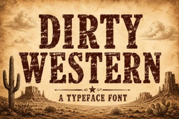
Heavily weathered Wild-West woodtype & saloon slab serif
Dirty Western is a rugged frontier slab serif stamped with coarse woodblock grain, pitted distress, and classic 1880s wanted-poster authority.
Ideas for this font
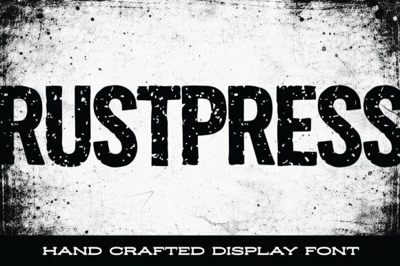
Condensed grunge grotesque
Rustpress is a condensed grotesque in black on a stained white ground: narrow caps with square shoulders, thick even stems, and a distress of punched holes and scratches that makes the word read as a rubber stamp pressed too hard.
Ideas for this font
Same independent foundry
Allow optional Google Analytics to measure visits and catalogue actions. Your search words and notes are not included. Privacy & storage