Modern Grotesque Body

Neo Joel + Memoir Slang
Creates crisp high-hierarchy contrast beneath Neo Joel headlines across menus, websites and labels.
Inspect Memoir Slang specimenDisclosure: MakerFileHub may earn a commission from qualifying purchases via paid links on this page. How our links work.
Elegant display serif with star counters
Neo Joel is an elegant display serif in gold on a dark floral ground: light thin stems, tall ascenders, wide open letters, and a four-point star set inside the counter of the O, which turns the letter into a small emblem.
Paid link
Get this fontProject & layout blueprintsAt-a-glance maker compatibility
Crisp hairline serifs shine on stationery, foil stamping, and packaging; add slight offset for small decals.
Visual anatomy & craft review
The two words are stacked and drawn with a light weight that is unusual for a serif display: the stems are thin, the serifs are fine hairlines, and the contrast is low enough that the face reads as delicate rather than dramatic. The counters of the O are large and round, and one of them carries a star, which is the single ornament in the letterforms and works because the letter is wide enough to hold it. Spacing is generous, almost a fifth of a letter width, so the thin strokes stay separated and the word reads as a line of fine drawing rather than as a mass. The ground is a dark still life of shadows and petals, and the gold type is placed so the light falls behind the stems; the four corner labels are set in small tracked capitals, keeping the ornament confined to the O.
Elegant, light, ornamental, formal
Two-font hierarchy recipes
Tested contrast partners — pairing Neo Joel with grounded secondary typography.
Neo Joel + Memoir Slang
Creates crisp high-hierarchy contrast beneath Neo Joel headlines across menus, websites and labels.
Inspect Memoir Slang specimen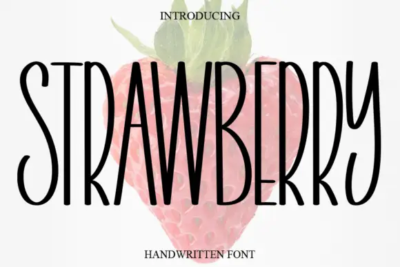
Neo Joel + Strawberry
Adds a warm human signature touch for 1-to-3-word callouts without competing against structured serif capitals.
Inspect Strawberry specimenPractical applications
Concrete hierarchy, scale and production guidance tailored to Neo Joel’s stroke geometry.
A light display serif gives a poetry title the delicacy the subject usually wants, and the star in the counter gives the cover one memorable detail without an illustration.
Hierarchy & layout recipe
Set the title at 72 pt in two lines on a 198 by 129 mm cover, the author in a 10 pt serif beneath, and a 0.5 pt rule at the foot. Print gold on a dark board or black on cream, and keep the star counter on the largest line only.
Pre-production check
Check the light stems at 72 pt on the chosen board, where a thin stroke can break in foil; use a solid ink for the finest parts. Confirm the author line reads at arm's length and that the star counter is not lost when the cover is viewed as a thumbnail.
A light serif with one emblem letter gives a perfume label a quiet luxury, and the star works as a repeatable detail across a range without a change of typeface.
Hierarchy & layout recipe
Print a 45 by 85 mm label: the name at 16 pt, the concentration in a 6.5 pt sans caps, and the volume in 6 pt at the base. Keep the star counter on the first letter only and leave 4 mm of clear space inside the die.
Pre-production check
Check the 16 pt name on the label, where the thin stems can fall below 0.15 pt and vanish; raise the weight for the small size. Confirm the 6 pt volume reads on the curved bottle and that the star is still visible at arm's length.
A light serif sets a ceremony with restraint, and one ornamental counter gives the cover a detail without a monogram or a floral motif.
Hierarchy & layout recipe
A5 programme: the names at 40 pt, the order of service in a 9.5 pt serif, and the venue in 8 pt caps at the foot. Keep 22 mm margins and print one ink on a heavy cream stock so the thin strokes stay crisp.
Pre-production check
Check the 40 pt names on the uncoated stock, where the light stems can lose their serifs; proof a sheet before the run. Confirm the 9.5 pt order of service stays legible in dim light and that the ornamental counter is not cut by the trim.
Technical & licence verification
Confirm included OTF/TTF/WOFF formats, full glyph tables and licence coverage on the live store page before batch production.
Closest visual alternatives
Matched across letterform anatomy, stroke behaviour and craft applications.

Sleek classic retro display serif
De Rozzo balances wide classical roman bowls with crisp modern wedge serifs and alternates, built for luxury fashion, magazines and wine labels, where the expansive round O and C counters contrast with slender horizontal hairlines for a confident Mediterranean feel.
Ideas for this font
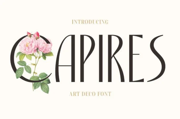
Tall slender Art-Nouveau & Art-Deco crossover serif
Capires is a tall, poised display serif fusing 1920s high-waisted Art Deco proportions with soft Art Nouveau curved tapers.
Ideas for this font
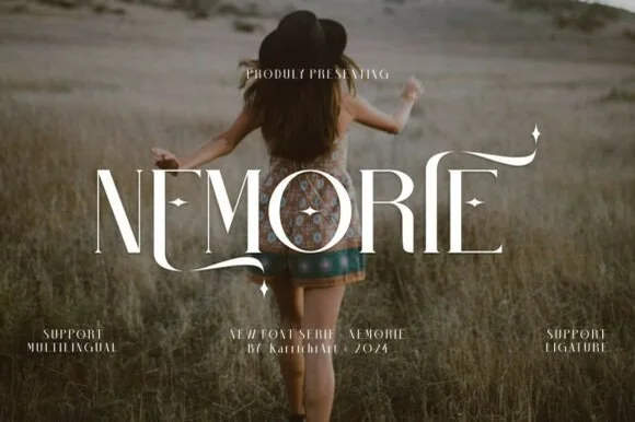
Celestial high-contrast art-nouveau & fantasy ligature serif
Nemorie is a refined high-contrast display serif featuring sweeping scythe-like swash bars, sculpted ligatures, and four-point star accents.
Ideas for this font
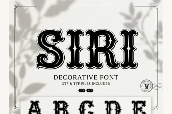
Inline-ornamented vintage Deco serif with bevel lines and a heavy contour
Siri is a vintage Deco serif in which every stem carries an inline bevel, the serifs curl and a heavy contour closes the shape, so a word reads as a painted shop window from the thirties.
Ideas for this font
Same independent foundry
Allow optional Google Analytics to measure visits and catalogue actions. Your search words and notes are not included. Privacy & storage