Neutral Sans Workhorse

Phantasm Ghost + Mango Dream
Lets Phantasm Ghost own the focal silhouette while handling secondary copy, sizing and subheads cleanly.
Inspect Mango Dream specimenDisclosure: MakerFileHub may earn a commission from qualifying purchases via paid links on this page. How our links work.
Dripping horror display with cut faces
Phantasm Ghost is a dripping horror display in cream on a dark scene: heavy rounded caps with long drips running from the baseline, faces cut into the counters of the A and the O, and rounded terminals, so the pair reads as a friendly haunted-house sign rather than a brutal metal logo.
Paid link
Get this fontProject & layout blueprintsAt-a-glance maker compatibility
Sturdy stroke walls and open counters weed cleanly on adhesive vinyl, HTV apparel film, and cut cardstock.
Visual anatomy & craft review
The two words are stacked at the same width and the drawing is a rounded display with the melt built in: every stroke ends in a drip of a different length, the bottoms of the letters sag, and the counters are punched with ghost faces, which turns two letters into illustrations. Because the drips hang below the baseline, the words need vertical room, and the specimen gives them a full plate on a red-black sky with a castle silhouette behind. The weight is heavy enough that the face holds at poster size, and the drips are thick rather than hairline, which is what separates a usable seasonal display from a novelty that disappears when printed. The caption beneath is set in a smaller hand-drawn style from the same family, which keeps the sheet in one voice.
Horror, drippy, playful, seasonal
Two-font hierarchy recipes
Tested contrast partners — pairing Phantasm Ghost with grounded secondary typography.
Phantasm Ghost + Mango Dream
Lets Phantasm Ghost own the focal silhouette while handling secondary copy, sizing and subheads cleanly.
Inspect Mango Dream specimen
Phantasm Ghost + Cronelo
Grounds bold display lettering with classic typographic authority on posters, badges and apparel.
Inspect Cronelo specimenPractical applications
Concrete hierarchy, scale and production guidance tailored to Phantasm Ghost’s stroke geometry.
A drippy display with faces cut into the letters sells the attraction from across the street, and the thick drips hold at large print sizes where a thin melt would disappear.
Hierarchy & layout recipe
A2 portrait: the name at 150 mm cap height, the dates in a 16 mm sans, and the times in 12 mm. Keep 40 mm below the drips so they never touch the small type, and print fluorescent cream on a dark ground for night visibility.
Pre-production check
Check the poster at five metres, where the longest drips can merge with the line beneath; keep the clear zone. Confirm the 12 mm times read at three metres and that the cut faces still read as faces at half size.
A playful horror face is seasonal without being frightening for younger children, and the heavy strokes survive the copier a school actually uses for corridor notices.
Hierarchy & layout recipe
A4 print: the headline at 50 mm cap height, the stalls in a 10 mm sans, and a 4 mm rule. Keep the headline to two words so the drips stay inside the sheet, and print two colours at the highest copier setting.
Pre-production check
Check the A4 on a copier, where the drips can fill into the line below; keep 12 mm of clear space. Confirm the 10 mm stalls read at two metres and that the faces in the counters survive at half size on a phone.
A thick dripping display cuts cleanly in card and gives a Halloween birthday the look of a bought topper, and the melt is what makes the silhouette interesting when it is cut out.
Hierarchy & layout recipe
Cut a 160 mm topper: the name at 55 mm cap height with a 4 mm minimum stroke, two 3 mm tabs at the base, and a 6 mm gap between letters so the cutter clears the drips.
Pre-production check
Check the cut file at 160 mm, where the longest drip can snap in card; thicken the joins. Confirm the topper stands in a 200 mm cake and that the tabs stay hidden under the icing line.
Technical & licence verification
Confirm included OTF/TTF/WOFF formats, full glyph tables and licence coverage on the live store page before batch production.
Closest visual alternatives
Matched across letterform anatomy, stroke behaviour and craft applications.
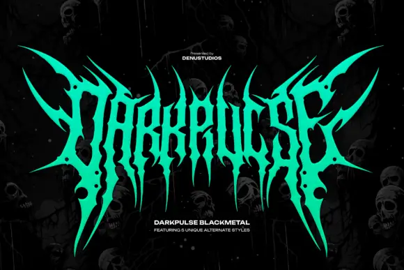
Spiked metal-style lettering with branching tips and hanging points
Darkpulse is black metal logo lettering: tall spiked strokes, mirrored symmetry, thin blade terminals that reach above and below the baseline, and five alternate versions of the wordmark.
Ideas for this font
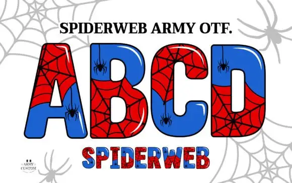
Broad glossy capitals split into red webs and blue fields
Spiderweb Army draws fat comic capitals, splits each letter into two colour fields and covers the halves with drawn spiderwebs, then hangs a small spider from a thread inside the counters.
Ideas for this font
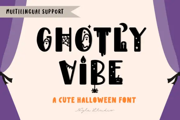
Mixed heavy capitals with distinct ghosts, webs, drips, crescent and candle details
Ghostly Vibe is a cute Halloween display face in which the caps carry little scenes inside them: a ghost in the counter of the O, a spider web in the G, a dripping stroke under the T, and a candelabra between two words.
Ideas for this font
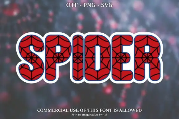
Web-filled red display
Spider is a rounded red display on a blurred dark ground: fat capitals filled with black spiderwebs drawn from a central point, outlined in white with a blue inner line and a wide white surround, set as one large word with a format line above and a plain note beneath.
Ideas for this font
Same independent foundry
Allow optional Google Analytics to measure visits and catalogue actions. Your search words and notes are not included. Privacy & storage